This is a joint blogpost from the University of Bristol’s Professor Simon Burgess and the Datalab team
Way back in August, the prime minister called getting all children back into school a “moral duty” and “the national priority”.
This followed a great deal of work over the summer by researchers, showing the strong detrimental impact of school closures on the life-chances of children, especially those from poorer families.
Also in August, the chief medical officers of the UK released a consensus statement noting that the risks to children of shutting schools were greater than the risks of opening them.
We are now halfway through the first term back, and can make a very partial assessment of pupil attendance so far.
The Department for Education publishes updates at a national level which reported that 86% of children attending on 22 October, compared to 88% on 10 September.
While obviously some way short of attendance levels in normal times (the figure in autumn 2019 was 96%), these figures do not sound too bad for a time when infection rates are high and rising.
But this overall national message hides strong regional and local differences in school attendance. We have used data from a written response to a parliamentary question which reports school attendance at regional and local authority level to explore this.[1]
This dataset relates to attendance in state-funded schools on 15 October. Here we’ll focus on secondary schools – where attendance rates are lower than in primary schools. It is worth saying that the figures are based on schools that submitted a response to the DfE Department for Education (around 75-85% of schools do), which will have some bearing on the accuracy of the figures.
Variation between regions
The chart below compares the rate of positive tests among 25- to 34-year-olds in each region from the ONS infection survey to the secondary school attendance rate. (Note that the y-axis starts at 50% – this is used as the minimum in subsequent charts too.)
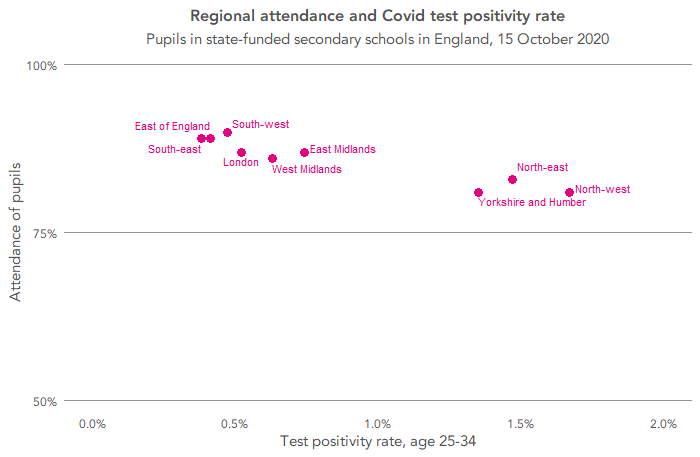
This shows that attendance tends to be lower in regions with higher infection rates, as community infection spreads into schools and some children are sent home.
Within regions, there is considerable variation in attendance between local authorities – shown in the following chart. For each region, the highest, lowest and median attendance rate are shown by LA.
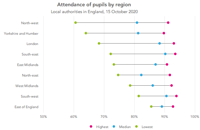
In all regions, there are LAs where school attendance was above 90%. That is, there are areas of close-to-complete attendance everywhere.
But there are big differences at the other end of the scale. There are some strikingly low numbers: the LAs with the lowest attendance in the north-west, Yorkshire and the Humber and London have less than 70% attending. (Knowsley, in the north-west, had the lowest attendance overall, with 61%.) Again, the regional pattern broadly matches the virus infection rate, but not perfectly; other factors are also at work.
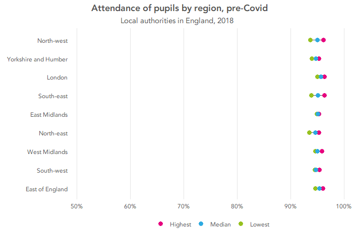
Ordinarily, we wouldn’t see such variation. The following chart shows the same information based on the whole of the autumn term in 2018.
Mapping the figures from 15 October helps show the difference in attendance rates between different parts of the countries – use the map below to explore this.
We must also remember the LA data are averages, so there will be schools below these – maybe even some schools below 50% attendance. School-level data must exist as this is the level it is collected at; it would be very useful if this was published, to help all those working with schools to understand where support is needed most.
The relationship with disadvantage
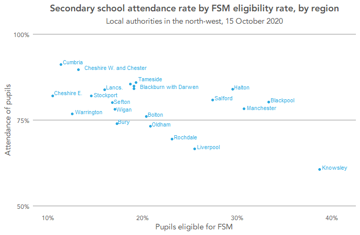
It is also worth looking at the relationship between these LA-level absence rates and disadvantage rates. We’ll use a school-relevant measure of poverty – the percentage of pupils in a local authority eligible for free school meals.
Let’s look first at the north-west of England, which has seen some of the highest infection rates – see the chart below. It is immediately clear that there is a very strong relationship between school attendance and disadvantage, with school attendance lower in LAs with high disadvantage.
This strong negative relationship is also apparent in the north-east, Yorkshire and the Humber and the east Midlands, as the next chart shows. In the case of the first two of these regions, these are also places where infection rates were particularly high in mid-October.

Interestingly, it is not the case everywhere: there is no real relationship between attendance and poverty in London or the west Midlands.
There are many factors that might be contributing to this difference and we’ll not speculate here on what they might be. However, it does possibly give some hope that there may be lessons to be learnt to try to maintain higher school attendance levels in other disadvantaged areas.
In short, it seems that local and regional variations in prevalence are influenced by poverty and also affecting attendance. Covid-19 infection rates are higher in poor areas, and high ambient infection rates result in more pupils having to drop out of school to isolate.
In summary
This brief data analysis brings more bad news for inequality and social mobility: the pupils missing the most schooling are found in the poorest areas of the country.
Once again, the biggest hit to future life chances is felt by those in the most challenging circumstances.
This is rendered even stronger by the fact that we know that online remote schooling has worked least well for poorer families. In part, this is due to lack of suitable networked devices in such households.
Schools continue to be hit very hard by the Covid-19 pandemic. School staff are being resolute in trying to maximise learning in a very difficult situation, providing both classes to those who can attend and online classes and other materials for those who can’t. Not to mention having to cover the classes for teachers who are also off due to Covid-19.
But the high rates of local infection and the inadequacy of the Covid-testing regime means that a lot of schooling is being missed, despite it being a “moral duty” to keep children in schools.
And, as we see again and again, the pandemic is exacerbating inequalities and reducing still further the chances of “levelling up”.
This brief post underlines what more we can learn from disaggregated data, here just to region and LA level. School-level data would be even more informative.
Want to stay up-to-date with the latest research from FFT Education Datalab? Sign up to Datalab’s mailing list to get notifications about new blogposts, or to receive the team’s half-termly newsletter.
1. Data is available on 150 of England’s 151 local authorities – no figures are reported for Worcestershire.
Is there any research for post 16 GCSE Maths/English ?
Hi Geraldine, is there anything in particular you were looking for?
Hi, great article as always, thanks.
Are you involved analysing the impact of catch up funding and the National Tutor Programme? The marketing accompanying the initiatives states that disadvantaged and vulnerable learners should be prioritised. However, as the funding hasn’t been ring fenced to students in categories that will officially identify them as disadvantaged or vulnerable, such as qualifying for Free School Meals or Pupil Premium, or in receipt of an EHCP, I wonder whether it will work out this way?
Hi Stephen, thanks for the kind comment, and sorry for the delay in replying.
We don’t have any current involvement in analysing the impact of the funding, and I’m not sure it’s something that we would be asked to contribute to, or would opt to. I say this in part because, as you may have seen, FFT is one of the 32 organisations appointed as NTP tuition partners.
I’m in agreement about the lack of ring-fencing – Nick Gibb has said that it will be left to schools’judgment to decide exactly who the tutoring is used for. So I think it’s a valid question to ask – how well-targeted will the interventions be (and how much will this vary between schools).
Hi, really good read, thank you.
Can you tell me if the national attendance figures include those pupils with X codes? Or is it, for example, that 86% of students ‘eligible’ to attend that are present, ignoring any absent with a X code?