This project has been funded by the Nuffield Foundation, but the views expressed are those of the authors and not necessarily the Foundation. Visit nuffieldfoundation.org
In this post, we bring you some of the highlights from new research into Key Stage 2 maths attainment. You can read the full report here.
Maths – like any subject – is made up of all sorts of components, for example geometry, algebra and statistics. Some pupils may do really well in one of these areas, but not so well in others.
The national curriculum for Key Stage 2 maths includes eight different curriculum areas. Each of these areas is tested as part of the maths national curriculum tests (often called SATs), and schools can access their raw scores for each different area, or ‘sub-domain’ from the Analyse School Performance website.
But how useful are these raw scores? Should schools be analysing them to pinpoint areas where pupils are struggling? And do schools tend to do better in some areas than others? These are some of the questions that we set out to answer in this Nuffield-funded project.
Data
We used question level data from KS2 SATs from 2017-23 matched to pupil tables from the National Pupil Database for the same years. As far as we know, it’s the first time that external researchers have been able to use question level SATs data for a research project.
To determine which questions cover which curriculum area, we used the technical appendices of the national curriculum test development handbook for the relevant year and the mapping set out in the KS2 mathematics test framework. The eight curriculum areas are:
- Number and place value
- Addition, subtraction, multiplication and division (calculations)
- Fractions, decimals and percentages
- Ratio and proportion
- Algebra
- Measurement
- Geometry
- Statistics
Some background
Sign up to our newsletter
If you enjoy our content, why not sign up now to get notified when we publish a new post, or to receive our half termly newsletter?
You may be wondering why we’re questioning the use of sub-domain scores. Surely if a schools’ pupils have lower scores for, say, questions on statistics than for most other sub-domains, that’s a clear indication that pupils are struggling with statistics?
The problem is that simply comparing the raw scores doesn’t the account for the differences in the number of questions in each area, their positioning in the test and their level of difficulty. And there are some considerable differences here, as we’ll see.
Maths SATs consist of three papers and there are 110 questions in total each year. Each question is linked to at least one curriculum area, and a minority are linked to two or even three. Where they are linked to more than one area, the area most closely related to the question is termed the primary area, the next most related the secondary area, and so on. We’ll come back to this question of secondary and tertiary areas later on, but for now we’ll just focus on primary areas.
The chart below shows the number of questions by primary area from 2017-23.
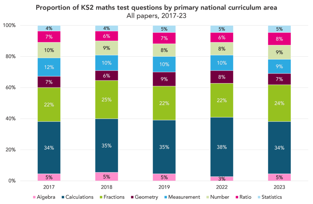
The questions are not split evenly between the areas. Calculations is the area covered by most questions: around a third have this as their primary area. At the other end of the scale, algebra and statistics are each covered by around 5% of questions.
There are also some differences in where questions focused on each area tend to appear in the test. The table below shows the position in which the first question on each area appears in a paper (note that there were no SATs in 2020 and 2021).
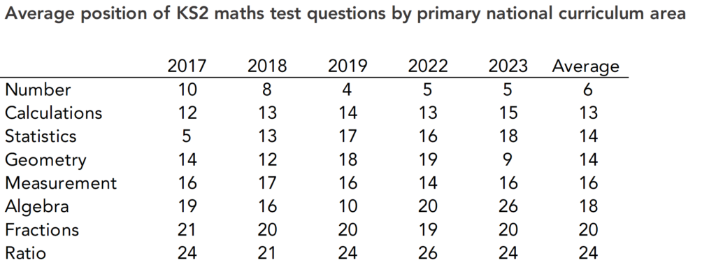
Questions covering number tend to appear early on in a paper, and those covering ratio and fractions tend to appear towards the end. The areas that are covered by a lower number of questions – algebra and statistics – are more variable in where they appear.
And there are also differences in the difficulty of questions by curriculum area.
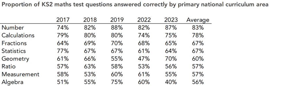
Pupils are most likely to get questions on number and calculations correct, and least likely to get those on ratio, measurement and algebra correct.
Are raw sub-domain scores useful?
We’ve established that there are considerable differences in the number of questions, position in the test and level of difficulty between areas. Given these differences, we would suggest that raw sub-domain scores – as currently provided to schools via the Analyse School Performance tool – are not useful. In fact, they may be misleading.
However, we can account for the differences by fitting Item Response Theory (IRT) population models then creating imputed values for each curriculum area. This should produce sub-domain scores that actually do reflect how well pupils did in each area. We did this for a sample of 500 schools and analysed the results to see what they could tell us about how school and pupil performance varies across curriculum areas.
Do pupils perform differently across areas?
Let’s start with a look at how pupil performance varies by curriculum area. In the table below, we’ve pooled results from 2017-23 and shown the correlation in the scores that pupils achieved across all curriculum areas.
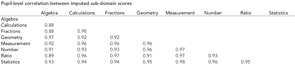
These correlations are very high. The only curriculum area with correlation of less than 0.9 with any other area is algebra.
This suggests that the variation in scores by area is low: pupils who do well in one area tend to do well across all the other areas, and vice versa.
Do schools perform differently across areas?
Let’s use the same methodology to look at the correlation at school level.
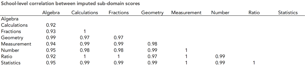
Here, the correlation is even higher than at pupil level, well over 0.9 for every combination.
This suggests that schools perform very similarly across the different areas.
What does this tell us (if anything)?
The results so far may seem like a bit of an anti-climax: neither pupils nor schools seem to perform much differently across the different curriculum areas. So, is this actually useful information?
Well, it does tell us that analysis of maths SATs scores by curriculum area should probably not be a priority for schools. And analysis of raw sub-domain scores should certainly not be a priority. Raw scores are at best unhelpful, and at worst misleading, given that they don’t take account of the considerable differences in the number, positioning and difficulty of questions between areas.
We’d also suggest that splitting questions into curriculum areas, as we’ve done in this analysis so far, could perhaps be a bit misleading. Some questions, as mentioned earlier, have secondary and even tertiary areas. Even those that don’t may not be quite as clear cut as the classification suggests. You could probably argue that the majority of questions involve some sort of calculation or use of numbers, for example.
If that’s the case, it’s possible that pupils’ and schools’ performance in different aspects of maths varies more than this analysis suggests, but that’s just not reflected by the test questions and curriculum areas as they stand.
Want to stay up-to-date with the latest research from FFT Education Datalab? Sign up to Datalab’s mailing list to get notifications about new blogposts, or to receive the team’s half-termly newsletter.

Leave A Comment