From time to time the use of significance tests for school performance indicators in RAISEonline is called into question. If school cohorts are not independent, random samples then surely we should not be using significance tests that assume independent, random samples right?
Well, yes and no. If we want to make causal statements (i.e. that a school ‘causes’ low attainment or poor progress) then no, significance tests based on independent, random samples are inappropriate. If, however, we want to highlight aspects of a school’s performance that may be due to more than chance variation and therefore be worthy of further analysis then significance tests are appropriate.
In this blog we explain why. We illustrate our thinking with reference to the FFT Aspire system. We presume that significance tests in RAISEonline are intended to fulfil a similar purpose.
What significance tests don’t mean
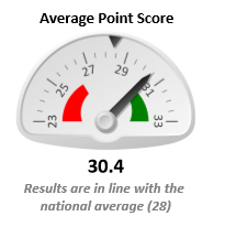
Significance tests have been used in education for some time now. Here’s an example from RAISEonline showing a breakdown of attainment in KS1 reading at a school. The percentage of pupils achieving level 2A or above is significantly above the national average.
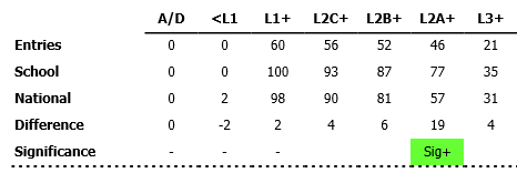
Unfortunately, and despite being part of the educational landscape for ten years, significance tests are not widely understood by many users. When comparing a school average to the national average, some adopt the following definition:
Sig-= A lot worse than average
This is not necessarily true. The everyday definition of ‘significance’ tends to denote importance. But ‘statistical significance’ does not have such a meaning.
A significance test merely tells us that there is a difference compared to the national average. It does not tell us anything about the magnitude of that difference. As we shall see below, with a large enough cohort even trivially small differences become flagged as significant.
The application of a label to a significance test, such as good/ bad or well above average/ well below average, is an inference (or judgment) made by a person, not by the test. These sorts of inferences should be challenged when made.
What significance tests do mean
If we didn’t have any data about school performance, we would have no objective evidence to suggest that the performance of any one school is different to that of any other school.
With data for all schools, we can examine how well the system as a whole is performing. Funnel plots, which are widely used in health (Spiegelhalter, 2004)[1], are very useful for doing so. In the example below, we make use of an Excel tool provided by the Association of Public Health Observatories (APHO).
Chart 1: Funnel plot of the percentage of pupils achieving 5 or more A*-C grades including GCSE English and maths, Outer London, 2013
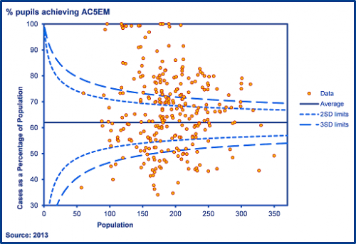
First and foremost, funnel plots are a useful way of demonstrating variation in outcomes between schools. In Chart 1, we see that 100% of pupils achieved 5 or more A*-C grades (including GCSE English and mathematics) at a number of schools. By contrast, fewer than 40% of pupils achieved this standard at 7 schools. The funnel plot also gives us a framework for thinking about how much variation (if any) we would expect to see between schools.
The horizontal line through the centre of the chart denotes the national average. The dotted lines indicate a notional 2 standard errors[2] from the national average (the ‘warning’ limits) and the dashed lines represent 3 standard errors from the national average (the ‘control’ limits). The shape of the lines forms a funnel. As the number of pupils increases, the limits narrow. With a sufficiently large sample (e.g. all pupils in a shire county), the limits will be very close to the national average and trivially small differences will be flagged as significant.
If differences between schools were exclusively due to chance and chance alone, almost all data points would be plotted within the control (3SD) limits. In the chart above, we observe an unstable process with a large number of schools plotted above or below the control limits (over-dispersion). All this means is that school attainment is far more variable than what might be expected given chance variation. It does not imply that some schools are more or less effective than others.
What is chance variation?
Let’s look at an educational process, the allocation of pupils to secondary schools. Imagine if all pupils in Outer London were randomly assigned to secondary schools at age 11. In the funnel plot below, we look at the percentage of each school’s new intake who had achieved level 5 or above in maths at Key Stage 2.
Chart 2: % of year 7 pupils with level 5+ in maths at KS2 following random allocation of pupils to secondary schools
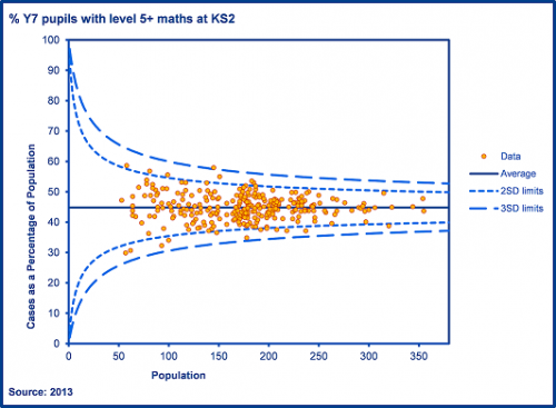
By nothing more than random chance, we observe some variation between schools. Some schools obtain more able cohorts and some obtain less able cohorts. We see a small number plotted outside of warning (and indeed control) limits. This is known as common cause variation which is entirely due to chance.
We can contrast the plot above (Chart 2) with the plot below (Chart 3) which shows the actual allocation of pupils. This shows far more schools plotted outside of the control limits. All we are showing here is that the process of allocating school places is not random: factors such as selection (covert and overt) and preference play a part.
Chart 3: % of year 7 pupils with level 5+ in maths at KS2 following actual allocation of pupils to secondary schools
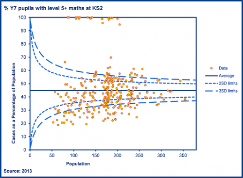
Funnel plots help to identify variation that is due to more than common cause (chance) variation. With raw attainment indicators, many schools are above or below upper limits. This is simply because pupils are not randomly assigned to schools. This is a very obvious point to make but it is critical to understanding of significance tests. Some schools receive more able intakes and others less able intakes. Some schools are situated in advantaged areas and others in disadvantaged areas.
When we say that a school’s average point score is significantly above average, all we are saying is that it is unlikely due to be due to chance variation. We then ask why this has occurred. One obvious reason is that the school has a more able than average cohort and this can be explored using value added (VA) data.
How are funnel plots and significance tests related?
The calculations for determining the warning limits on funnel plots are, to all intents and purposes, the same as those for calculating statistical significance in FFT Aspire. The gauges are equivalent to a funnel plot for a single school. The warning limits are denoted by the red and green areas.
When looking at a single school we must nonetheless remain conscious of ‘significant’ results occurring by chance. Even in Chart 2, where we show the random allocation of pupils to schools, some schools (around 5%) would have ended up labelled as having a proportion of pupils with level 5 maths significantly higher (or lower) than we might expect given chance alone. As the process was random, these might be considered ‘false positives’. It is vital therefore to check data for previous years or other indicators- a history of ‘significant’ results is extremely unlikely to be due to chance variation.
Should we talk about significance?
Much of the criticism of significance tests for school performance indicators is based upon violation of assumptions about simple random samples. This criticism would be entirely justified if significance tests were being presented as evidence of causal effects.
School cohorts are not simple, random samples. The 2-way process through which pupils and schools select each other is not random. Nor can we treat them as effectively random by controlling for observable pupil characteristics. This means we cannot- even with contextual value added calculations- make causal statements about the effectiveness of schools using the data at our disposal. We can, however, highlight aspects of performance that appear to be due to more than chance variation.
But to avoid confusion with concepts of importance, causality and null hypothesis significance testing in academic research, perhaps we should think about using different terminology for our significance tests. Any terminology is likely to cause difficulty but perhaps the expressions ‘above/ below control limits’ or ‘worthy of investigation’ may help reduce misinterpretation.
Conclusion
Significance tests help to identify potentially interesting aspects of a school’s performance that school leaders, teachers or governors may wish to explore further during the process of self-evaluation and school improvement planning.
If you see a difference flagged as significant, ask yourself what it means. How many additional pupils would have had to achieve a particular threshold to cancel it out? Or how many additional points would each pupil have had to achieve on average?
We see significance tests as a helpful first step in the process of understanding a school’s performance, not the conclusion. They are not intended to be judgments about a school. Data raises questions and, alongside professional judgment, helps in thinking about how to improve a process.
1. Spiegelhalter, D. (2004) Funnel plots for comparing institutional performance, Stat Med 24(8):1185-202.
2. The standard error is the standard deviation of the outcome measure divided by the square root of the number of pupils. It can be thought of as a margin of error based purely on chance variation given the number of pupils at a school.

Leave A Comment