This blogpost is part of the FFT KS1 Early Results Service. The service, available through FFT Aspire, allows schools to upload and receive an early analysis of their KS1 results.
So far, over 2,000 schools have participated in the FFT KS1 Early Results Service, the second year we have offered it.
FFT Aspire users
If you’ve already uploaded your KS1 results, you can download your Aspire report here.
Haven’t uploaded your KS1 results? There’s still time to get a KS1 report. Click here for further details.
Want an early KS2 report as well? The window closes on Thursday 11 July. Click here for further info.
Not an FFT Aspire user?
Last year, we looked at what we could learn from the collection of Key Stage 1 test scaled scores. Briefly, we found that:
- more pupils reached the expected standard by teacher assessment than they did in the test;
- the teacher assessments of infant schools tended to be slightly higher than those of all-through primary schools, taking account of pupils’ test scores;
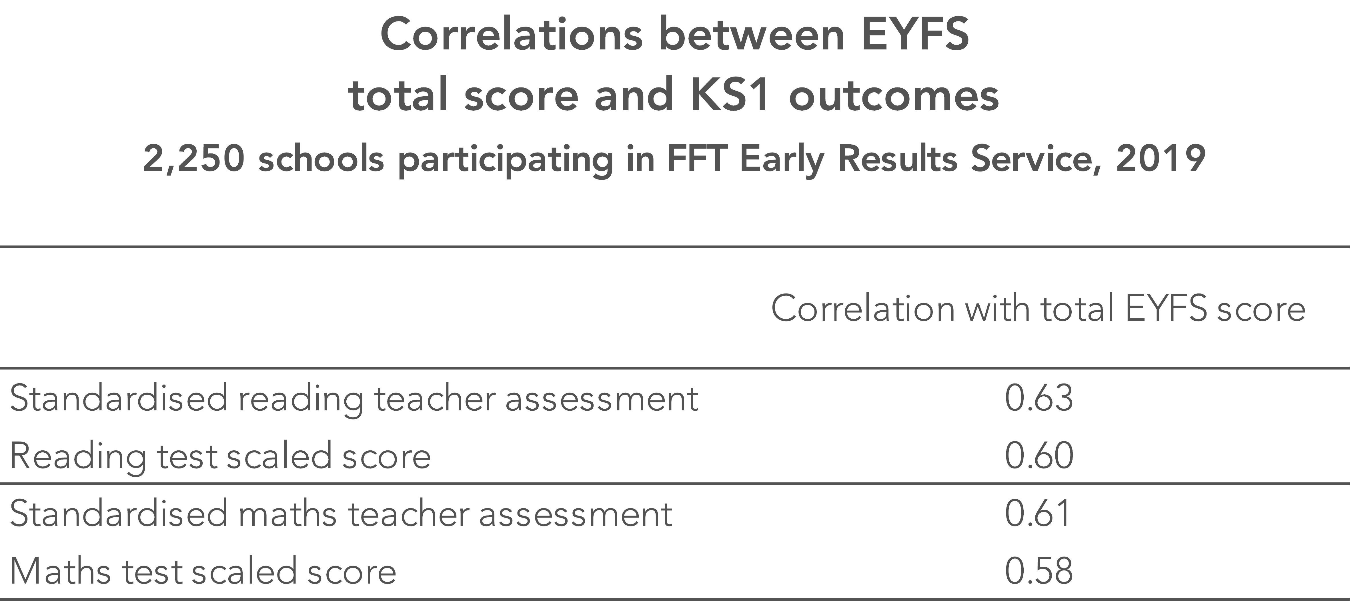
- there was a higher level of correlation between Early Years Foundation Stage (EYFS) scores and KS1 teacher assessments than between EYFS scores and KS1 test scaled scores.
Scaled scores and more
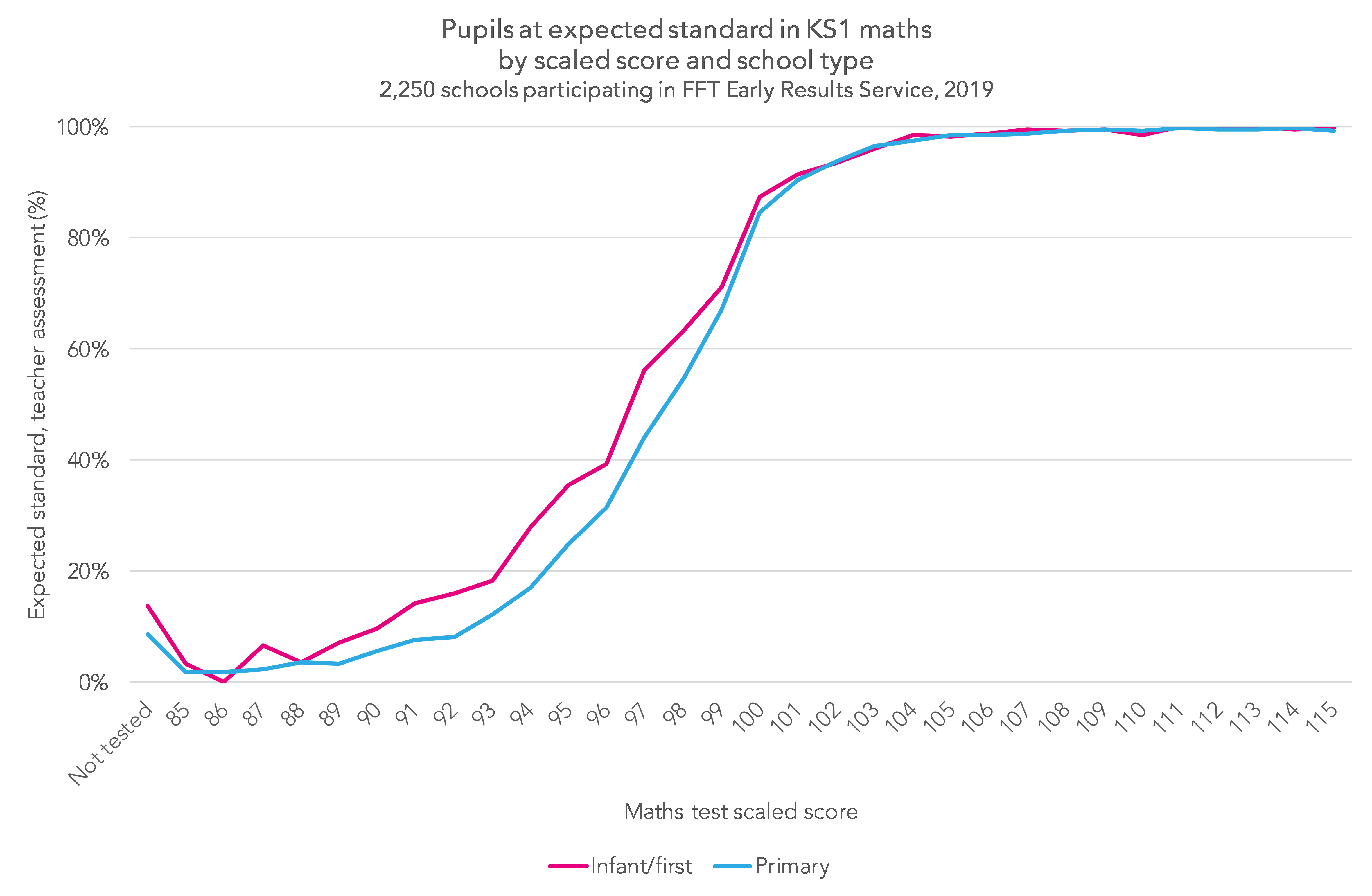
Just like last year, fewer pupils reached the expected standard of the test (a scaled score of 100 or more) than were judged to have reached the expected standard by teacher assessment. In order for the test to yield similar percentages achieving the expected standard, the required scaled score would have to drop to 97 in reading and 98 in maths.

Secondly, infant (and first) schools were still more likely to assess pupils who scored 91-98 in the test as being at the expected standard when compared to all-through primary schools. The following chart is for maths, but the picture is the same in reading.
Thirdly, EYFS scores from two years earlier still seem to correlate more highly with KS1 teacher assessments than KS1 test scaled scores do.
Overall, the percentage of pupils achieving the expected standard in all three of reading, writing and maths (by teacher assessment) increased among participating schools by 0.2 of a percentage points. However, the percentage achieving greater depth in all three subjects fell by a similar margin.
Age matters (a bit)
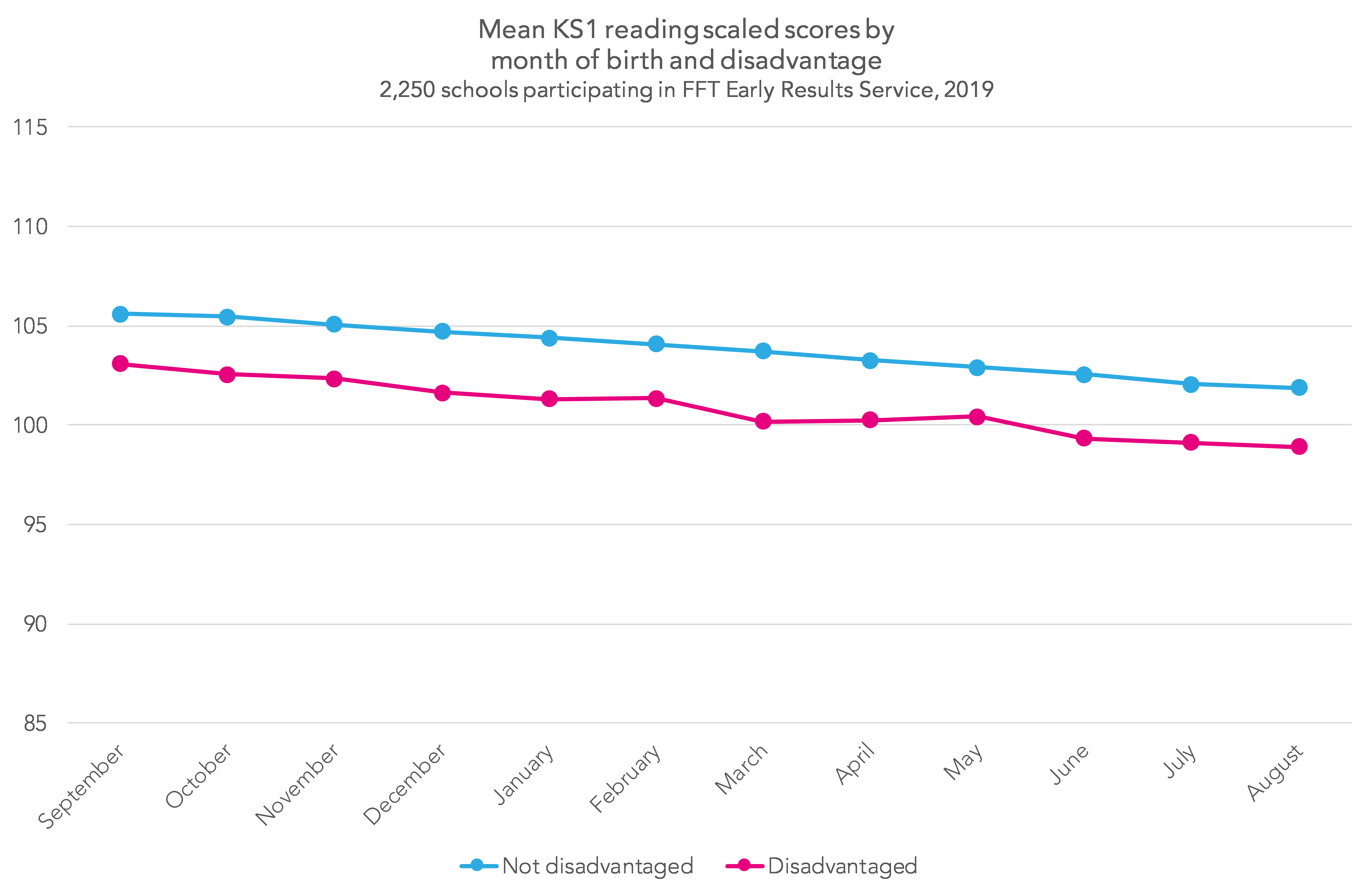
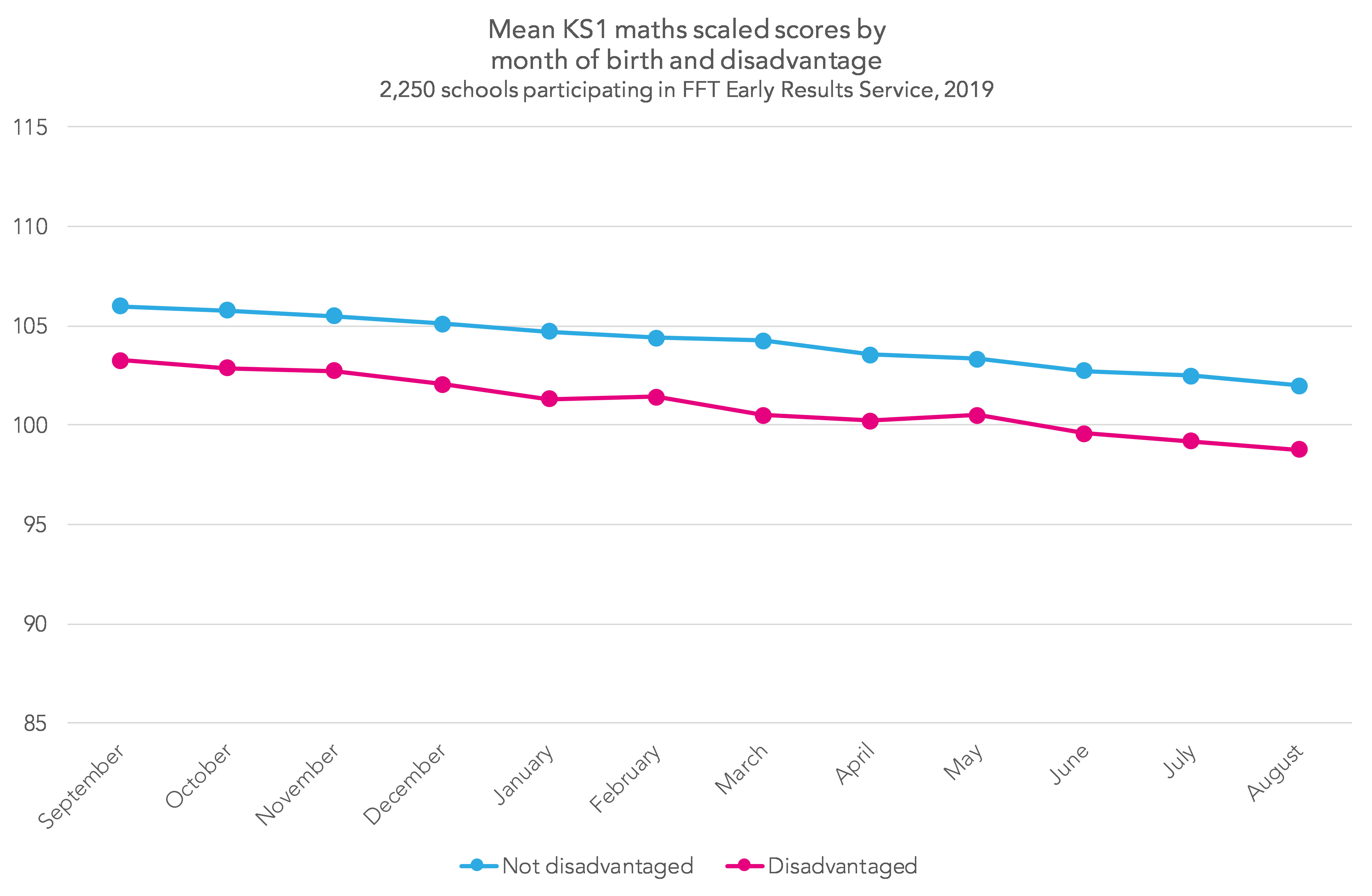
The charts below show that September-born pupils outperform August-born pupils by 4 scaled score points on average. Roughly speaking then, you might expect pupils born three months apart to be 1 scaled score apart, all other things being equal.
However, age is only weakly correlated with KS1 attainment. Whereas the correlation between EYFS score and KS1 attainment is in the region of 0.6, the correlation between age and KS1 attainment is less than 0.2. So while age has an impact, there are still plenty of August-born pupils who outperform some of their September-born peers – as the chart below shows.
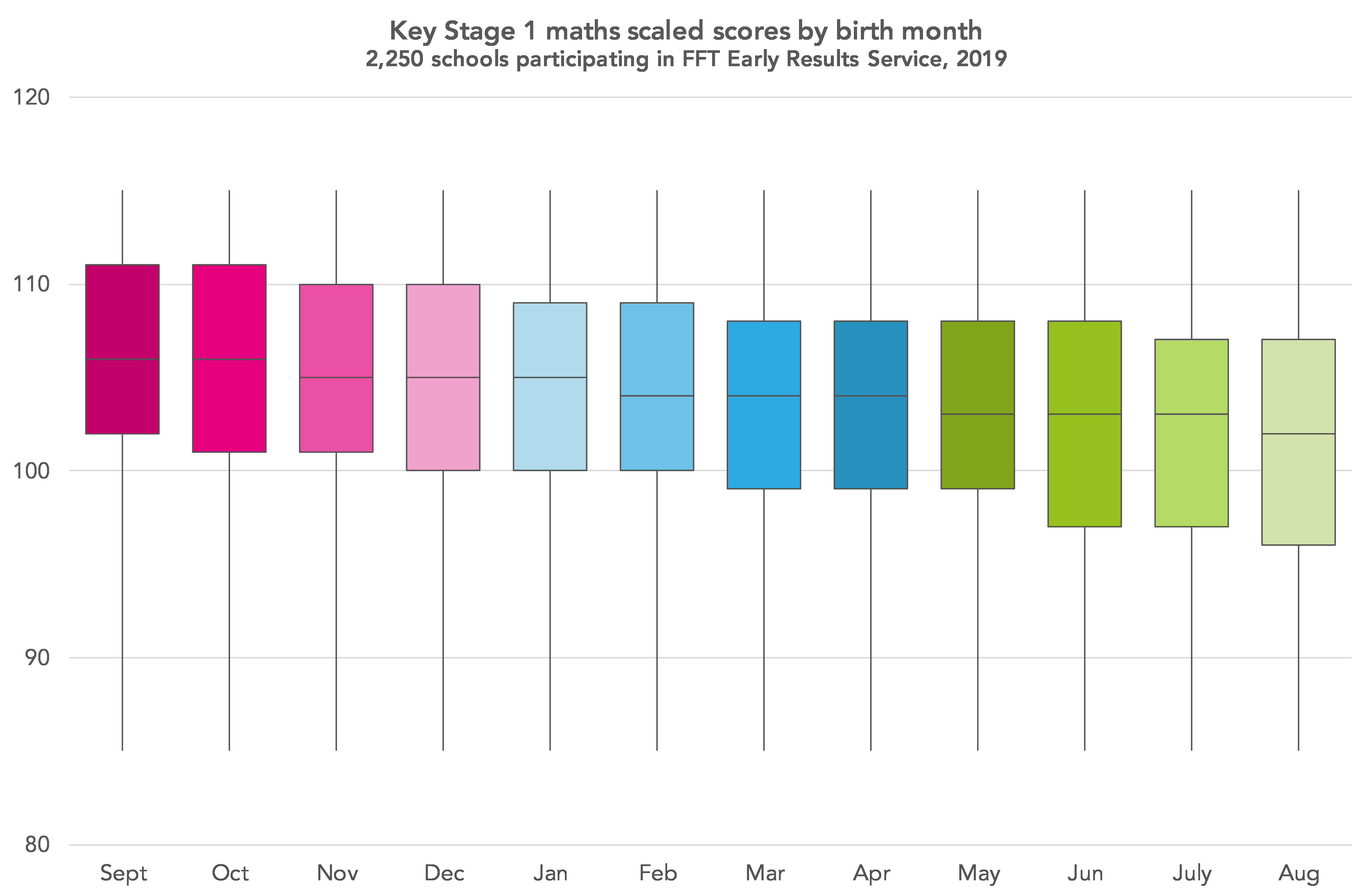
How to interpret a box plot
The chart used here is a box plot, a type of chart which most people are likely to recognise – but the details of which we may not all remember.
The line across the middle of the box is the median – the value which exactly half of results fall below, and the other half fall above. The box itself shows the range between the lower quartile – the value below which exactly a quarter of results fall – and the upper quartile – the value above which exactly a quarter of results fall. This definition means that exactly 50% of results are within the range of values covered by the box.
The whiskers stretching out from the box reach to the maximum and minimum values. In this case, the maximum and minimum values are the same for each birth month, as the lowest scaled score that can be achieved is 85 and the highest is 115.
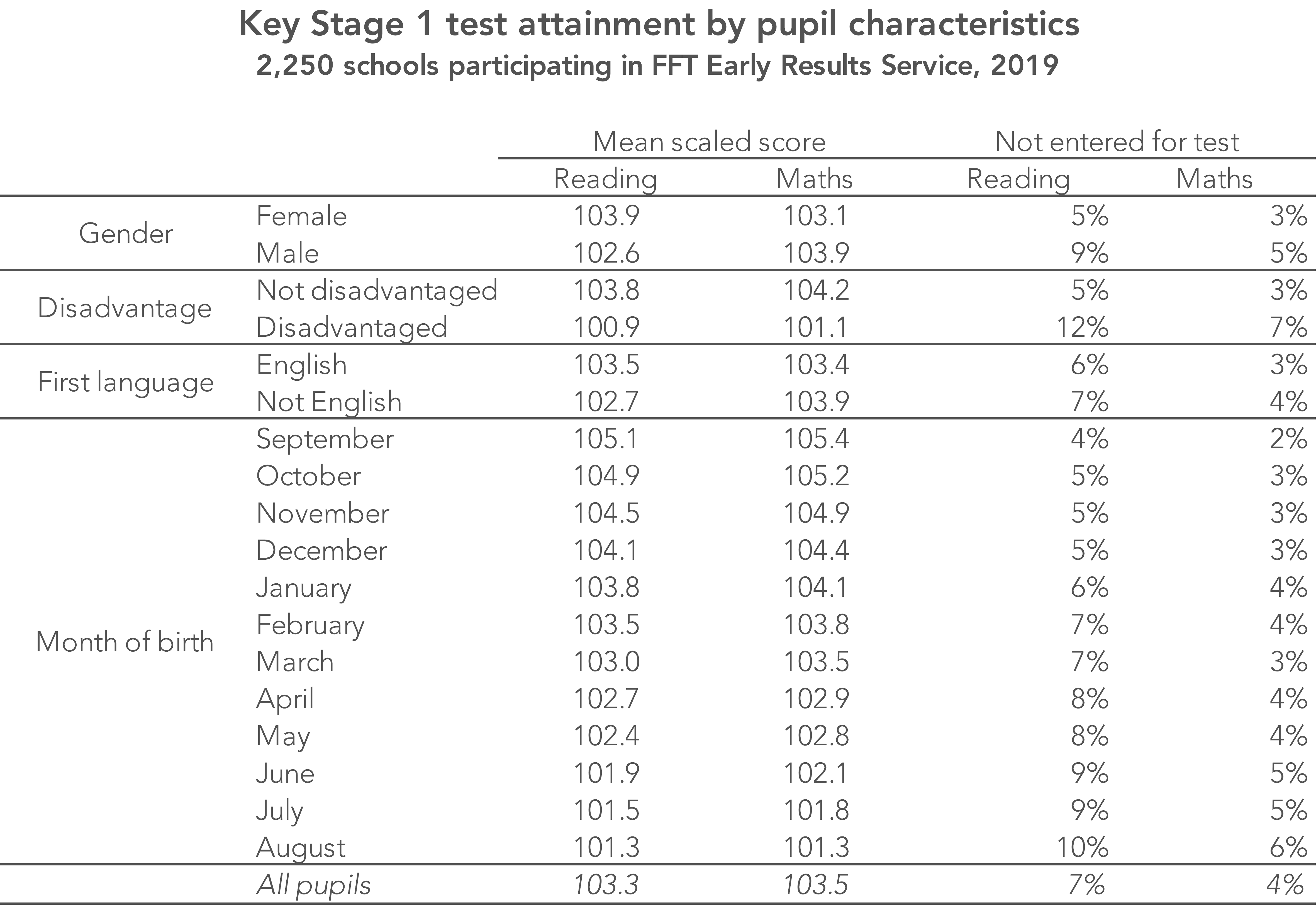
Disadvantaged pupils[1] tend to score 3 scaled score points lower than their peers in both reading and maths.
However, this may be an underestimate because they are twice as likely not to even take the tests due to them working at a lower level. For example, 5.4% of non-disadvantaged pupils in our sample did not take the reading test. Among disadvantaged pupils this figure was 11.8%. Among August-born, disadvantaged pupils, the figure stood at 16.5% (one-in-six).
Download your KS1 scaled score report now to see how your school differs from national patterns.
Want to stay up-to-date with the latest research from FFT Education Datalab? Sign up to Datalab’s mailing list to get notifications about new blogposts, or to receive the team’s half-termly newsletter.
1. The standard definition of being eligible for free school meals in the last six years applies – in this case, then, since the child started school.
The box plots are a very nice way of illustrating month of birth bias. To what extent are summer-born children who have been held back a year contributing to an uplift in scores for their month of birth cohort?
Hi Steve. Thanks for the kind words. To answer the question, we only included pupils of Year 2 chronological age (i.e. those born between September 2011 and August 2012). Incidence of being held back a year is very low. Based on all pupils, just 1% of the August born pupils were of a different chronological age.
How can you have a cumulative frequency graph where some points are lower than the points before them? A cumulative frequency graph can never go downhill!
Ignore that last comment, I’ve looked at the graph again and of course it isn’t a cumulative frequency graph, it’s just got a similar shape to one. Silly me!