This week, FFT are running two special primary school events looking at attendance and a new estimates service. You can find out more and register here.
To coincide with the events, this post focusses specifically on primary school attendance patterns so far this year.
We recently looked at absence in secondary schools this year. We found that although absence has improved compared with last year, it’s still a long way above pre-pandemic levels. There’s less regional variation too, but we suspect that there are many pupils with asymptomatic COVID-19 attending school.
Today, we turn our attention to primary.
We’re going to use data from 4,600 primary schools who subscribe to Aspire Attendance Tracker. This is around 25% of state-funded primaries in England: enough to give us a good idea of patterns in attendance.
Absence by year group
Let’s start with year group. Here, we compare absence in the first half-term this year with last year, and with Autumn term 2019[1].
We divide absences into “COVID-related” (the light shading) and “Other” (the dark shading) using the DfE definition.
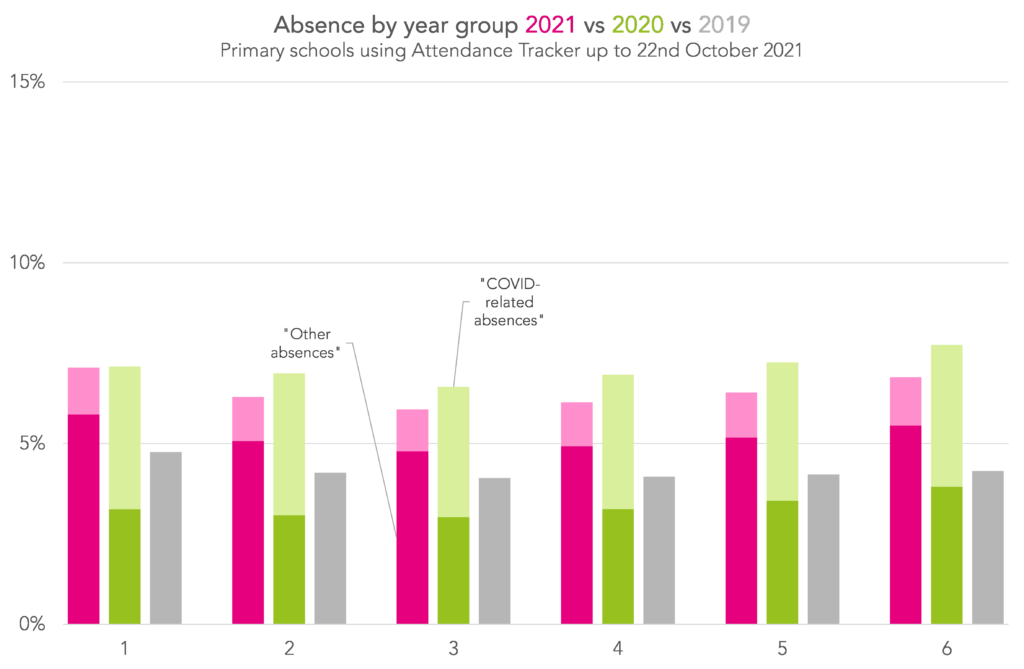
Broadly, we see absence had improved slightly compared with the first half-term last year, but it was still a lot higher than pre-pandemic (overall, absence was 6.5% this year vs 7.1% last year and 4.2% in 2019).
Year 1 was the only year group where absence wasn’t lower than last year (it was pretty much the same). But, like all other year groups, it was higher than pre-pandemic.
In all year groups, there was a big reduction in “COVID-related” absences (from 3.8% overall last year to 1.2% this year) but a big rise in “Other” absences (from 3.3% to 5.2%). This seems counter-intuitive, given that cases among primary school-age children are much higher this year. But it’s largely down to the way these categories are defined. Schools are advised to record absence for pupils who test positive for COVID as sickness, so they end up in the “Other” category, rather than the “COVID-related” category.
The drop in “COVID-related” absences definitely means fewer pupils isolating at home this year, and the rise in “Other” absences probably means more pupils at home with COVID (if you find the “probably” in this sentence troubling, don’t worry, we’ll be digging into this in a future blogpost).
Absence by region
Now let’s look at the picture by region.
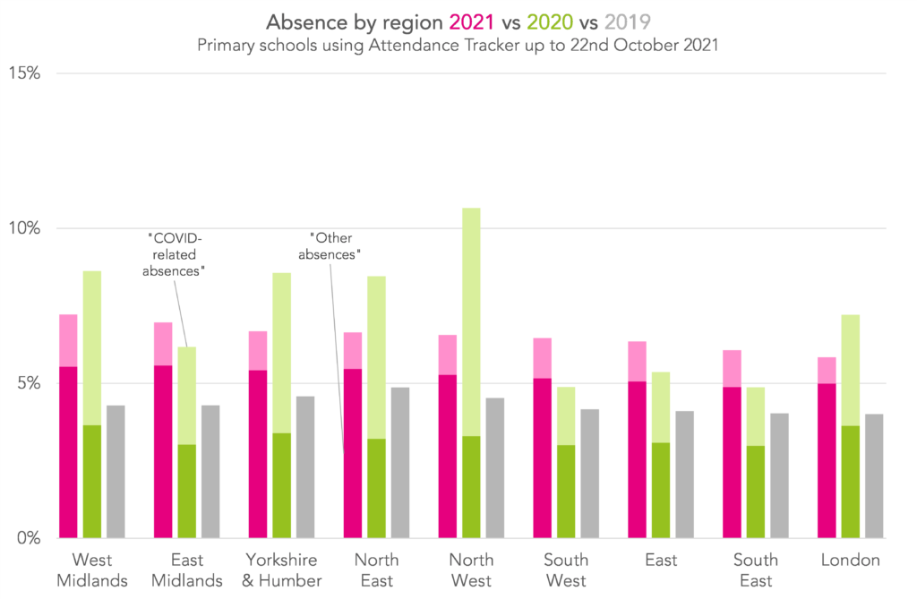
Mirroring the pattern we saw at secondary, there was a lot less regional variation this year.
Five regions saw reductions in absence (the North West, North East, Yorkshire, West Midlands and London) while the others saw increases (East Midlands, South West, East and South East).
In general, regions where more pupils were isolating last year (a higher proportion of “COVID-related” absences) saw improvements in absence rates.
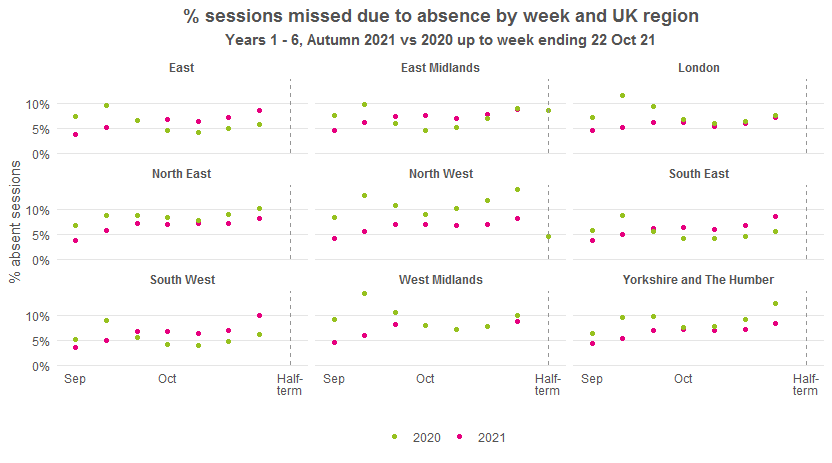
When we plot the data by week, again it’s striking how much more similar the regions were to each other this year compared with last year. Generally, absence rates rose in the first three weeks of term, then plateaued, then rose again before the break.
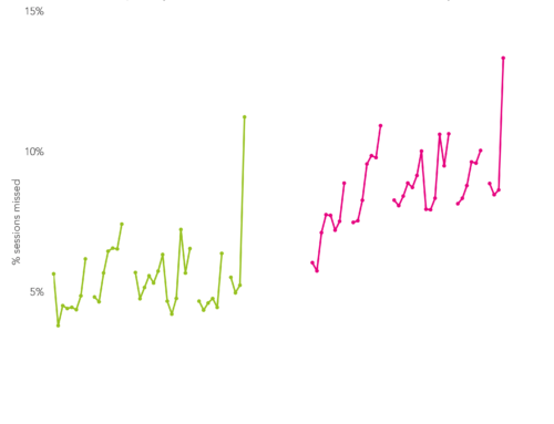
Absence and infection rates
To finish, we’re going to look at how absence this year compares with estimated COVID infection rates from the ONS infection survey[3].
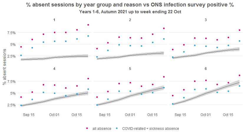
Here we plot absence so far this term by week and year group, and compare with the relevant age-specific ONS infection estimates[4] (the line with grey halo showing the confidence intervals for the estimates). We show overall absence and absence which is either due to sickness or is COVID-related (because positive COVID cases are recorded as sickness).
We expect to see that absence rate increased with infection rate – over time and between year groups. And we expect that sickness + COVID absence was higher than the infection rate.
Some of the patterns we see, then, are puzzling.
Year 1, for instance, consistently had the highest rate of absence due to sickness or COVID, but the lowest infection rate. This suggests that non-COVID sickness was much more prevalent in Year 1 than in any other year group.
Years 5 and 6 had sickness + COVID absence rates lower than the infection rate in recent weeks. We saw this for younger secondary year groups too, and we think it means that lots of these pupils were attending school with asymptomatic COVID.
One thing that is as expected is we do see that both absence and infection rates increased as term went on. With absence between eight and nine percent in the final week of the half-term, any further rise in infections would likely cause serious disruption.
Aspire Attendance Tracker
Schools can track, analyse and compare their attendance data against 1,000s of other FFT schools using Aspire Attendance Tracker.
Log in to Aspire to access Attendance Tracker – log in here.
Not an FFT Aspire user? Learn more here.
Summing up
In our Attendance Tracker primary schools, absence improved compared with last year, mostly due to a large reduction in pupils isolating at home. However, we’re still seeing higher levels of absence than pre-pandemic.
It looks like we had unusually high rates of non-COVID sickness in Year 1. And pupils in older year groups look like they might have been attending school despite having (asymptomatic) COVID.
With absence approaching 10% in the final week of last half-term, primary schools will be hoping for a sustained reduction in infections to avoid serious disruption this half-term.
[1] 2019 data is for the whole of Autumn term as that’s what’s available.
[2] We’ve left out the first week here so there’s no distortion from phased returns
[3] This provides estimates of the population in England testing positive for COVID by day and single year of age. The latest release covers the period from the 19th September to 30th October (the most recent week isn’t shown on the charts because it’s the half-term break). We use the previous release for the period 5th to 18th September.
[4] We equate being in Year 1 with being 5 years-old, Year 2 with being 6 years-old etc. so that we can match our absence data (in national curriculum Year groups) with ONS infection data (in years of age). We know this isn’t quite correct, but as we’re still early in the school year we think it’s correct enough.
Want to stay up-to-date with the latest research from FFT Education Datalab? Sign up to Datalab’s mailing list to get notifications about new blogposts, or to receive the team’s half-termly newsletter.
Leave A Comment