Performance tables for secondary schools and MATs were published last week. While it may be tempting to use these to pick out the best – and worst – performers, we don’t think that’s the best way to use the data. Largely because doing so doesn’t take account of the context that individual schools and MATs find themselves in. And that’s more important than ever in the wake of the pandemic.
So instead we’ve picked out some interesting points from the data and taken a closer look at how context might affect the measures for MATs.
Changes in Attainment 8 in schools
We’ll start with a look at how Attainment 8 scores in schools have changed.
Most schools will see little to no change in their results compared with Autumn’s provisional release. Nationally, the average Attainment 8 score increased by just 0.1. Around 30% of schools saw no change at all. And only 17 schools saw increases of more than 0.5.
Changes since last year were much bigger, of course, with 2023 bringing a return to pre-pandemic grading norms. To see how school-level changes compare with pre-pandemic, we plot the percentage of schools by the change in their Attainment 8 score between 2022 and 2023, and between 2018 and 2019.

Between 2022 and 2023, 81% of schools saw their Attainment 8 score fall or stay the same, compared with 47% of schools between 2018 and 2019.
Big drops were much more common last year than pre-pandemic too, with around 17% of schools experiencing a drop of at least five points, compared with 3.4% of schools between 2018 and 2019. And big increases were much less common, with around 1.5% of schools seeing increases of five points or more, compared with 5% of schools between 2018 and 2019.
Changes in Progress 8 in MATs
MAT performance tables were also published last week, so let’s take a quick look at how MAT-level changes compare with pre-pandemic.
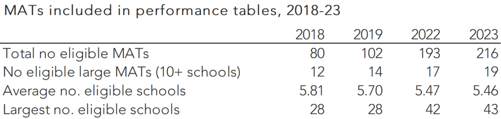
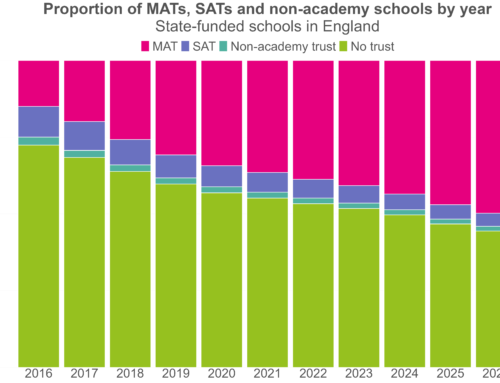
As an aside, it’s worth noting that both the number and size of eligible MATs has increased in recent years, as shown below.
Below, we plot the percentage of MATs by the change in their Progress 8 score between 2022 and 2023, and between 2018 and 2019.
We look at Progress 8 here rather than Attainment 8 because MAT performance tables for 2018 and 2019 did not include MAT level Attainment 8 scores. We’d generally expect less change in Progress 8 than in Attainment 8 year on year, as Progress 8 is zero centred each year.

Between 2022 and 2023, 52% of MATs saw their score fall or stay the same, compared to 59% between 2018 and 2019.
But we’re really not comparing like with like here. As we noted earlier, there are more MATs now than there were pre-pandemic: in 2018, there were just 80 MATs included in performance tables, while in 2023 there were over 200.
MATs in context
And there’s more to say on context.
The published MAT performance measures do try to take some account of context – they are weighted based on the number of pupils in each school, as well as on the (capped) number of years for which they’ve been part of the trust. And they don’t include schools that have been part of the trust for less than three years.[1]
Even so, it may not particularly fair to compare MATs based on the published figures. But it’s worth looking at why that’s the case in a bit more detail.
The chart below shows the Progress 8 scores for the largest MATs – those with ten or more schools that were within the scope of MAT league tables.
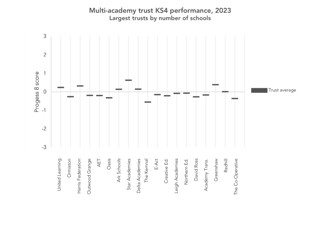
Clearly some MATs have scores far above average, but context is king, as we can see in the next chart, which shows the different types of academies that make up each trust.

Most large trusts are mostly made up of sponsored academies, but there are some exceptions. And that matters because the context of different academy types is very different. Sponsored academies are schools that were required by the DfE to join a trust after a period of underperformance, while converter academies chose to convert to academy status. Other academies (free schools, studio schools and UTCs) are new academies with no predecessor.
Given that context, we’d expect the performance of sponsored academies to be lower than that of other academies, on average. And indeed it is: this year, the average Progress 8 score in sponsored academies was -0.19, compared to 0.08 in converter academies, and 0.32 in free schools.
We can also look at how trust Progress 8 scores relate to pupil characteristics. The chart below shows how each school’s proportion of disadvantaged pupils differs from the national average, as well as their Progress 8 band.[2]
We show the percentage difference from the national average proportion of FSM6 pupils.[3] A school with the same proportion as the national average would have a percentage difference of zero, a school with a higher proportion than the national average would have a positive percentage difference, and a school with a lower proportion than the national average would have a negative percentage difference.
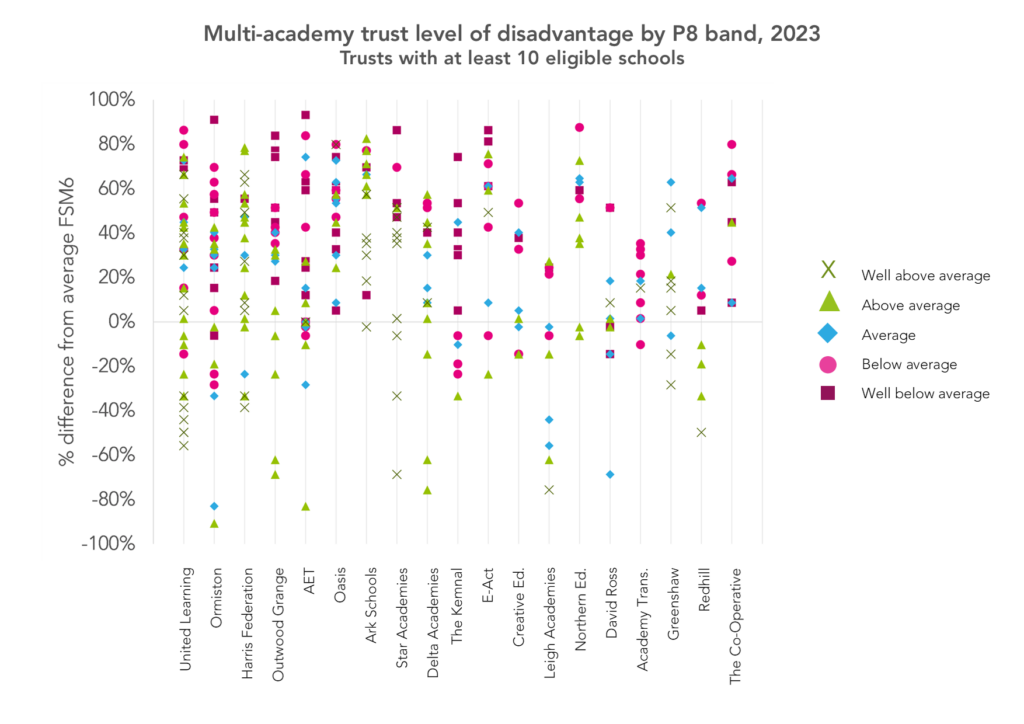
We can see that some trusts tend to have more schools with a high proportion of FSM6 pupils than others, and that schools with a lower proportion of FSM6 pupils are more likely to have Progress 8 score above or well above average.
The chart below does the same thing for the proportion of EAL pupils in each school.
Again, we show the percentage difference from the national average proportion of EAL pupils. A school with the same proportion as the national average would have a percentage difference of zero, a school with a higher proportion than the national average would have a positive percentage difference, and a school with a lower proportion than the national average would have a negative percentage difference.[3]
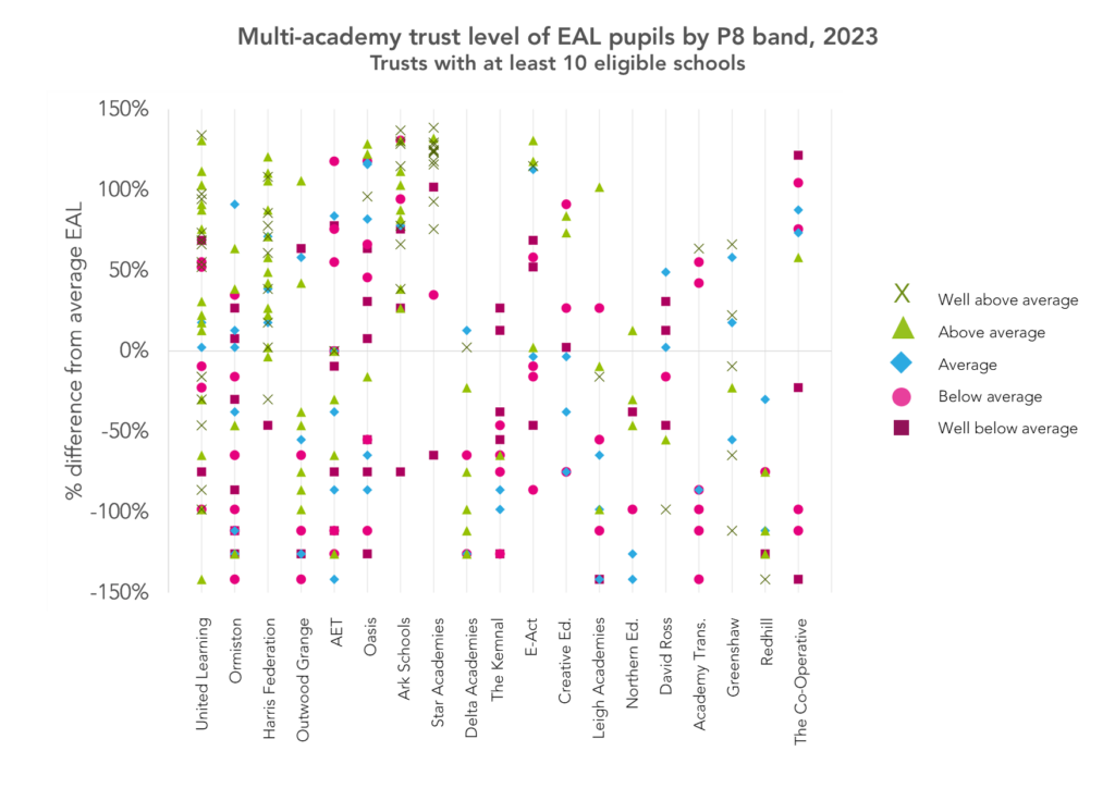
In some trusts, almost all the schools shown have a higher than average proportion of EAL pupils. And there is a tendency for these schools to have higher Progress 8 scores, as we’d expect given that the average Progress 8 score for EAL pupils is well above average (0.51).
Summing up
So what have we learned? Largely that, as ever, we need to keep context in mind when we look at league tables.
Not only is it always tricky to fairly compare the performance measures of one MAT with another, or indeed one school with another, but the effects of the pandemic continue to make themselves felt.
While comparing one school’s results with another might not be that helpful, we can learn something from the increased instability in schools’ results over the last couple of years compared to pre-pandemic.
Want to stay up-to-date with the latest research from FFT Education Datalab? Sign up to Datalab’s mailing list to get notifications about new blogposts, or to receive the team’s half-termly newsletter.
[1]: For a full description of how MAT performance measures are calculated, see the methodology document for secondary accountability measures.
[2]: For a full description of Progress 8 bandings, again see the methodology document for secondary accountability measures (Annex O).
[3]: The percentage difference in FSM6 is calculated by taking the difference between the school’s % of FSM6 pupils and the national average, then dividing by the average of the two values. The national average for eligible schools is 26.6%, so for a school in which 50% of pupils are disadvantaged, the percentage difference would be (0.50-0.266)/((0.50+0.266)/2) = 0.61 = 61%.
I’ve taken the whole national database and created a pivot table for FSM & EAL. I’ve then added or subtracted those contextual indicators from a schools P8 score, and it make for some facinating recalibration of scores, showing just how misleading progress 8 is as a measure.
Apologies for the mass of typos in the previous comment.
Hi Billy. Don’t worry- it all made sense. Yes, contextual factors like FSM and EAL are associated with P8. It’s why we’ve always advocated creating contextualised value added (CVA) versions of P8 (and have provided it in our Aspire system since P8 was introduced). I don’t necessarily agree that P8 is misleading. It is if it is interpreted as a measure of school effectiveness (which I suspect is what you’re getting at) but if its seen as a measure of attainment conditional on Key Stage 2 attainment it isn’t (as that is what it is).
“Between 2022 and 2023, 52% of MATs saw their score change or stay the same,” – So what happened in the other 48% of MATs?
LOL, nice spot. I believe I can take credit for this one. What I meant to say was “52% of MATs saw their score *fall* or stay the same”. I’ll edit the text in a mo. Thanks for picking this up!