School leaders are used to dealing with change, not least when it comes to assessment data, but this year is in a league of its own. With changes to all the tests, teacher assessment, scaled scores and accountability measures, headteachers would be forgiven for despairing of any attempt to make sense of it.
Even when Raise becomes available, there’s no saying how easy it will be to interpret, not least because of all the changes this year. However, the FFT Aspire Summary Dashboard is available from this month, allowing you to make headway into that first stage of data analysis to evaluate your school’s strengths, and pick out areas for further development. In today’s climate, any help with that will be welcome!
The first glance of your dashboard will give you a very quick visual representation of your key headline figures – attainment and progress – related to those that will feature in performance tables and be published on your school website. In FFT these are represented in the form of comparison gauges:
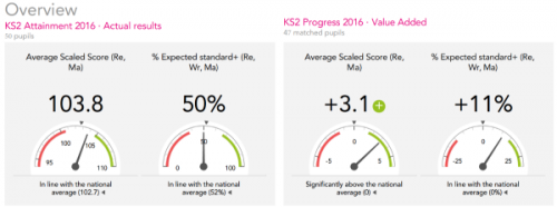
Comparison gauges that show key figures at a glance
The beauty of this is the clarity they provide compared to the complexity of the published data and its confidence intervals. In short: the middle white zone shows that you’re broadly in line with national outcomes; the red and green bands at either end suggest significant lower or higher results. This will be particularly helpful for governors who are either shocked by changes in numbers from the old system, or who are concerned about small negative values on the progress measures.
The dashboard offers more clarity, too, about specific groups within your school. With a changing landscape it can be hard to know what to expect, but the pupil group analysis will quickly tell you which specific groups – girls, middle attainers, free school meals – have performed particularly well, and which seem not to be keeping up. It’s a simple overview that makes a good starting point for further investigation.
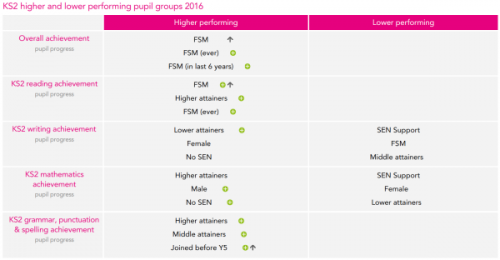
Quick identification of groups that have done particularly well, or poorly (green plus symbols show significant values).
It’s worth remembering, though, that some groups may be very small in your school: if you’ve only got a handful of girls, then don’t get too worked up over variations!
The dashboard also helps to pick out trends over time – another challenge when all the goalposts seem to have moved. By comparing the national results to previous years, FFT have been able to plot a trajectory that compares how attainment and progress might have looked in 2014 and 2015 under the current system. As a result, you can begin to see whether your school has improved by comparison to the national picture.

The time series shows your previous results adjusted to bring them more closely into line with the new frameworks. Not perfect, but a very telling ‘starter for ten’!
A caveat here: this is much more difficult with the writing judgements which are much less precise than the scaled scores. Take that alongside the evident variation in writing outcomes this year, and you may want to look deeper into those figures before making any quick judgements.
Further into the summary dashboard itself, we get into the detail of vulnerable groups and of the separate subjects. Again, you get an overview that helps to pinpoint areas to look into further. Specific groups remain a clear focus for Ofsted and other inspections, so this information will be vital to leaders. The further breakdown of subjects will be of interest too, and of particular use in schools where writing has been affected by the national inconsistencies. Again these sections allow you to compare your attainment and progress to the national picture, and also to reflect on how your results may have changed over time.
No doubt, by the time school leaders and governors have begun to look at their summary overview, there will be many more questions asked. That’s where the FFT Aspire platform can help. Using your summary as a starting point, you can explore each element in greater detail, filtering your results for different groups, or subjects – even down to the level of individual pupils. It will help you to unpick the measures that are likely to feature on your Raise Online profile when it arrives, and with others too, including using contextual information about your pupils to compare to similar groups elsewhere. Alongside the target-setting and other elements of FFT, you have a wealth of information at your fingertips that can be used to focus your school improvement planning – the summary dashboard is just the start.
Leave A Comment