
If anyone has ever read one of the international PISA reports or seen Andreas Schleicher present they will know that the OECD is rather fond of cross-national scatterplots. These illustrate the relationship between two variables measured at the country level.
Take, for instance, the chart below. This has been taken from one of Mr Schleicher’s blogposts, and illustrates the relationship between a country’s test scores and its rate of economic growth. It has been interpreted by the OECD as showing “that the quality of schooling in a country is a powerful predictor of the wealth that countries will produce in the long run”.
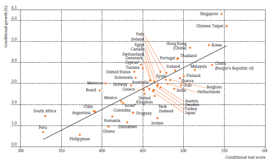
Source: Research by Hanushek and Woessmann, via the OECD Education and Skills Today blog
Sounds convincing, right?
The trouble is, correlation does not equal causation. And, despite the OECD’s obsession with such cross-country relationships, they can often deceive.
Should we eat more fish?
Of course, it is not only the OECD that produce such analyses. Academics do as well.
One of the more unusual examples I have found is this study by a group of epidemiologists. They look (I kid you not) at the relationship between average fish consumption and average PISA test scores.
Somehow, the study manages to find a strong positive correlation of around 0.6! It then goes on to conclude that a “linear association between fish consumption and PISA scores is likely” and that “it is plausible to assume that a higher level of fish consumption drives improvement at school level”.
As a nation of fish-and-chip lovers, this should be good news for our PISA scores…
But isn’t eating ice cream just as important?
Getting kids to eat more fish is difficult. My little boy hates the stuff! He does, however, like ice cream – and lots of it (who doesn’t?). If only eating ice cream were as good for PISA scores as eating fish.
Well, apparently it is!
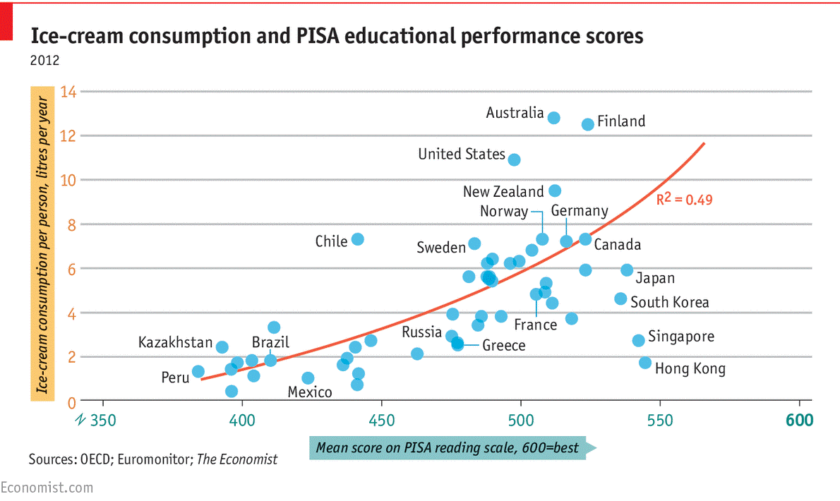
The chart below provides one of my all-time favourite PISA graphs. It plots the level of ice cream consumption of a country against average PISA reading scores. There is actually quite a strong positive relationship, with around half the variation in PISA scores explained.
It also seems that the relationship is exponential (i.e. the line of best fit is curved upwards). Not only should be eat more ice cream, but we should be eating lots of it!
The take-away message (no pun intended)
Hopefully, the point of this blogpost has become clear.
When the PISA results get released at the start of December, the international report and presentations given by the OECD are bound to include this kind of graph, along with stories about how ‘high-performing countries’ all do X, Y or Z.
Clearly, we should be treating any such interpretation of the PISA results with caution. There are likely to be hundreds, if not thousands, of reasons why some countries do well on PISA and others don’t. In reality, it is almost impossible to separate these competing reasons out.
What we do know is that overly simplistic “explanations” for the PISA results must be avoided. Organisations like the OECD have their own agenda, and it is just too easy for such groups to use the results to promote their own hobby-horses.
Want to stay up-to-date with the latest research from FFT Education Datalab? Sign up to Datalab’s mailing list to get notifications about new blogposts, or to receive the team’s half-termly newsletter.

This started my day with a laugh,thank you for sharing it. I guess if the students have fish and chips for lunch followed by an Ice cream for dessert we will be ready for our exam in the afternoon.
Surely more pieces of pizza needed to improve Pisa scores?
You’re banned.
“If anyone has ever read one of the international PISA reports or seen Andreas Schleicher present they will know that the OECD is rather fond of cross-national scatterplots. These illustrate the relationship between two variables measured at the country level.”
This is true, but the really important link with national IQ is ignored. I did the statistics myself for PISA maths scores and you can find it here.
https://rogertitcombelearningmatters.wordpress.com/2016/12/11/national-iqs-and-pisa-it-changes-everything/
There is a correlation of 0.89, which is very similar to that which results when the GCSE scores of schools within an LA area are plotted against mean intake Cognitive Ability Test (CATs) scores. Whereas causation looks unlikely in the case of fish & ships and ice-cream this is not the case in respect of IQ and it is indeed clear from national CATs data going back decades that CATs scores are the strongest predictor of GCSE results. Indeed when CATs scores are taken into account social and economic disadvantage effects largely disappear.
My study has been updated with better national IQ data and can be found here.
https://rogertitcombelearningmatters.wordpress.com/2016/12/18/national-iqs-and-pisa-update/
Surely there should be no great surprise that OECD’s plot of national economic growth against national IQs follows the same pattern as PISA scores.
Virtually every article on my website hammers away at these links, the obvious point being that this being the case schools should be focused primarily on exploiting the proven plasticity of cognitive ability/IQ to prioritise its development over jumping the arbitrary GCSE school attainment thresholds need to drive school league tables and the marketisation ideology produced perverse incentives that are actually making our students dimmer rather than brighter.
An excellent summary of the misuse of statistics.
If you haven’t already seen it, may I recommend to your notice the following paper?
Messeli, F.H. Chocolate Consumption, Cognitive Function, and Nobel Laureates. New England Journal of Medicine. Oct 18, 2012. pp. 1562-1564
The scatter graph in this paper shows a very high correlation between the consumption of chocolate in a country, and the number of Nobel Laureates per 10 million population. The correlation coefficient is 0.79, or excluding one outlier (Sweden), 0.86. Dr Messeli goes on, as you do, to debunk the post hoc ergo propter hoc argument.
The discussion of why Sweden is an outlier is a masterpiece of humour, whilst remaining strictly within the bounds of propriety for an academic paper.