The nature and scale of Covid transmission in schools is still poorly understood, despite considerable research efforts worldwide. But key decisions, such as closing (or rather moving to online learning) or opening schools, have to be made despite the scarcity of evidence. So we must make the most of every relevant dataset that does become available, to try and advance our understanding.
Most recently, the Department for Education has released data on teacher absence, for reasons related to Covid. This data spans the period since the October half term and covers all state-funded schools in England, split by education phase and date, and by location.
School leaders and administrators are asked to count separately the number of teachers on roll who are unavailable because:
- they are a suspected case of Covid;
- they are a confirmed case of Covid;
- they are requested to remain at home by the school because of contact within the school;
- they are isolating because of contact outside the school; and
- any other reasons for absence.
We must bear in mind that this is workplace absence data, not (apart from one) medically certified health data. The data and our analysis must be treated with caution.
Trends in teacher absence
The chart below simply shows Covid-related teacher absence week-by-week, by type of school. The rate averages around 4% for secondary schools, 4.7% for primary schools and higher again for special schools.

By contrast, and as we show here, pupil absence over the same period was higher in secondary schools: For example, absence in secondary schools was 28% compared to 15% in primary schools. So here is the first puzzle: teacher absence is higher in primary schools while pupil absence higher in secondary schools.
The next two charts present more detail on the nature of Covid-related teacher absence, separately by primary and secondary schools, and split into the categories noted above.
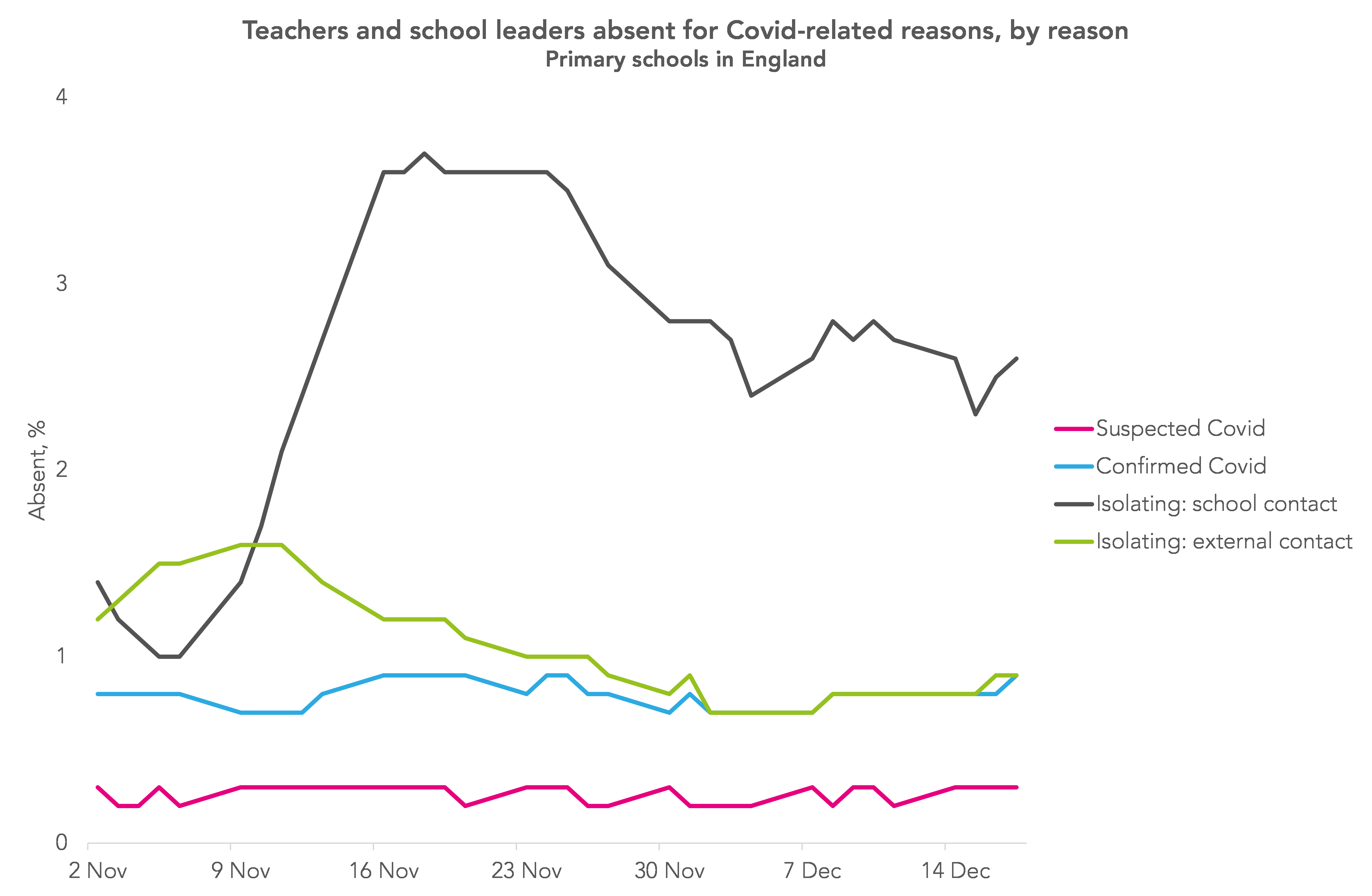
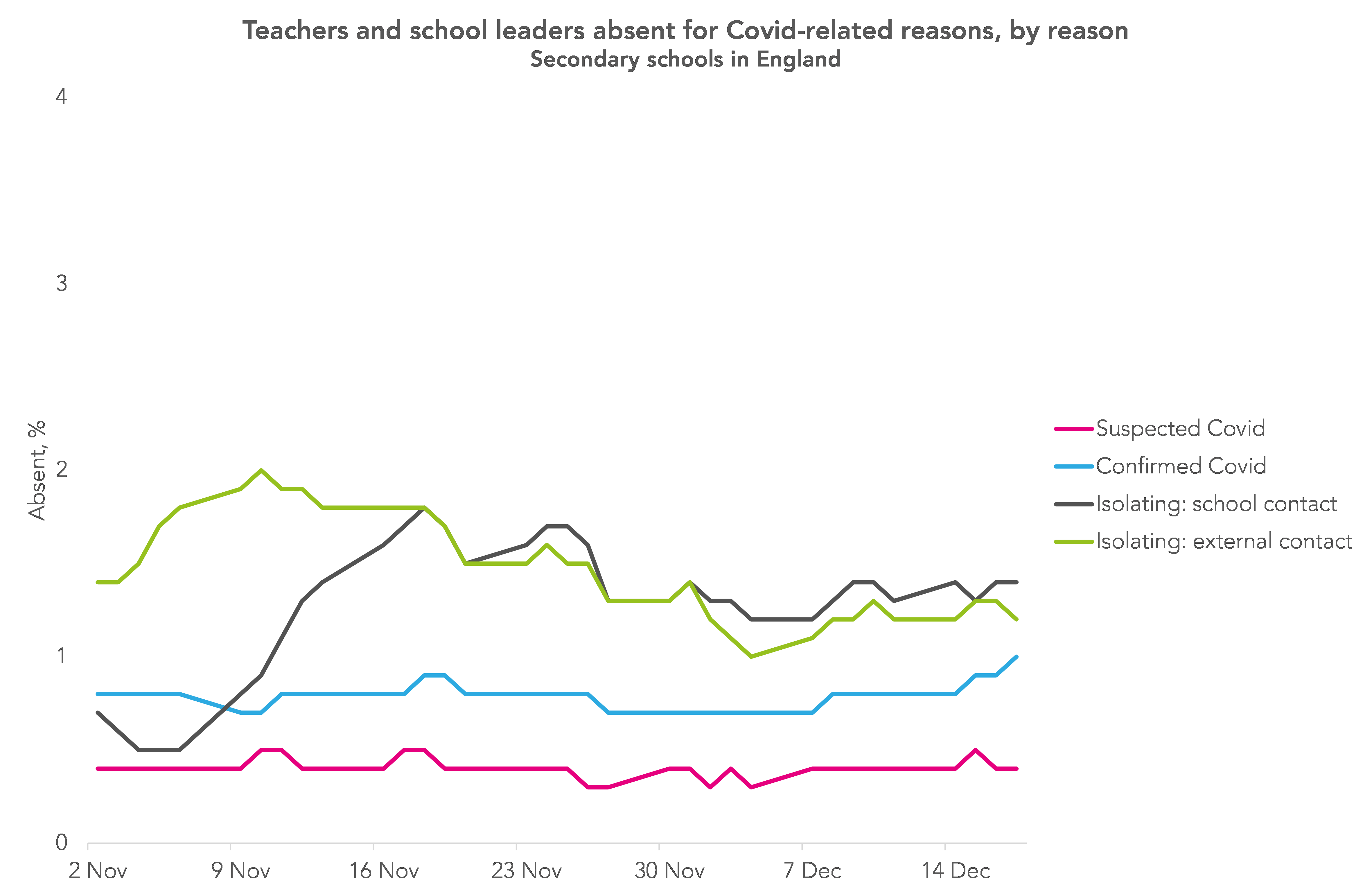
There are a number of interesting features in this pair of graphs.
First, rates of teacher absence due to suspected Covid are very similar in the two school phases, and the same is true of teacher absence due to actual Covid. This is the next puzzle: we might have expected higher rates in secondary schools as younger pupils are less likely to transmit infection.
Second, these rates vary very little over the half-term, somehow bucking the national trend in overall infection rates for working age people, which changed quite considerably over this period – to see this spelled out, see the chart below.[1]

Third, the rates of teachers self-isolating following contacts outside school are also about the same between phases. Both rates follow the same pattern over time, with the rate being consistently about 0.5% points higher in secondary school.
But the most interesting comparison, and clearly the one driving the overall difference, is the very different rates of teachers sent home by their school because of close contact with a confirmed case in school. This reaches over 3.5% of teachers in primary schools, twice the level of the peak in secondary schools. This is the final puzzle.
Deciphering the data
How can we explain these facts? We certainly do not have definitive answers, and all contributions are welcome.
Our current best story is this. Starting from well-established facts, we hypothesise that there was a much lower rate of pupil infection in primary schools (see figure 7 here).
If this was all there was to it, there would have been substantial differences in teacher absence deriving from in-school contacts, with the rate much higher in secondary schools.
But in fact we see the reverse: higher teacher absence in primaries. So the (lower) pupil infection rate in primary must have a much greater effect on the number of teachers being sent home than the same rate would in a secondary school.
This in turn must have disproportionately raised pupil absence in primary schools, as classes found themselves without a teacher, meaning that the difference in pupil absence between phases was less than it might otherwise have been.
Why the greater effect of pupil infection on teacher absence? Primary schools are physically much smaller than secondaries, so social distancing strategies for teachers (and pupils) from pupils must be harder. Second, it may be harder for teachers in primary (and special) schools to maintain social distance from pupils. Third, primaries have far fewer staff, and are organised differently, so this must reduce scope for coping and redeploying staff.
This seems to us to be the key new fact emerging from this data: the much greater impact that an initial infection in a primary school has on teachers isolating than in secondary schools.
Relationship with national infection rates
Finally, what might explain the relationship between teacher absence data for confirmed Covid cases and national infection rates, as seen in the fourth chart above?
The time series patterns are rather different, with the rate for teachers being much flatter over these weeks. (Note that we have not tried to align the scales for the two series. These two measures are sufficiently different in a number of dimensions that a direct comparison is not reliable.)
The best assessment we have to date of infection rates by occupation is from the ONS, in a single integrated study, which concludes for the period 2 September to 16 October 2020 that “there is no evidence of difference in the positivity rate between teachers and other key workers” (see figure 12). It would be interesting to see this work repeated for the November to December period we look at here.
[UPDATE: The Office for Statistics Regulation has written to ONS to elaborate on the strengths and limitations of the analysis undertaken to arrive at this conclusion].
Message for policymakers
We take it that the main goals of interest for policy are pupils’ and teachers’ health, and pupils’ time in school. It seems to be the case that home learning does not work well for many, and pupils do best in school with actual teachers. Hence the government’s and the chief medical officer’s statement of the prime aim of keeping schools open.
We find two points to emphasise for policy from the teacher absence data.
First, the difference by phase between pupil absence and teachers sent home to isolate suggests that quite a substantial fraction of pupil absence in primary school may be due to the greater effect of pupil infection on teacher absence. The lack of investment in spatial and staffing flexibility may have led to significantly more lost learning.
Second, in secondary schools, the potentially infectious contact that teachers have splits roughly half and half between those from the teachers’ life outside school, and those arising in school. This re-emphasises the degree to which infection in schools reflects infection in the broader community, and that the dangers to teachers’ health are not only, perhaps not even mainly, to be found within schools. The debates between closing or opening schools must keep this fact central.
Thanks for comments to Ines Hassan, Anna Vignoles, Richard Wilkinson.
Want to stay up-to-date with the latest research from FFT Education Datalab? Sign up to Datalab’s mailing list to get notifications about new blogposts, or to receive the team’s half-termly newsletter.
- For all schools, we compare the percentage of teachers and leaders absent with a confirmed case of Covid with the rate of Covid in the 20-64-year-old population in England. We use the seven-day rolling rate by specimen date available from https://coronavirus.data.gov.uk/

Very interesting. I have felt all along though that the fact younger students do not seem to be as symptomatic, they are not tested as much. This means that the potential infected rate in primary children is repeatedly under reported. We have had many families where mom and dad have both been positive but the children have not been tested as they have not appeared ill. This may explain why primary teachers seem to have higher rates than expected.
I completely agree with this. In my experience, younger children children have tended to be asymptomatic and are therefore not tested meaning the data is skewed. I do not agree with the assumption that there is a lower rate of infection in primary pupils, the facts only tell us that there are less infections reported in primary pupils.
A thought for you.
Many teachers are married to other teachers – hence a contact out of school is quite likely to have come from the other teacher? My husband and I are both teachers – my husband caught COVID from his school, then passed it to me – hence my contact was from A school just not my school! Many teachers are also parents and do again a contact from outside school, could be from their childs school?
I appreciate there are lots of factors but just wanted to check you had considered this.
Hi Caroline. Thank you. Yes, that’s a good point. When we looked at this a few years back in the Labour Force Survey we found about 20% of teachers had a partner that worked in education. What I’d now like to know is whether the rate is higher for teachers in primary schools than secondary.
Is the source of your data the DfE daily returns from schools? While this may be the best data available, there are (unintended) issues regarding this collection.
Schools make the return on the day to the best of their knowledge. However, when it comes to knowledge of staff reasons for absence – especially in larger schools – then it is likely to be an estimate at best. Some schools may also be sending in the figures that they think the DfE wants to see whilst others are unable to make a return each day.
Hi Paul. Agreed. We almost always have to do the best we can with imperfect data.
It would be even more interesting to know how many lay-offs are actually ill, or even have symptoms, and are not just a result of false-positive tests.
The article says that the data has not been published by location. The data was published for each Thursday in the autumn term at local authority level. This can be found in table 1c of the underlying data.
Thanks Gemma- yes you’re right. We’ve corrected the article.
In my secondary school no teachers were “sent home ” due to a contact within school either pupil or staff . It was just not allowed. Quite common in secondary and distancing just as difficult as older primary . Can’t keep 1m away from kids in class as rooms are not big enough. VERY poor ventilation. Consequently Several staff were in school with an infection for several days before feeling ill and leaving to have a test. I was one. Out of 50 staff over half tested positive last term. Two seriously ill. There is a problem with the ons data splitting up school workers into teachers and classroom assistant etc. We are all equally exposed in my school. Retail workers aren’t split up between Asda, sainsbury, tills, shelf stacking etc. Also – data recently released compares deaths among school workers with deaths among other workers and finds not much difference but NOT allowing for the fact that the overwhelming majority of school workers were at home from end March to end August whereas other workers such as nursing and retail were not at home. More statistical analysis is needed. Much Too simplistic.
Very interesting and thought provoking analysis. Thanks for the good read. I am minded to comment to explain the difference between teacher absence as a result of close contacts in schools. I have had several students in my classes test positive but I have remained teaching in school despite the isolation of this entire year group – I teach secondary and the logic that has been applied is that even if they are in my class I can remain socially distanced from them (although this is rarely the true case). Meanwhile staff in primary are generally sent home when someone in their class tests positive because maintaining social distance is clearly much harder. Doesn’t this entirely explain the higher absence rate for staff in primaries despite the relatively fewer student cases?
Hi Mike. Thank you for this comment and apologies for being slow in acknowledging it. I went off in search of further evidence to support or challenge your hypothesis but then the day job got in the way.