We are delighted to introduce another new feature to FFT Aspire’s ground-breaking Attendance Tracker. In addition to whole school and year group figures, pupil groups have now been added to the persistent absence analysis, allowing you to compare persistent absence rates for key groups in your school such as gender, SEND and FSM6. This development has been heavily requested by schools and we hope that you find it useful.
Aspire Attendance Tracker
Schools can track, analyse and compare their attendance data against 1,000s of other FFT schools using Aspire Attendance Tracker.
Log in to Aspire to access Attendance Tracker – log in here.
Not an FFT Aspire user? Learn more here.
In this post we’ll explore patterns in persistent absence. To do this, we’ll make use of published DfE data covering all state-funded schools in England alongside data from our Attendance Tracker schools – around 2,600 state-funded secondary and 7,300 state-funded primary schools. We’ll use published data for figures up to the end of the 2018/19 academic year (available here), and Attendance Tracker data for 2020/21, 2021/22 and 2022/23.
Long-term trend in persistent absence
Let’s start by looking at how rates of persistent absence have changed over the years.
Below, we plot the proportion of pupils[1] who missed at least 10% of sessions (the usual definition of “persistent absence”) in each academic year since 2006/07[2].

The proportion of pupils missing at least 10% of sessions stayed fairly static between 2013/14 and 2018/19 at both primary and secondary. At primary, rates were around 8-9%, and at secondary 13-14%.
There was a big increase in 2020/21, mostly driven by high numbers of pupils required to isolate (the “bubble” system), before dropping to 18% at primary and 28% at secondary in the most recent academic year.
The reduction between 2006/07 and 2013/14 was driven by an overall reduction in authorised absence.
Now, let’s look at the proportion of pupils who missed at least 50% of sessions, so-called “severe absentees” or “severe persistent absentees”. These figures have only been published since 2013/14. Also note the very different scale.

In contrast to persistent absence at the 10% threshold, the proportion of pupils missing at least 50% of sessions increased steadily between 2013/14 and 2018/19 – from 0.30% to 0.39% at primary and 0.8% to 1.3% at secondary[3].
At primary, rates peaked in 2020/21 at 1.2% before dropping to 0.8% in 2022/23. At secondary the big rise to 2.8% in 2020/21 was followed by further rises to 3.8% in 2022/23.
Overall, rates of persistent absence at the 10% threshold were around double pre-pandemic rates at primary, and triple at secondary. At the 50% threshold, they were around double pre-pandemic rates at primary, and over nine times as high at secondary.
Reasons for persistent absence by year group
Let’s look at persistent absence in the most recent academic year in more detail. Specifically, let’s look at the “reasons for absence” recorded by schools.
We first calculate for each pupil the percentage of sessions missed due to unauthorised absence. If this is over the threshold, we plot these as “unauthorised only” persistent absentees. We then add in sessions missed due to illness. Pupils who weren’t persistently absent based only on their unauthorised absence, but were based on the combination of unauthorised and illness are plotted as “including illness”. And, finally, we add in all other authorised reasons, and plot the additional persistent absentees as “including other authorised”.
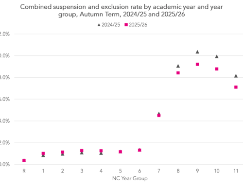
Let’s look at how this varies by year group for persistent absence at the 10% threshold:

Overall, the vast majority of persistent absence is caused by a combination of unauthorised and illness-related absence. The proportion of pupils who were persistently absent based only on unauthorised absence is higher among secondary pupils than primary, and highest among pupils in Years 9, 10 and 11.
Turning to the 50% threshold:

Patterns are similar to the 10% threshold, though illness plays a smaller role.
Reasons for persistent absence by disadvantage
We’ll plot the same charts now by pupil characteristics.
Firstly, the 10% persistent absence threshold by disadvantage (defined by being eligible for free school meals in the previous six years, or “FSM6”):
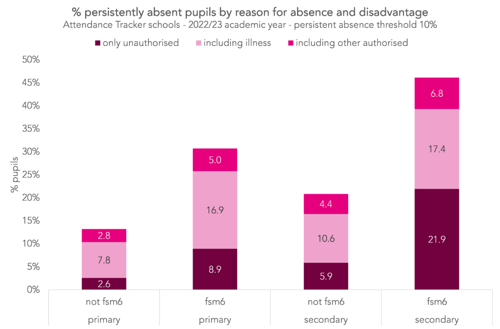
Higher rates of persistent absence among disadvantaged pupils were caused by more absence of all types. At secondary though, unauthorised absence was a bigger contributor than illness or other authorised absence.
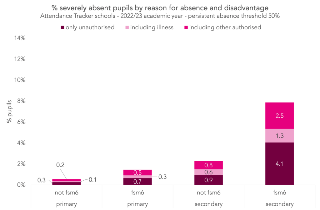
Similar patterns are evident at the 50% threshold:
Reasons for persistent absence by SEND status
Turning now to pupils with identified special educational needs or disabilities (SEND).
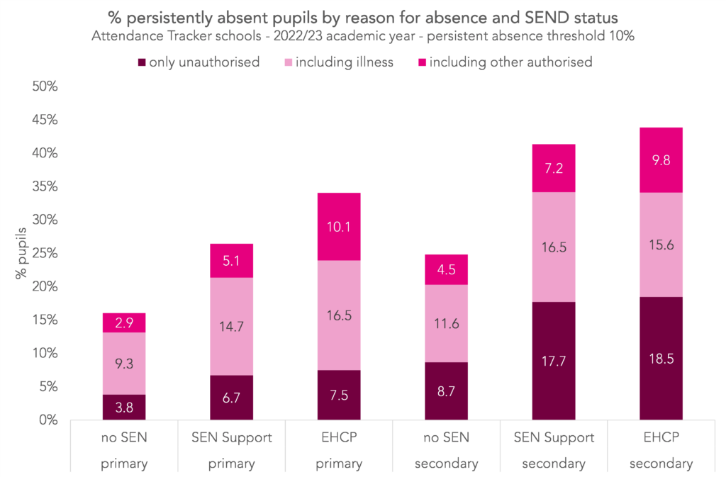
The 10% persistent absence threshold by SEND status:
and the 50% threshold:
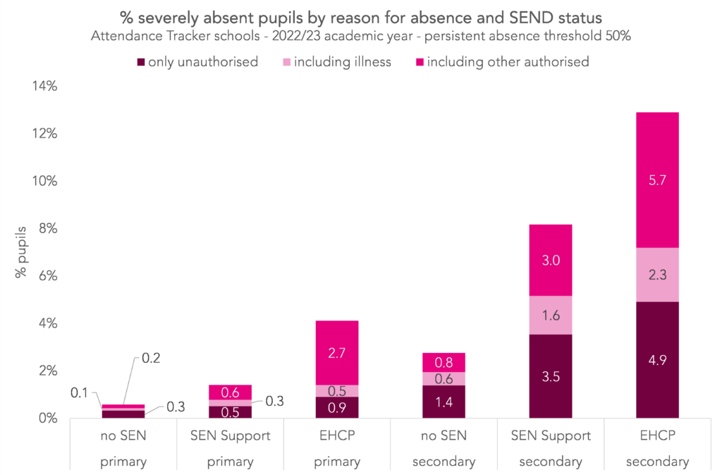
Broadly, pupils with an identified SEND had higher rates of persistent absence than those without due to higher absence of all types. There is an outsized contribution from “other authorised absence” though, particularly for pupils with an EHCP, and particularly at the 50% threshold.
Reasons for persistent absence by region
To finish, let’s take a look across the regions.
Below, we plot the proportion of primary pupils who missed at least 10% of sessions by reason and region:
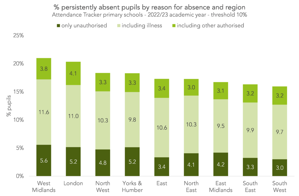
Persistent absence was highest in the West Midlands and lowest in the South West. This was driven by the former having higher rates of unauthorised and illness-related absence than the latter.
And at secondary:
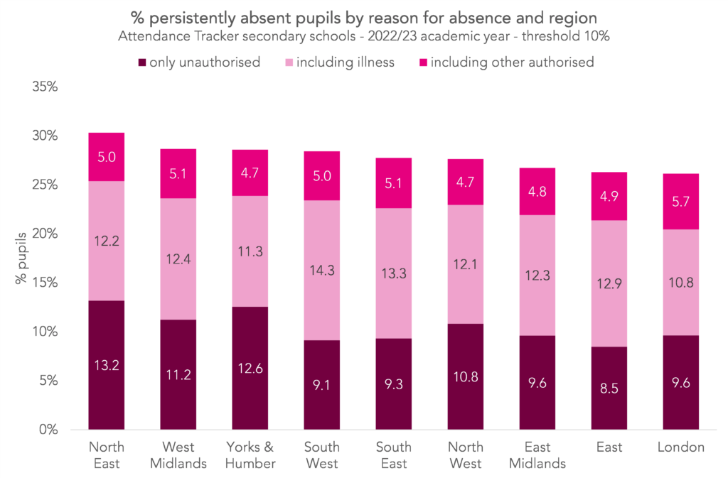
The North East had the highest rates of persistent absence and London the lowest. This was primarily driven by differences in unauthorised absence rates.
Summing up
There are big differences in persistent absence by pupil group. To see what this looks like in your school, log in to Attendance Tracker now.
[1] Actually, it’s the proportion of “pupil enrolments” – a pupil who moved schools during the academic year will be counted separately in each of the schools at which they were enrolled.
[2] Changes to the published persistent absence methodology over this time period are summarised here. We have used the current “10% exact methodology” in all years, which was published retrospectively for years where an alternative measure of persistent absence was used. Pre-2012/13, figures were only calculated over the first five half-terms. From 2012/13 onwards, they were calculated over the full academic year (except for Year 11 pupils, where the final half-term is not included).
[3] Worth noting that this could come about in two, non-mutually-exclusive ways: more pupils missing more school and/or pupils who miss more school moving school more often (because the statistics are calculated over pupil enrolments rather than pupils).
As a former school leader and having SEND grandchildren the statistics hide much bigger issues.
The barriers to ECHP have become so great that some opt out of state school if they can manage home and work life. The pandemic made others, some with no registered SEND status reconsider options (with an ever more restrictive rationing system where parents must balance legal support fees for inevitable appeals, timescales and real school support versus stated levels).
Simply put if you ration need, manipulate reports to reflect budgets and not reality, make barriers greater for those parents less financially or educationally blessed the outcome is fairly obvious.
The solution is also obvious. Fund schools appropriately and fairly, provide sufficient places if the appropriate type and deal with mental and physical health holes. These are not ‘education’ problems per se and not errant parents usually simply parents making balanced choices according to the options presented to them and (usually) trying to find the best solution for their child. Similarly school leaders must manage and frequently fail in a system not fit or at least funded appropriately.