We’ve written lots about high levels of absence since the start of the pandemic. In Autumn Term this year, secondary pupils missed an average of 8.8% of sessions – around three percentage points higher than pre-pandemic.
Among disadvantaged pupils, absence rates were even higher, at 14.0%. But how did this vary in schools with different levels of disadvantage? Did disadvantaged pupils in schools with a high percentage of disadvantaged pupils tend to have higher or lower rates of absence? That’s what we look at in this article.
Data
As usual, we’ll be using data from our FFT Attendance Tracker schools. We limit our sample to state-funded mainstream secondaries – around 2,500 schools in total. And we’ll look at data across the whole of the 22/23 academic year[1].
To measure school-level disadvantage, we divide schools into ten equal sized groups, or “deciles” according to the proportion of their pupils who were eligible for free school meals in the past six years (FSM6). The average proportion of FSM6 pupils for schools in each decile is shown below.

Relationship between school disadvantage and overall absence rates
First, let’s see how overall absence rates vary by school disadvantage. Below we plot the percentage of sessions missed by pupils belonging to schools in each decile.

There is a clear relationship between school disadvantage and average absence rate. Pupils belonging to schools in the lowest decile missed an average of 6.6% of sessions last year, compared with 12% of sessions for pupils in the highest decile.
Absence by school- and pupil- level disadvantage
This isn’t a surprising result. After all, the most disadvantaged schools have the highest proportion of disadvantaged pupils, and disadvantaged pupils tend to have higher absence rates than other pupils.
But what happens if we look at the data just for disadvantaged pupils?
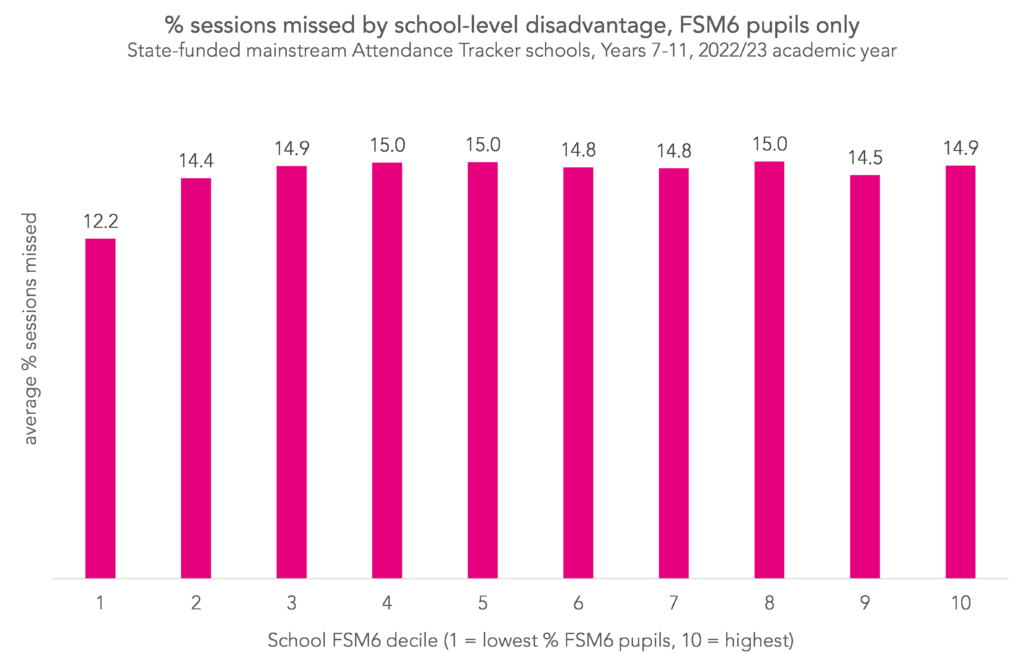
Apart from the lowest decile, absence of disadvantaged pupils didn’t seem to vary by school disadvantage at all. The range between the deciles with the highest and lowest absence, excluding decile one, was only around 0.6 percentage points.
Now let’s add in a bar for other pupils.

Interestingly, for pupils who were not disadvantaged, there is a clear pattern. Absence for these pupils tended to increase with increasing school-level disadvantage. Pupils in schools in the second-lowest decile missed an average of 7.0% of sessions, while those in schools in the highest decile missed 8.5% of sessions.
Around a third of schools in the lowest decile were selective schools, which may explain why absence rates are relatively low both for disadvantaged and non-disadvantaged pupils (for comparison, only around 4% of our Attendance Tracker secondary schools are selective).
We see a similar pattern when we look at persistent absence too.

The percentage of disadvantaged pupils persistently absent didn’t seem to increase with school disadvantage, but the percentage of other pupils persistently absent did.
Persistent absence for disadvantaged pupils was between 46% and 48% for schools in deciles two to ten, with no pattern of persistent absence increasing with increasing school disadvantage. For other pupils though, each increase in decile was associated with increased rates of persistent absence – from 19% of pupils in decile two schools to 27% of pupils in decile ten.
Again, the lowest decile is an outlier. 39% of FSM6 and 15% of non-FSM6 pupils were persistently absent in these schools.
Attainment 8 by school- and pupil-level disadvantage
To finish, let’s look at pupil attainment. Here we plot the average Attainment 8 score of FSM6 pupils compared with other pupils. This time we’ll use the full national dataset (available here). Again, we’ll divide schools into deciles according to the proportion of their pupils who were FSM6[2].
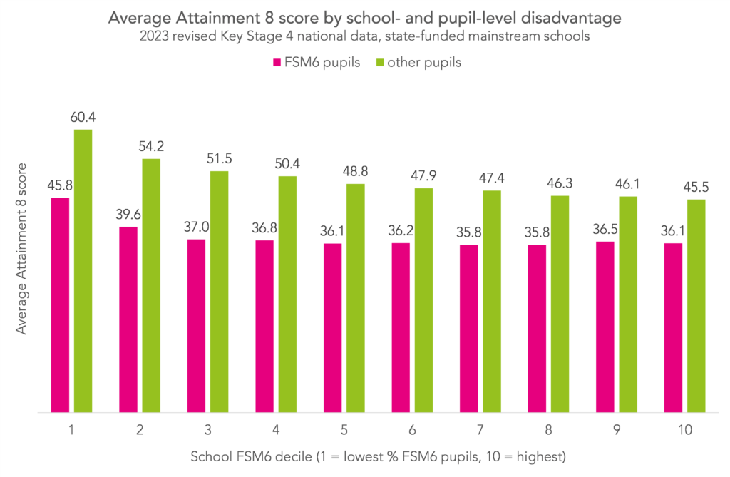
The pattern is a familiar one. The average attainment 8 score of disadvantaged pupils didn’t seem to vary by school disadvantage, while outcomes for other pupils worsened with increasing school disadvantage.
As we saw with absence, the lowest decile is an outlier. Unlike with absence though, the second decile seems somewhat out of step with the rest of the distribution too. We note that a higher proportion of schools in the second decile of our attainment dataset were selective, compared with the second decile of our absence dataset[3].
Summing up
There seems to be little relationship between school-level disadvantage and the absence rates of disadvantaged pupils. However, there does seem to be some correlation for non-disadvantaged pupils, with those in more disadvantaged schools tending to have higher absence rates than those in less disadvantaged schools. We see a similar pattern when we look at attainment too.
Perhaps pupils in the “non-disadvantaged” and “disadvantaged” groups are more similar in schools with higher levels of disadvantage than lower.
Want to stay up-to-date with the latest research from FFT Education Datalab? Sign up to Datalab’s mailing list to get notifications about new blogposts, or to receive the team’s half-termly newsletter.
Aspire Attendance Tracker
Schools can track, analyse and compare their attendance data against 1,000s of other FFT schools using Aspire Attendance Tracker.
Log in to Aspire to access Attendance Tracker – log in here.
Not an FFT Aspire user? Learn more here.
[1] Year 11 pupils are excluded from the figures from May half-term onwards.
[2] When we looked at absence, we divided schools into deciles according to the proportion of pupils in Years 7-11 who were FSM6. Here, for ease, we’ve divided them according to the proportion of pupils in the end of Key Stage 4 cohort who were FSM6.
[3] 6% of schools in the second decile of our attainment dataset were selective vs 1.5% in the second decile of our absence dataset.
I know there is nothing that captures the data, but from experience, many of the students who are not eligible for FSM in highly disadvantaged areas are borderline pupils…those where parents work hard, just about make ends meet and are just out of the cusp for claiming benefits. This often means that attendance (bus fares can be expensive, or the children are often off with coughs and colds as they can’t afford the rising fuel bills and heating or a solid hot meal) is one of the first things impacted.
Thank you Katie – this is a fascinating article! I’m interested as to whether you could look at similar deciles for level of deprivation in a schools catchment area to see how that would compare to the data?
Thanks Mark, interesting idea. What’s your hypothesis?
I suspect – as the previous comment from Abigail says, that schools with high levels of disadvantaged students are in areas where many students who aren’t eligible for FSM are part of the ‘Just About Managing’ demographic. In my limited experience, where schools are in areas of significant social deprivation, you find that the non-disadvantaged cohort tend to present differently to the same cohort in schools with lower levels of deprivation. I feel like the approach you have taken to this data could be used to understand and analyse that effect and would align with your existing findings.
Shows what a mockery of reality P8 is. And judgements by Ofsted? Largely nonsense anyway. Based on this? Can’t add progress when kids aren’t at school. They aren’t at school in disadvantaged areas to such a degree that they can’t land this at the door of the schools.
Ofsted judgements are gibberish.
Just to support Abigail’s and Mark’s comments above, I have an LA data set to work with and we noted that schools with larger disadvantaged cohorts tend to serve a more homogenous locality (measured using IMD deciles). Abigale’s struggling families just missing out on FSM. I guess really it just reiterates the point that Non-FSM is a pretty weak indicator. Also worth bearing in mind when using gap measures of any type.