When researchers finally gain access to a new dataset, the temptation is always the same: dive straight in. Who wants to spend hours wading through technical documentation when you could be plotting trends, running regressions, or uncovering surprising patterns? But sometimes, hidden in the fine print, lies a small detail that can upend the entire analysis.
This blog tells the story of exactly such a detail.
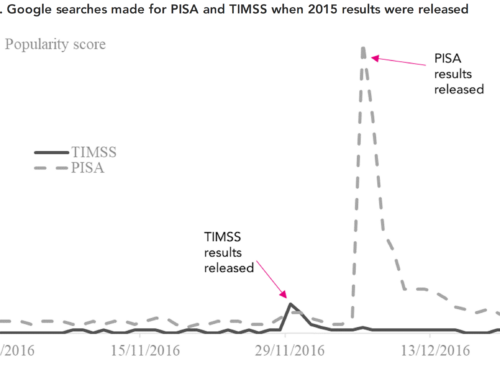
In a recent paper I discuss a subtle change in wording to one of the survey questions in PISA.
This one little change made in just one cycle, in just a subset of countries, has big implications for anyone using PISA to understand unexcused absences from school.
And it’s a reminder of the oldest rule in data analysis: always read the documentation carefully!
The question that quietly changed
PISA asks 15-year-olds a set of background questions, including one that seems straightforward:
“In the last two full weeks of school, how often: I skipped a whole school day.”
But in 2015, some countries quietly changed one word. Students in England, Wales, Northern Ireland, the United States and a few others were instead asked:
“… I missed a whole school day.”
The operative word in these statements are clearly very important.
“Skipped” implies truancy—an unexcused, intentional absence. “Missed” can include any absence—dentist appointment, illness, family reasons.
This is a crucial difference. Yet the international PISA documentation states that the wording was identical across all countries and cycles. The change only appears in the national questionnaires, which many researchers never check.
How one word reshaped a trend
Consider the United States and Australia, shown in Figure 1. Australia shows a clear post-pandemic jump in truancy in PISA 2022. The U.S., however, shows a zig-zag: a rise in 2015, a fall in 2018, then another rise in 2022.
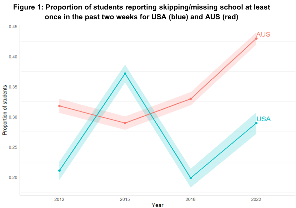
If taken at face value, the unexcused absence rate in the USA in 2022 doesn’t look particularly unusual— it’s actually somewhat below the rate in 2015.
But what is behind that spike in 2015? Rather than being a genuine pattern, it’s an artifact of the survey question wording switching from skipped to missed.
Once the 2015 data are removed, the U.S. shows a large, clear increase in truancy after the pandemic—larger than Canada’s. The wording change hides what is actually a worrying post-pandemic increase in unexcused absences.
The same pattern appears in England, Wales and Northern Ireland. In every affected country, the 2015 numbers look artificially high, making real increases appear modest.
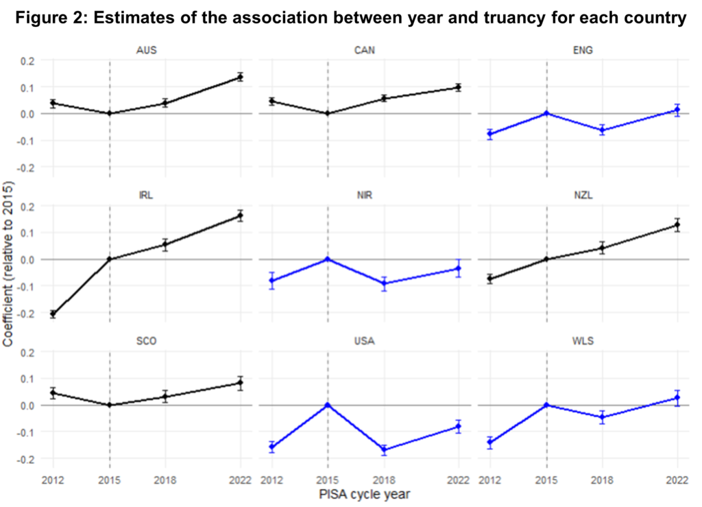
Another graph, same story
Figure 2 shows year-to-year changes with 2015 as the reference point. Countries shown in blue experienced the wording change; those in black did not.
In blue countries, 2015 is a major outlier—with numbers clearly inflated. In black countries, the time trend is smooth.
Again, the conclusion is unmistakable: 2015 breaks the series.
Could AI have caught the problem?
Given how subtle this issue is, could an AI assistant like ChatGPT help identify it?
Sign up to our newsletter
If you enjoy our content, why not sign up now to get notified when we publish a new post, or to receive our half termly newsletter?
Even when we used ChatGPT’s Deep Research model – and asked it explicitly about comparability issues in the truancy question – we were repeatedly reassured that:
“Each cycle asks exactly the same question… responses are directly comparable.”
And that:
“The wording and response scale have been unchanged.”
The advice from the AI was very clearly – and very overconfidently – incorrect.
Only after highly specific prompting did the AI vaguely suggest checking national questionnaires. But without already suspecting an issue, a researcher would not have been led to the key discovery.
This demonstrates an important point about AI in research: it can be helpful, but it cannot replace careful reading, expert knowledge and – crucially – gut instincts that something isn’t quite right.
Documentation matters
This blog has highlighted how a surprisingly big problem was caused by a surprisingly small change. One word shifted the meaning of a core variable and materially altered conclusions drawn from the PISA data.
And even the OECD’s own published reports appear to have missed the issue.
For those using and interpreting data, the lesson is clear:
- Always check data documentation carefully.
- AI is a tool to aid us – it does not speak with authority.
- Always interpret any strange blips or outlying data points with care.
As for PISA. Well, in my view, the OECD has big questions to answer as to why such strange changes were made, how on earth this got through their quality assurance processes, and whether similar gremlins could be lurking elsewhere in the PISA data.

An incredible cautionary tale John, on so many levels including our assumptions about seemingly authoritative sources and organisations, and the limitations (at least so far) of AI.
Yes AI is not well suited (currently) to things which are hard to verify if they are correct. Data analysis is pretty clearly in that category for me.
On the other hand – I suspect that having spotted this issue, if you asked AI to go back through all the previous PISA questionnaires for every country and identify any discrepancies in the questions asked including subtle differences in meaning between languages then it would do a pretty good job at that – and very quickly. A boring task that not many humans would relish.
The working paper highlights the risk of “Our haste leading us to break our shiny new toy, sinking our money down the drain. The same can happen in data analysis too. After waiting months – if not years – to get our hands on some exiting new data, the temptation is to just dive straight in. Why bother to read pages and pages of boring survey documentation, when the exciting world of data cleaning, descriptive statistics and statistical modelling awaits? The reason – as all good, experienced data analysts know – is that we might break our new “toy” (dataset) in the process, putting significant time and effort to waste. But – let’s be honest – do we always practise what we preach?”
If I may offer a perspective, I was under the impression that most researchers do indeed read the documentation, and can undertake work without relying on AI, and so on.
Perhaps some of us might feel a rush or pressure to be first to analyse data, to push the working paper out before anyone else, to have work in the media, and so on? To reassure, it’s likely to be unhelpful to pressure ourselves like that – and it’s unrealistic to expect every single research paper to be revolutional and sensational, to have hard-hitting impact, and so on.
Although, if I may be more critical – this looks like another working paper using linear regression to predict a binary outcome – may I ask why?
Linear regression is applied to linear outcomes, and logistic regression is applied to binary outcomes – this is what we teach in introductory courses, is it not? And we would presumably expect our students to apply this – and it probably would be questioned in peer-review.
If we’re talking about risks such as rushing versus reading the questionnaire phrasing carefully and so on – and (somewhat ironically) “do we always practise what we preach?” – we could presumably consider all manner of other potential risks.
It’s helpful if papers explain and justify matters, and this is especially important when working papers aren’t peer-reviewed.
Thanks!