Update 11:55, 27 February 2019: A reference to five trusts highlighted in blue in the first chart has been corrected to a reference to seven trusts.
Along with secondary school league tables, multi-academy trust (MAT) league tables have been published today.
The role that MATs play is large and only getting larger. It seems reasonable, therefore, to try and set accountability at this level – but the MAT league tables are not without problems.
These chiefly stem from issues with the school progress (or value added) measures which form a key component of the MAT league tables. These are points that we’ve raised numerous times before, but they include the fact that the progress measures take no account of pupil characteristics, bar prior attainment, and the fact that – more or less – they only take into account pupils who remain on-roll at the end of Year 11.
But, bearing these points in mind, what do today’s figures show?
2017 v 2018
After the publication of provisional Key Stage 4 data in the autumn, we wrote that some trusts looked to have been hit hard by the removal of the European Computer Driving Licence, or ECDL, from the list of qualifications eligible for school league tables.
While changes in MAT Progress 8 scores from 2017 to 2018 will be due to a combination of factors, this does seem to have been borne out.
The chart below compares 2017 and 2018 P8 scores for all trusts which featured in both years’ MAT league tables. Highlighted in blue are the seven trusts we identified where more than 80% of KS4 pupils had entered the ECDL in 2017.
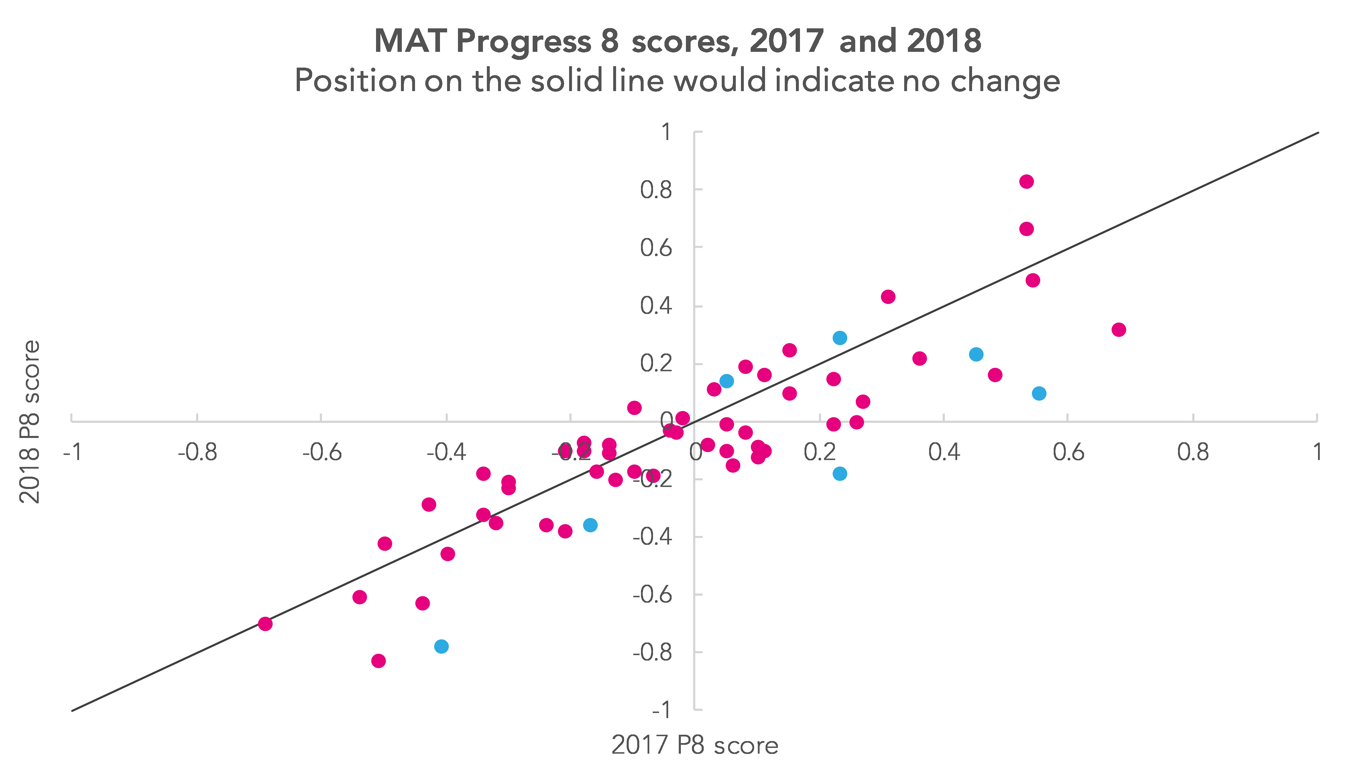
It’s worth saying that, under the rules determining how the MAT league tables are produced [PDF], some schools newly entered the scope of the exercise this year, and a few left the scope of the exercise. Overall, the impact of this changing population of schools was not large, but in the case of some individual trusts it made a bigger difference.
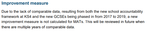
The Department for Education has talked in the past of introducing an ‘improvement’ measure, showing how MAT’s results have changed over a period of years – but this remains something for the future, owing to a lack of comparable enough data, in the DfE’s own words.
Disadvantage
Finally, a look at the P8 scores of disadvantaged pupils within these trusts.
The chart below shows this, again for 2017 and 2018.
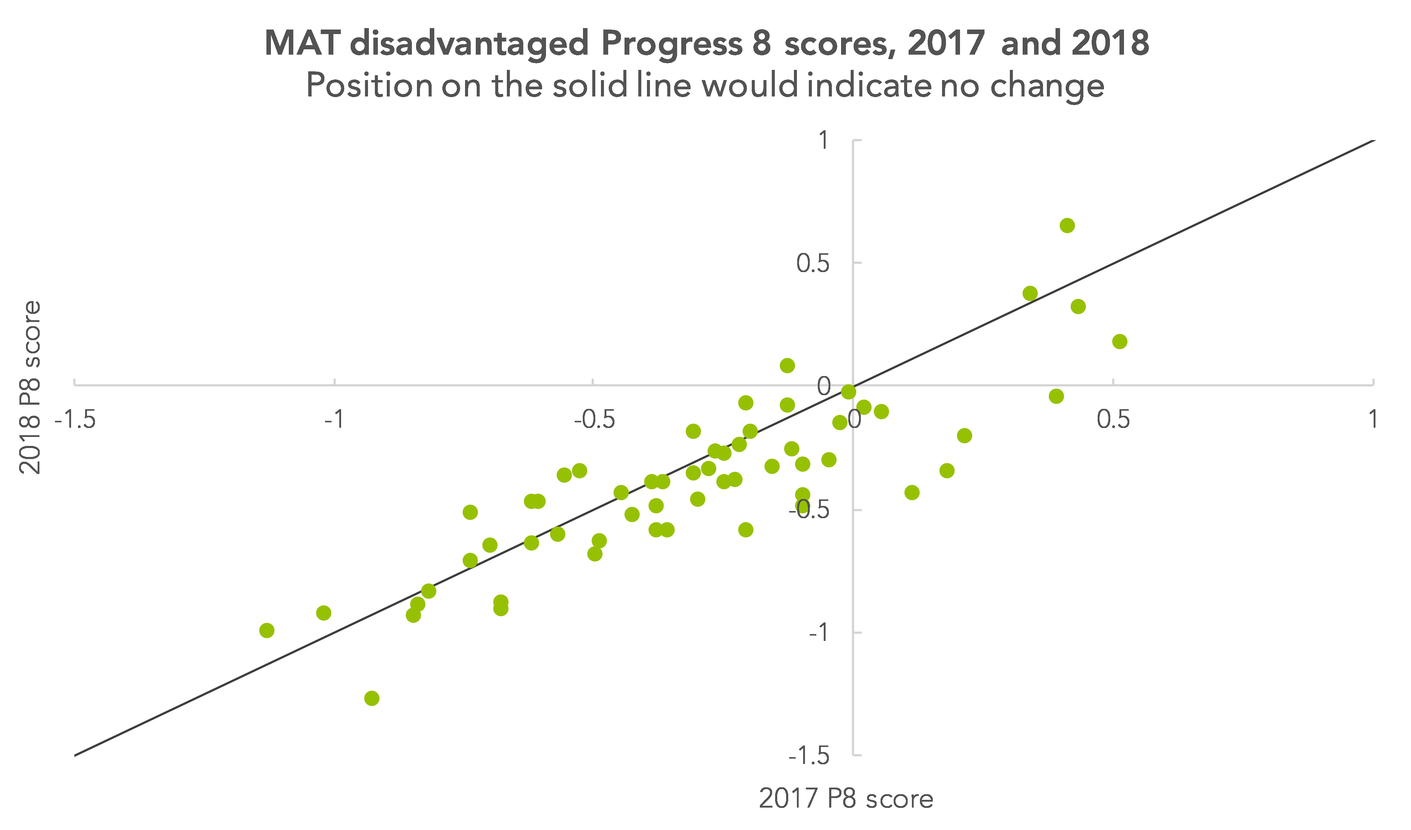
As we can see, there are just small handful of MATs for which disadvantaged pupils on average had positive progress scores in one or both years. But, of course, the disadvantage gap is a challenge far from unique to MAT schools.
Want to stay up-to-date with the latest research from FFT Education Datalab? Sign up to Datalab’s mailing list to get notifications about new blogposts, or to receive the team’s half-termly newsletter.


Using this kind of scatter graph, should there not be a regression score to see if there has been a positive change or not?
Or am I being blind and not seeing it in this report?
Thanks
You have suggested the five (there are seven) blue dots are those who had a high percentage of ECDL were hit hard.
However, the way you have labelled these axes makes it look (to me anyway) like you have plotted 2018 scores on the x-axis and 2017 on the y-axis. This therefore makes it look like improvements have been made from ’17 to ’18?
Hi Tom, you’re correct to point out that I should have said seven, rather than five, trusts – thanks for letting us know. The axes are the intended way round, though – 2017 on the x-axis and 2018 on the y-axis.
We didn’t calculate regression scores (in the case of the trusts highlighted in blue that’d be based on just seven trusts). I’ll happily send you the data the charts are based on if that would be of interest though.
Thanks,
Philip
Hi there – I don’t know how I didn’t notice you had replied!
Thanks for the clarification (disappointed that I misread it as a maths teacher). Fair call on regression, and most certainly yes please to the data! I am writing a masters essay and my dissertation on MATs so this is very interesting to me
Thanks