Our Schools Like Yours site has been updated with the latest published data on the school workforce, finance and exclusions.
The site allows you to compare your school with similar schools – where you decide what similar means.
One thing you may be interested to look at is how many leaders (heads, deputy heads and assistant heads) your school has compared to similar schools elsewhere in the country.
With too few leaders, schools may not function effectively (or those in post may burn out from trying). With too many, there is a danger that more bureaucracy is created, as Becky Allen argued in her Caroline Benn memorial lecture.
Pupils per teacher
There is a clear, linear relationship between the number of pupils at a secondary school and the number of teachers as the chart below shows.

If we were to plot a straight line through the data points, we’d find that for every 100 secondary school pupils there are 6.2 teachers. Alternatively, 16 pupils per teacher.
Although numbers of pupils and full-time equivalent teachers are highly correlated (r=0.94), schools with similar numbers of pupils do still vary in terms of number of teachers. For example, better funded schools (e.g. those with proportionately more disadvantaged pupils) may have more teachers.
It’s straightforward to create scatterplots similar to these using Schools Like Yours, and to see how your school compares.
How to make scatterplots using Schools Like Yours
Schools Like Yours allows you to compare your school with similar schools – where you decide what similar means.
To use it, you start off by setting similarity criteria. These are the factors that are used in finding similar schools. Several of these factors are set by default when you first visit the site, but feel free to change these.
You can also use filters to rule certain types of school out. For example, you may only be interested in comparing your school with other academies.
Your list of Schools Like Yours is then shown on the tables tab, towards the bottom of the page.
To produce a scatterplot, switch to the charts tab. Here you select which data you want to show on your scatterplot. To produce a similar chart to that shown above you’d select teachers for one axis and pupils for the other. Your school, and the Schools Like Yours, are highlighted on the chart.
Pupils per leader
Now let’s look at the relationship between number of pupils and the number of teachers in the leadership group at secondary schools.
This time, the relationship is much less clear.
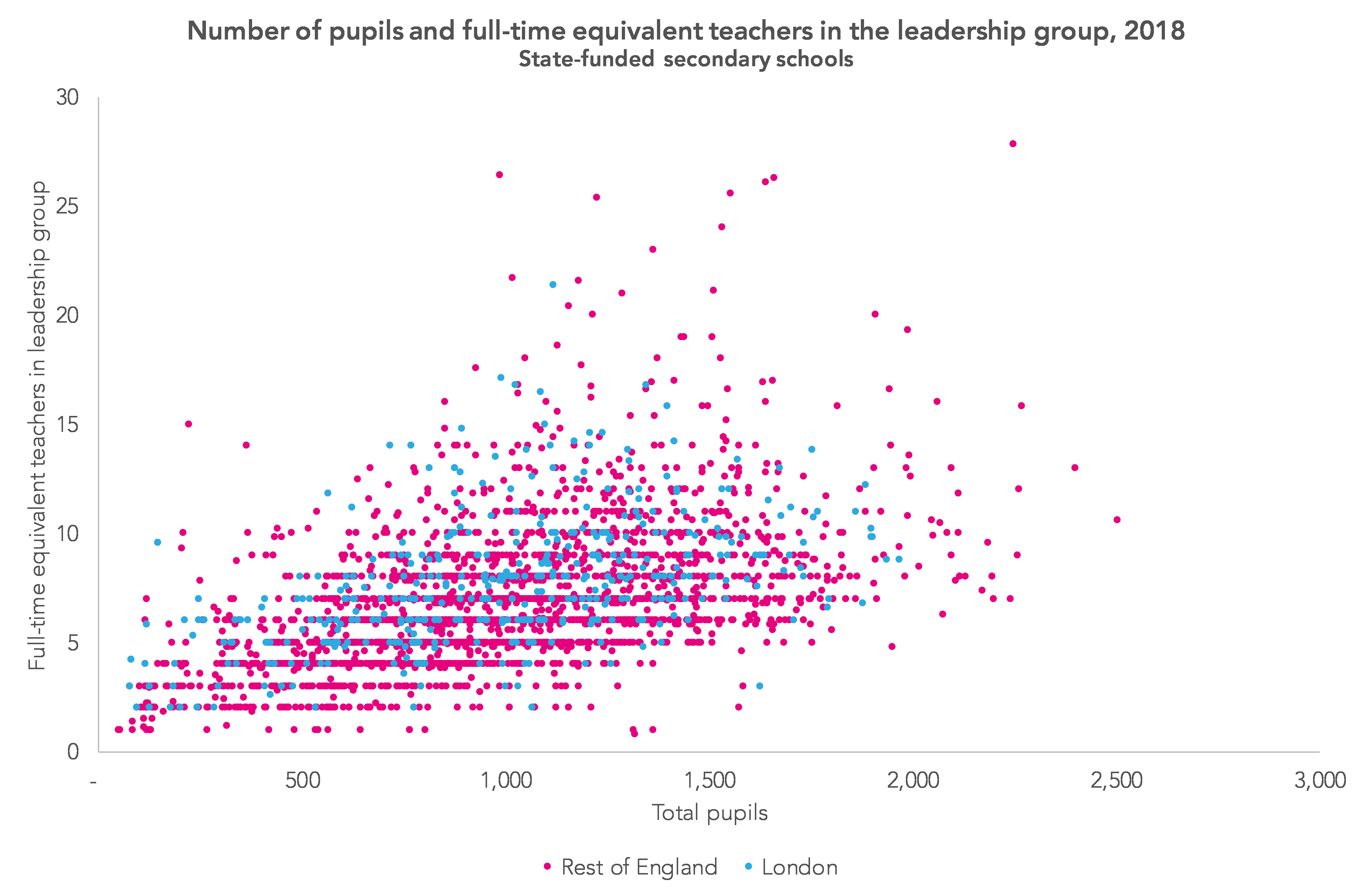
Broadly speaking, there are 6.6 leaders for every 1,000 pupils. But numbers vary hugely.
Unfortunately, we don’t know from the published data how much time the leadership group spend on teaching and related activity (marking, planning etc.). While a leadership team of 20 may seem excessive for a school with 1,500 pupils, it may be less so if they have an average 0.5 teaching commitment.
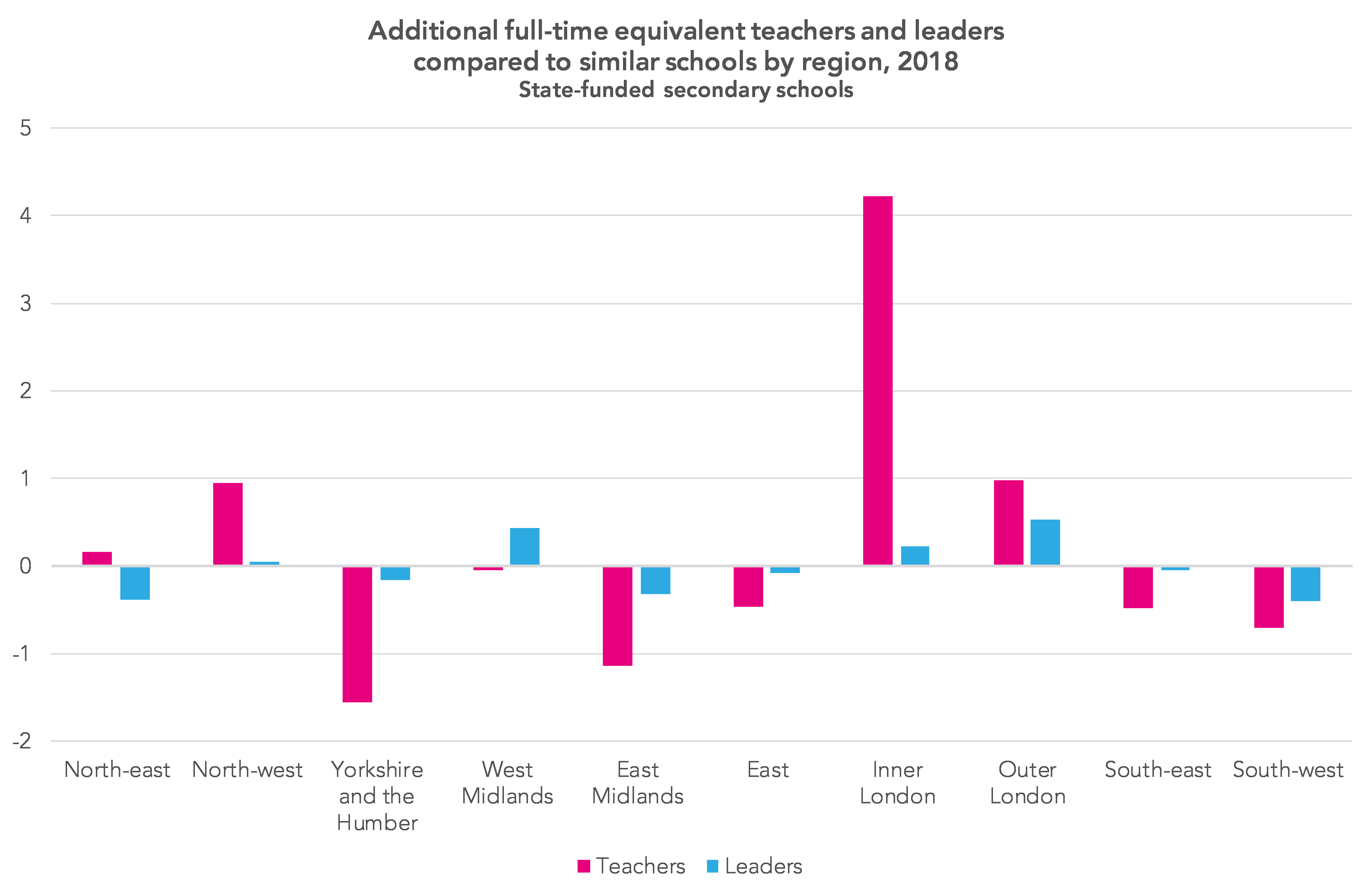
Regional differences
Across all schools included in our Key Stage 4 dataset, the mean income per pupil of a school in London is £1,235 higher than a school elsewhere in the country. Among the schools in the Key Stage 2 dataset, the difference is £1,070.
If you have schools in London in your set of similar schools then you may find they have slightly more teachers and leaders as well as tending to have more income per pupil.
Controlling for pupil numbers, percentage of disadvantaged pupils and whether the school has a sixth form, schools in Inner London have an additional four teachers on average. Schools in the west Midlands and outer London tend to have larger leadership teams than similar schools elsewhere.
Do take a look at School Like Yours and let us know if you find any interesting patterns.
Want to stay up-to-date with the latest research from FFT Education Datalab? Sign up to Datalab’s mailing list to get notifications about new blogposts, or to receive the team’s half-termly newsletter.

Leave A Comment