Key Stage 2 SATs results at a national and local authority level have just been published.
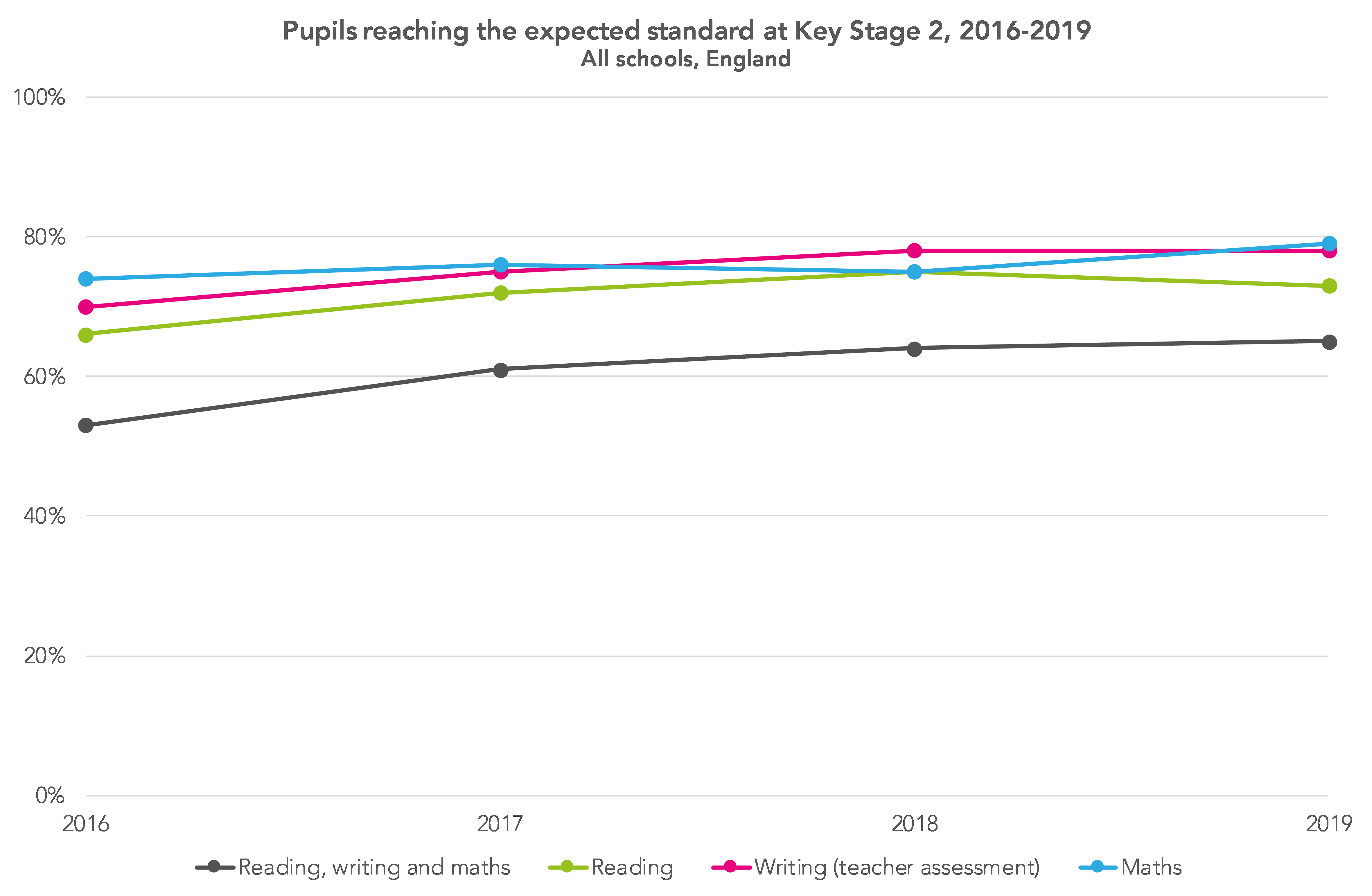
We got an idea of the headline numbers in July – with a small decrease in the share of pupils at the expected standard in reading, and an increase in maths. The figures released today give more detail, including gender and disadvantage breakdowns, and numbers that let us dig below the surface of the headline national figures.[1]
FFT Aspire users
2019 KS2 Question Level Analysis reports are now available in Aspire.
Analyse your KS2 reading, maths and GPS results in more detail at ‘strand’ level.
Click here to download your 2019 and 2017-19 aggregated reports.
Not an FFT Aspire user?
Gender gaps
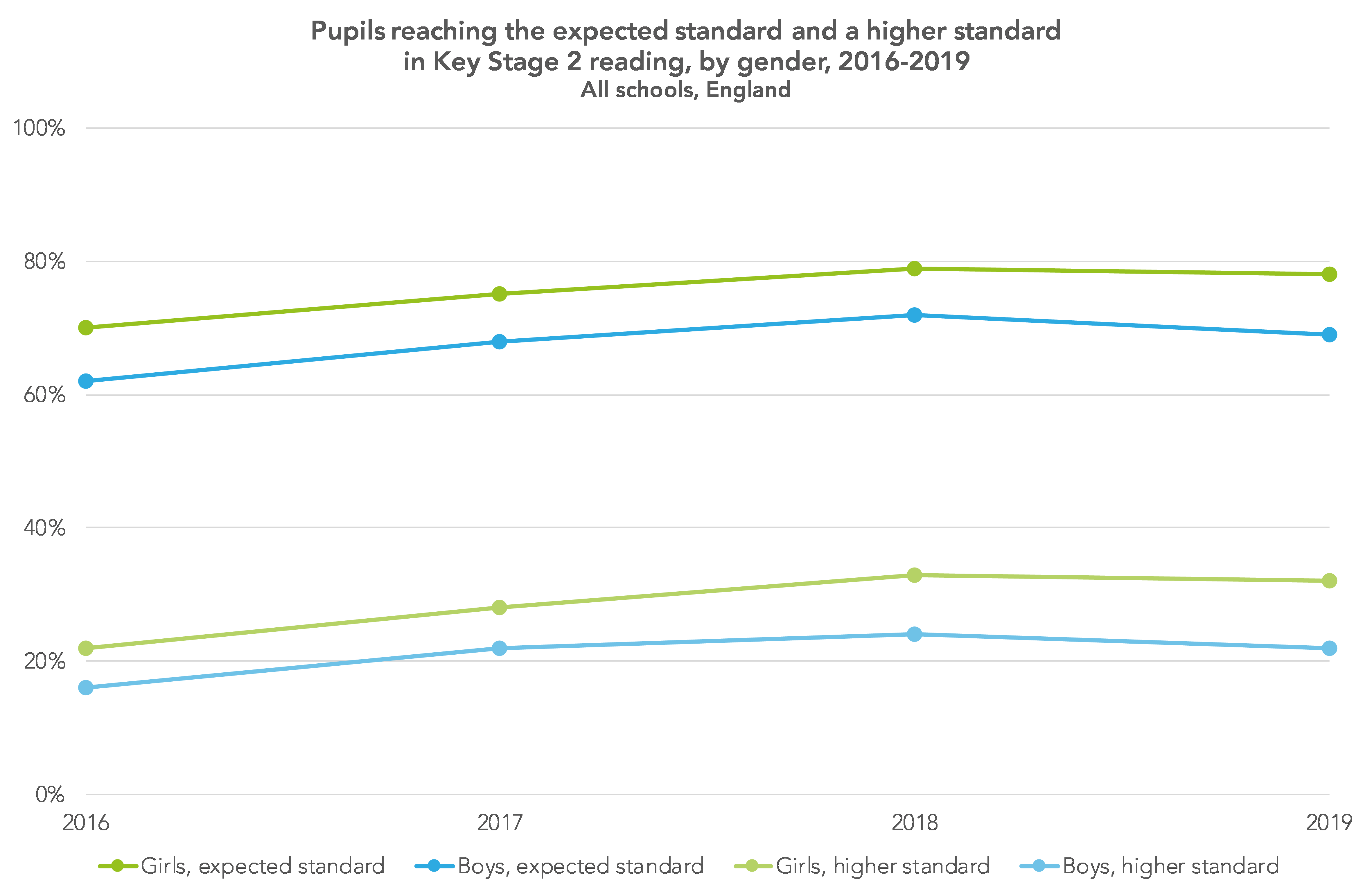
A sizeable gender gap exists – in girls’ favour – at age 11. In 2019, this stands at 10 percentage points when we look at the proportion of pupils at the expected standard in reading, writing and maths combined (60% of boys achieved this standard, while for girls the figure is 70%). The gender gap last year was 7 percentage points.
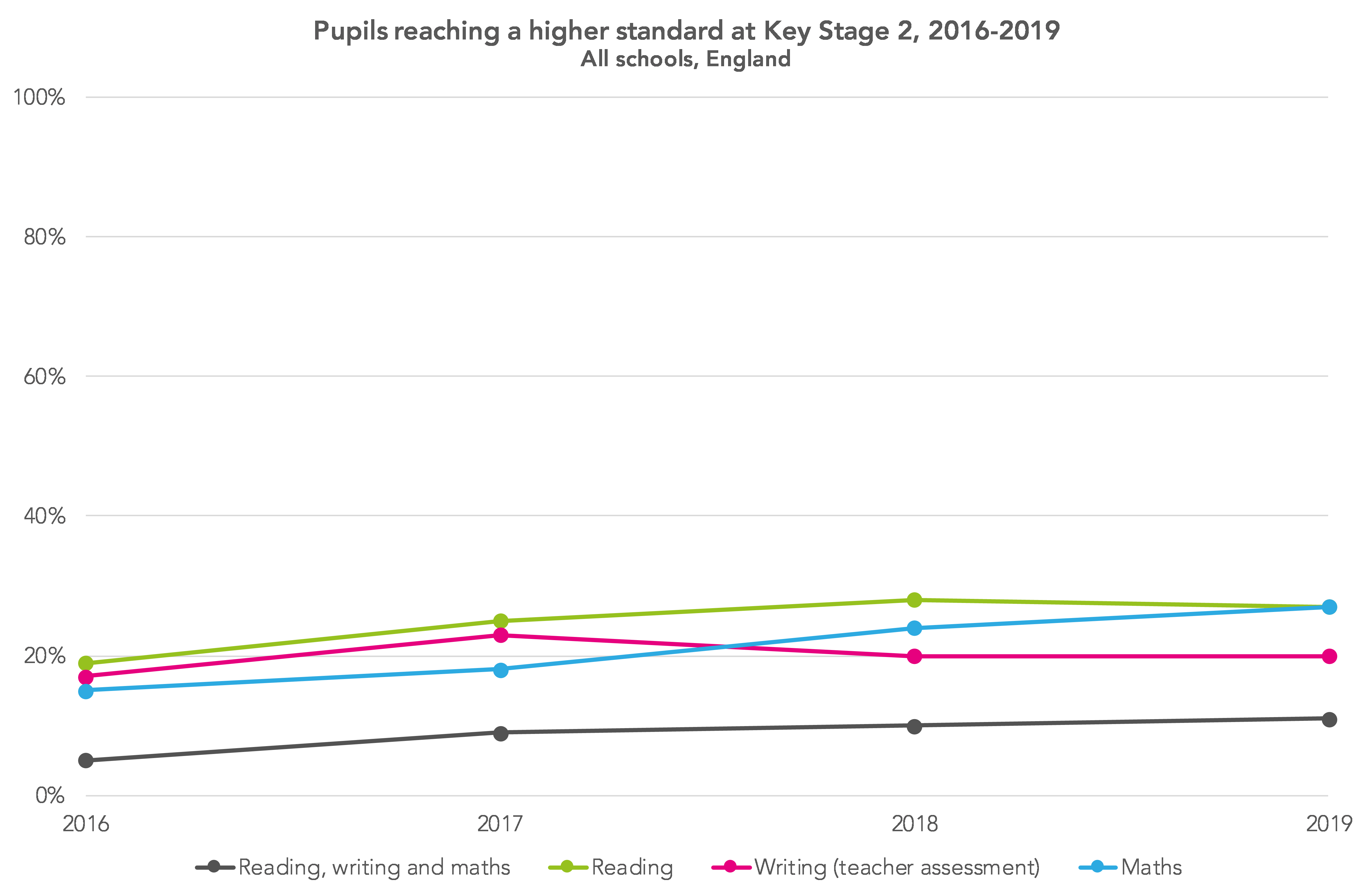
If we look at the proportion of pupils working at a higher standard, the gap is smaller at 4 percentage points (9% for boys and 13% for girls).
Gender gaps in girls’ favour exist in each of the components of the KS2 SATs, with the gap greatest in writing and smallest in maths.
The driver for the overall increase is a widening of the gender gap for reading, which we noted last month based on data from FFT Aspire’s Early Results Service. Boys are now 9 percentage points behind girls at the expected standard (69% versus 78%), up on a 7 percentage point gap last year, as the chart below shows.
There was also a small increase in the gap at the higher standard in reading – up from 10 percentage points from 9 percentage points, based on 32% of girls achieving this standard and only 22% of boys doing so.
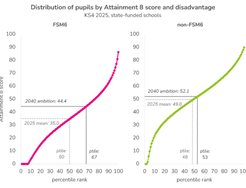
Disadvantage gaps
This year the Department for Education has published data on the Key Stage 2 disadvantage gap much earlier than usual, and it appears that the gap narrowed only fractionally this year = see the chart below.[2]
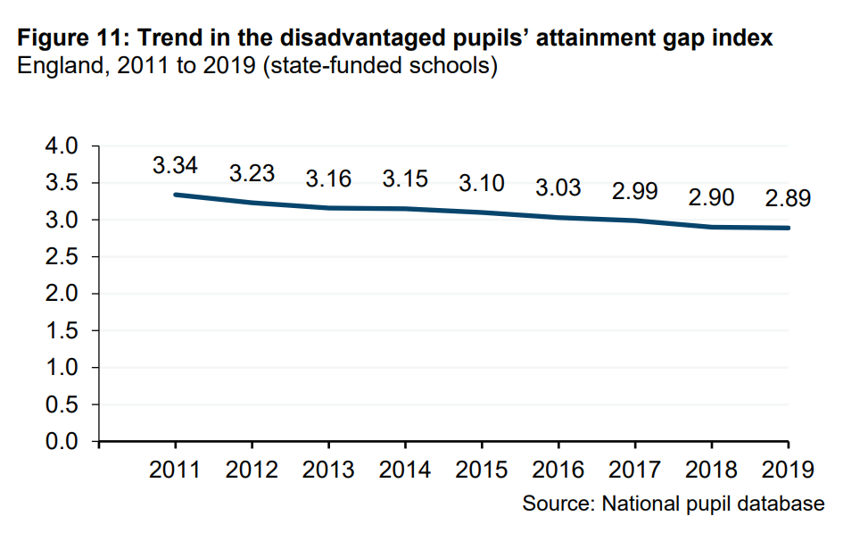
Looking over the long-term, however, since the introduction of the Pupil Premium, there is a fairly consistent narrowing of the gap. The tiny change in the gap in 2019 is not unprecedented; a similar thing happened in 2014.
Regional variation
We might wonder how results have changed at a local authority level since 2016, when the new KS2 assessments came in.
The interactive chart below show the percentage of pupils meeting the reading, writing and maths expected standard in 2019, compared to 2016.
There is a strong correlation between results in the two years, though for a number of local authorities there have been increases of 15 percentage points or more. Those with the biggest increases – including Knowsley, Hartlepool, Swindon and West Sussex – all had results below or around the national average in 2016.
While on the face of it a good thing, we need to be a little careful when working with threshold measures, which measure the proportion of students reaching a certain standard.
As we’ve written before, they effectively give great focus to the group who’ve been slightly below the threshold in previous years. So if there have been lots of pupils just below the threshold in previous years, there’s greater potential for increases in future years.
Taking a step back, as we can see from the chart below, there has been little change in the rank order of the different regions.
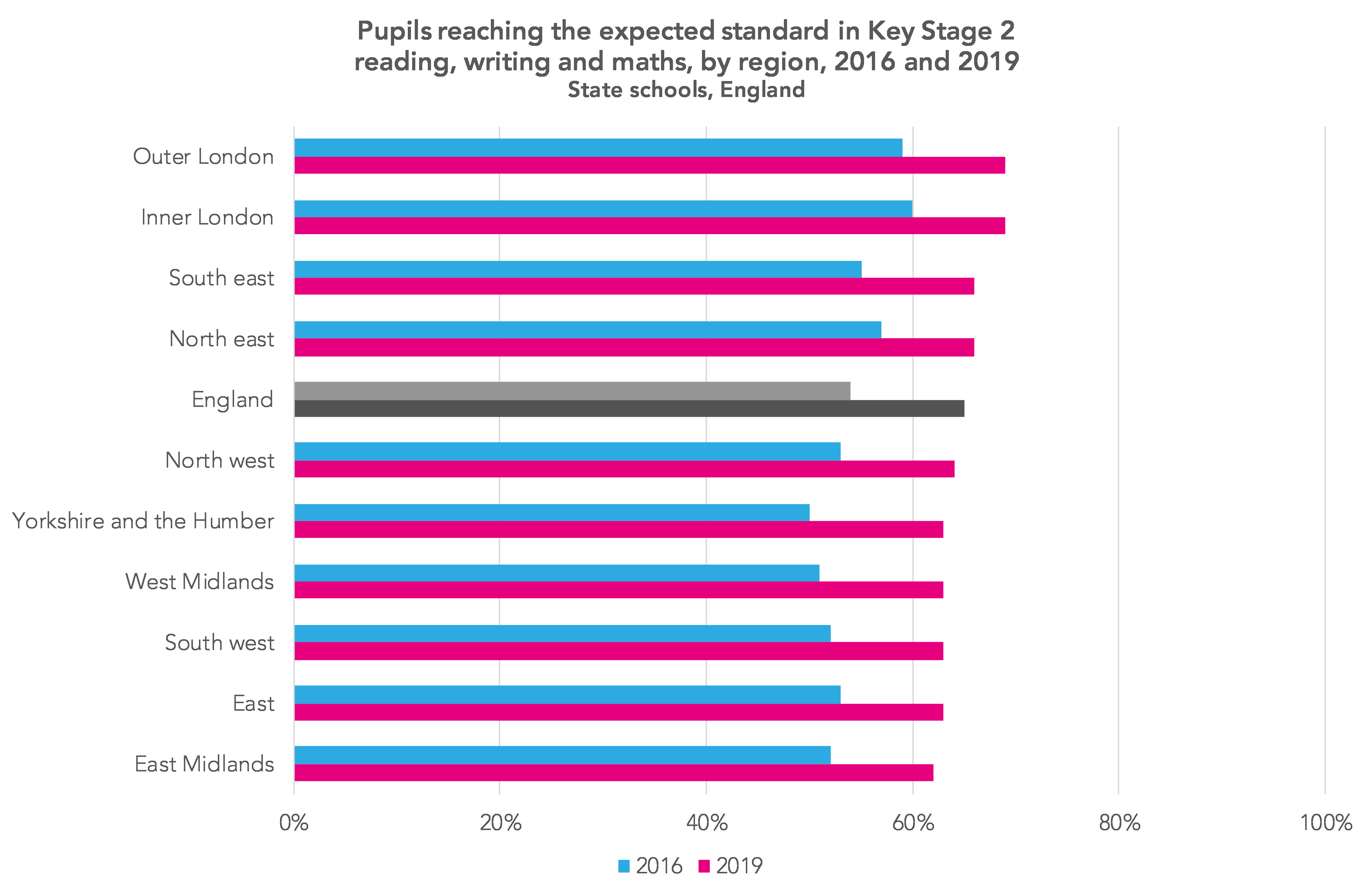
Compared to 2016, there’s been a slight narrowing of the range between the different regions. In 2016, there was a gap of 10 percentage points between inner London (60% at the expected standard) and Yorkshire and the Humber (50%). In 2019 that stands at 7 percentage points, with inner and outer London and the east Midlands at the two extremes (69%, 69% and 62% respectively).
One thing that might come as a surprise to those who aren’t regular readers is the performance of the north east – the other region, alongside inner and outer London and the south east, with a greater percentage of pupils reaching the expected standard in reading, writing and maths than the national average.
Looking at the north east in greater detail, it’s a case of almost all local authority areas in the region having a greater proportion of pupils at the expected standard in reading, writing and maths than the average for England, as the chart below shows.
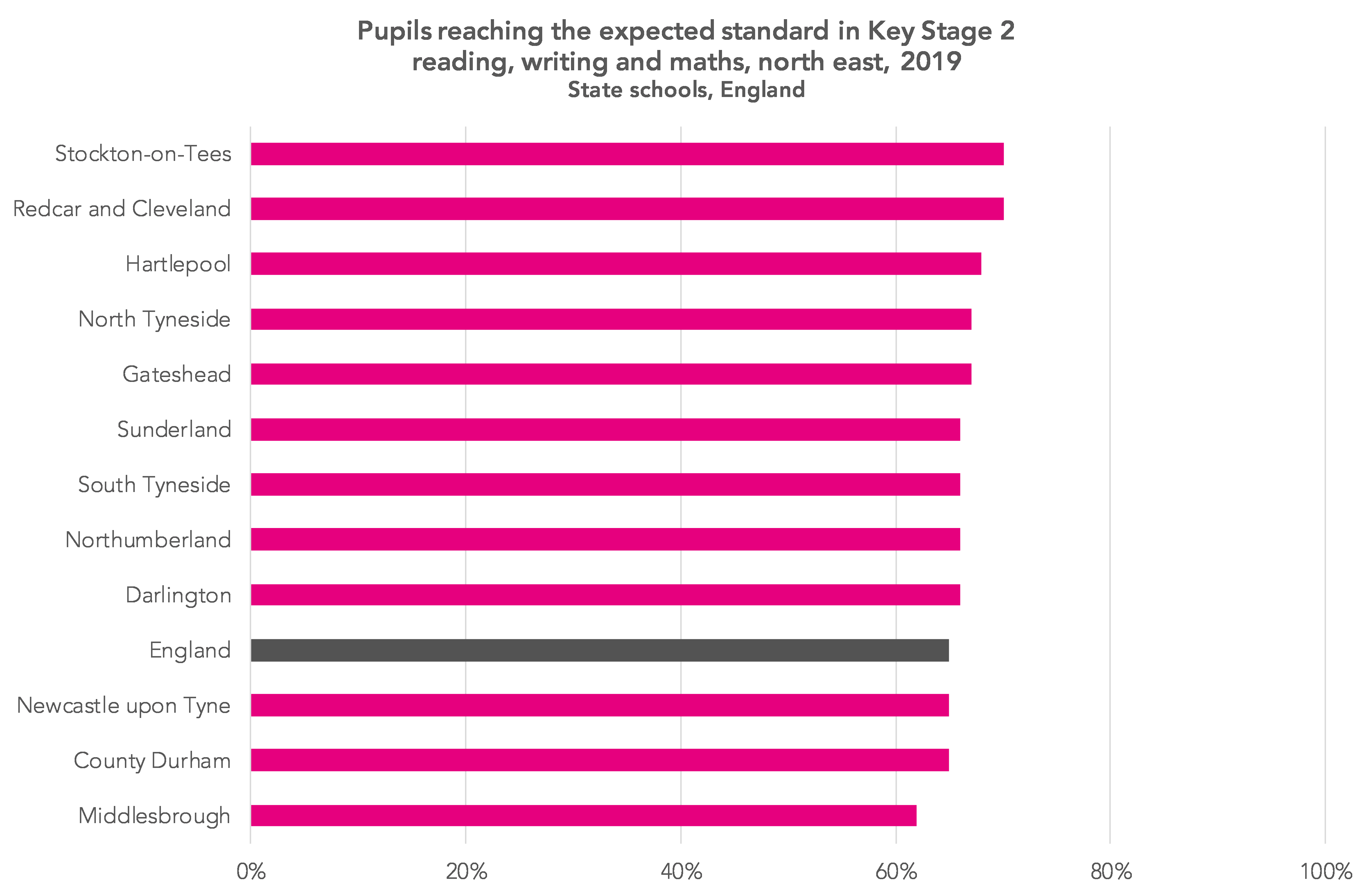
As we wrote in 2016, it’s hard to point to any one factor that explains this high performance. Among the possible explanations are high teacher workforce stability, with those teachers being more experienced than in some other parts of the country, together with less school system reorganisation. But there may well be other explanations – if you think there are, do leave them in the comments section below.
Phonics
This year’s KS2 cohort was the third to have taken the Year 1 phonics check.
Although a higher percentage of the cohort met the expected standard in the phonics check than the previous cohort, attainment in reading at Key Stage 2 nonetheless fell.
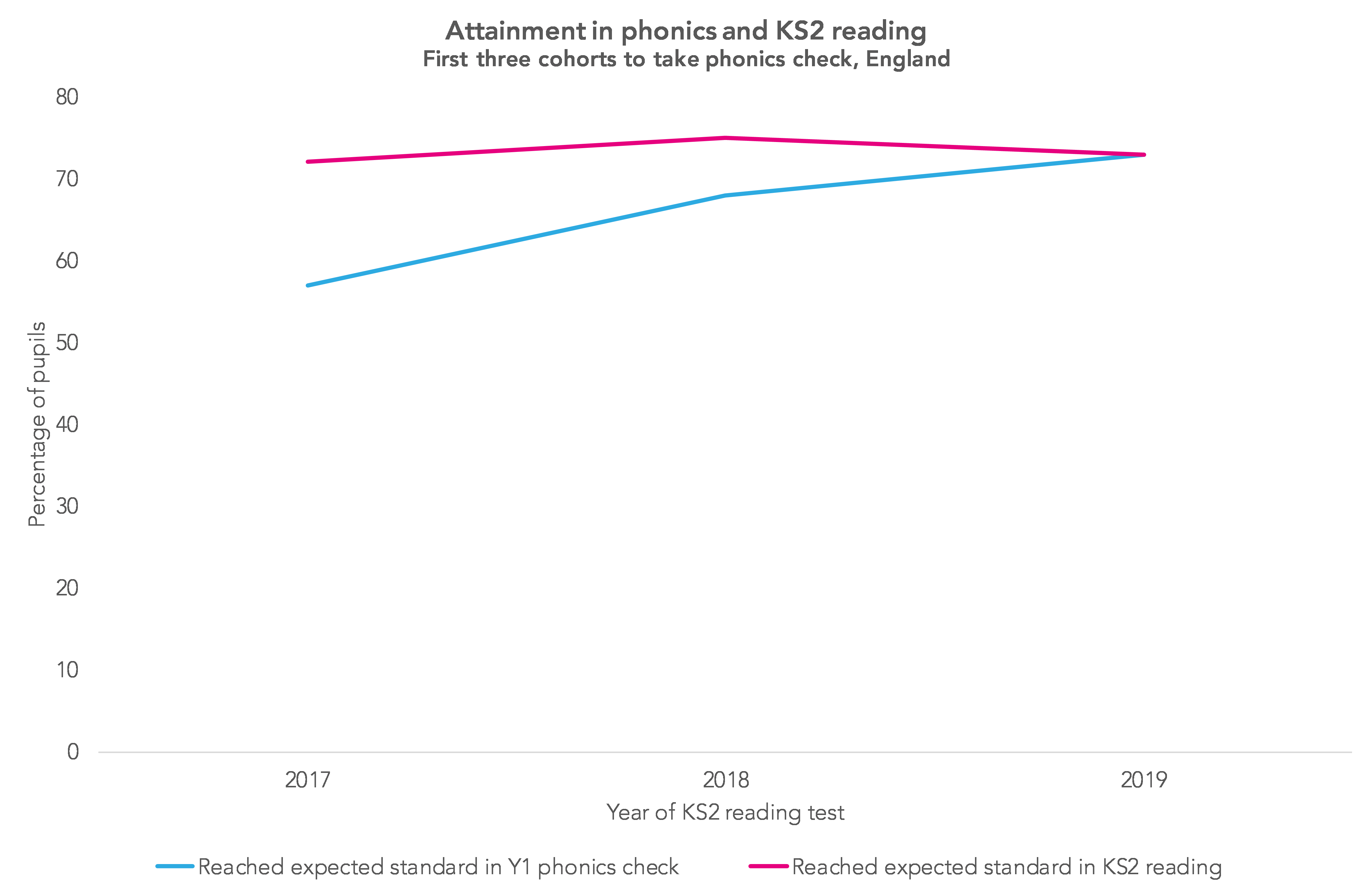
So if phonics improves reading, and phonics results have been improving, why do we not then see an improvement in Key Stage 2 reading?
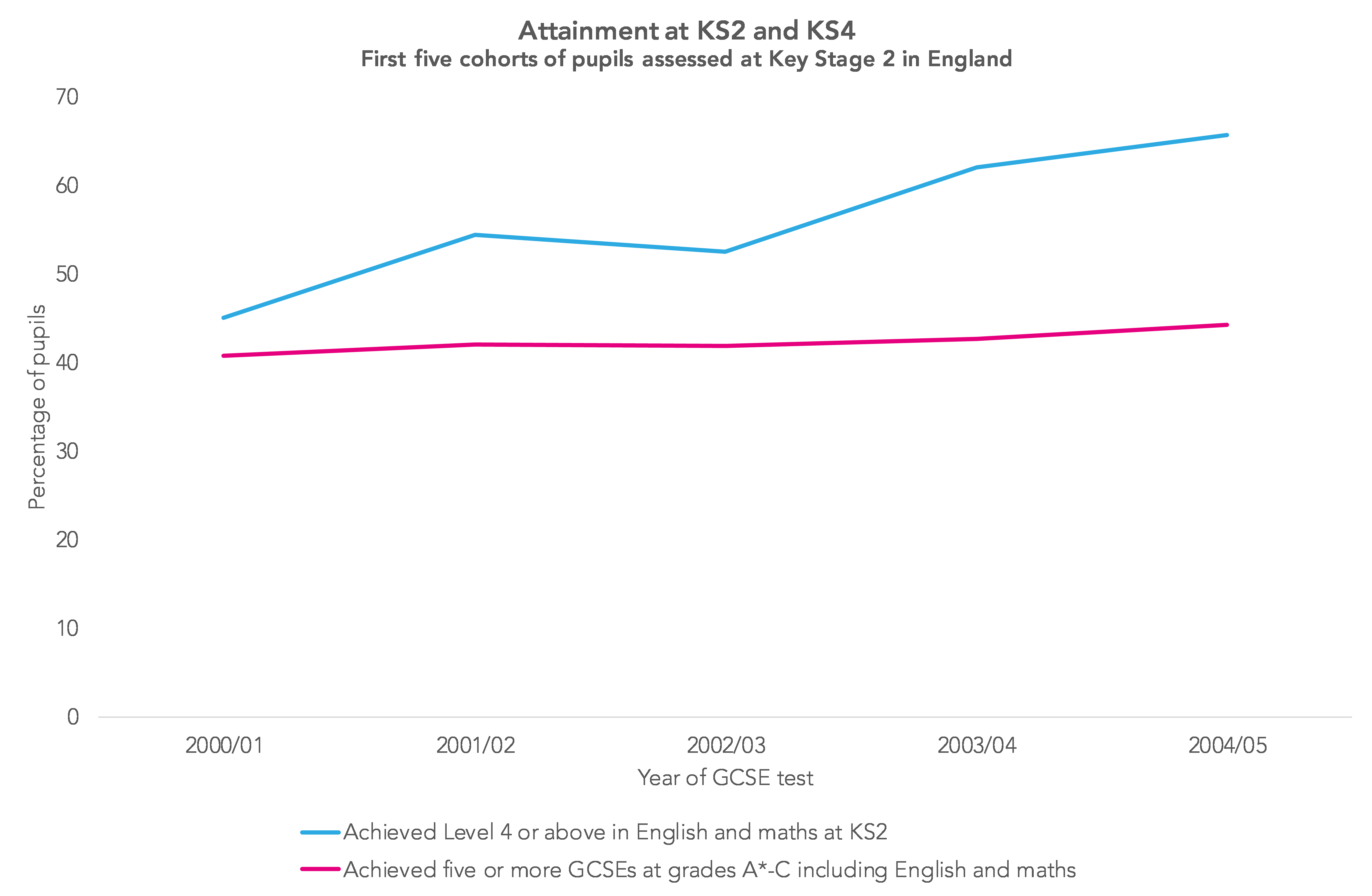
One possibility is that it takes time for a new assessment to bed in. If we look back to when Key Stage 2 testing was introduced in the mid 1990s, we see fairly rapid improvements in results but no overall improvement in GCSE attainment five years later.
As the phonics and Key Stage 1 statistical release shows, the percentage of pupils meeting the expected standards in the phonics check improved rapidly in the first five years, from 58% in 2012 to 81% in 2016. Since then, it has hardly changed.
It’s probably not worth reading too much into the relationship between assessments of phonics decoding and Key Stage 2 reading just yet.
Want to stay up-to-date with the latest research from FFT Education Datalab? Sign up to Datalab’s mailing list to get notifications about new blogposts, or to receive the team’s half-termly newsletter.
1. One thing to say – in most of the charts, and most of the analysis in this post we’re comparing things over the period 2016-2019. The writing teacher assessment framework changed between 2017 and 2018, so in theory figures for the periods before and after this change aren’t comparable – but we don’t think the change had a serious impact on comparability.
2. In their release, the Department states that these figures do not yet include the small number of children in care in the disadvantaged group.
Leave A Comment