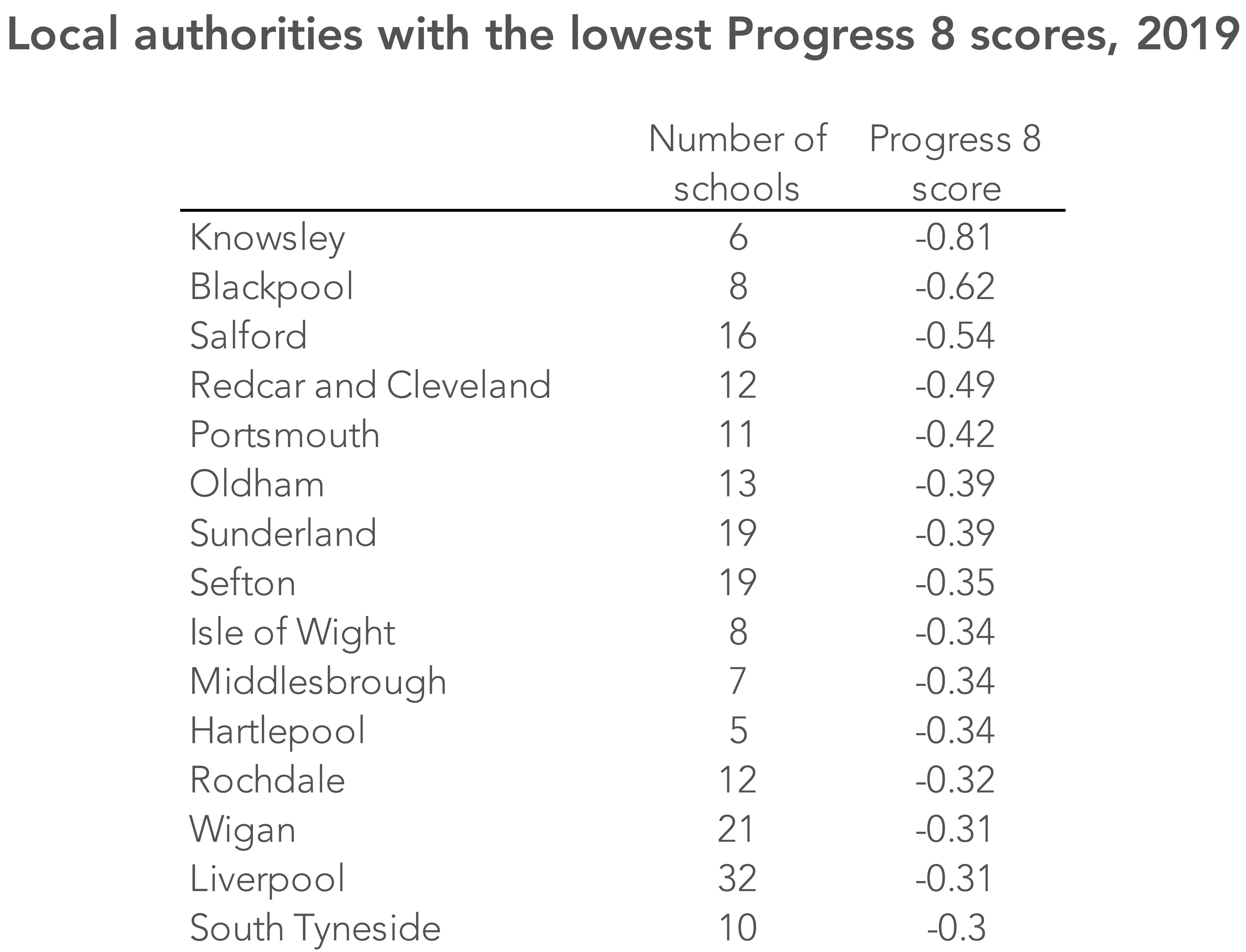
The recent publication of the secondary school league tables saw Knowsley at the bottom of the list for Progress 8 – a position it has held since the P8 measure came in in full in 2016. The table below shows the fifteen local authorities with the lowest P8 scores in 2019.
We’re written before about the circumstances that make boosting attainment and progress particularly challenging in Knowsley’s six schools.
But it got us thinking – are there clusters of six schools elsewhere in England with similarly low progress scores?
Creating small alternative local authorities
Identifying clusters of schools like this is more than just an academic exercise. Such clusters aren’t easily recognisable from existing data, and in some cases will span local authorities boundaries – important if you live in an area with such a cluster, but not following the neat geography on which results are reported.[1]
The map below shows all clusters of six or more schools that have an average P8 score of -0.5 or below. That is, every secondary school is grouped with its five closest neighbours and an average P8 score is calculated for the group. A school is shown on the map if it is part of a cluster with an average P8 score of -0.5 or less. (This equates to being half a grade below the national average in each of the eight subjects counted in the P8 performance measure.)
Many of the clusters are where local authority-level data would lead us to expect: Blackpool, Portsmouth, Liverpool and others.
But the map also brings to light some things that are otherwise disguised in published statistics.
There are two overlapping clusters of six schools with low P8 scores in the north-east of Kent – one in the Broadstairs area with an average score of -0.6 and another centred a little along the coast from Margate on -0.54. (Clusters overlap where the five schools closest to school X overlap with the five schools closest to Y – and, for the purposes of this exercise, the clusters around both school X and school Y have P8 scores below -0.5.)
That is lost in statistics for a large local authority like Kent.
And in the north-west of England there is a large area stretching west of Salford, encompassing parts of Bolton and Wigan where clusters of schools all have average P8 scores below -0.5.
Loosening the criteria
Things get more interesting still when we loosen our criteria a little more.
The next map shows clusters of six or more schools that have an average score of -0.4 or less.
Several new areas now come into focus, including clusters of schools in London, south Bristol and more bits of Kent.
The upshot
It’s worth bearing a few things in mind here.
Firstly, in some cases, pupils living near a school on the edge of one of these clusters may choose to travel further to attend another school. Knowsley is an extreme example, but the latest figures available show that 3,854 of the 8,512 (45%) secondary age pupils who live in Knowsley attended school in a different local authority in 2019. But travelling to a school outside the boundary of these clusters isn’t an option that’s open to all.
Secondly, Progress 8 is a measure of school performance not without problems – something we have written about many times. Perhaps chief among these is the fact that it takes no account of school context apart from pupils’ prior attainment. But it will continue to be used by the Department for Education as a way of deciding what support/chastisement schools get (we’ll have to see what balance the new government decides to strike). And it will still form part of the decision-making process for parents.
Finally, even though we can identify these clusters, that doesn’t necessarily mean that specific policy interventions should be targeted at those areas. Measures that successfully improve the attainment of all lower-attaining pupils would be more effective than geography-based interventions.
Want to stay up-to-date with the latest research from FFT Education Datalab? Sign up to Datalab’s mailing list to get notifications about new blogposts, or to receive the team’s half-termly newsletter.
1. It’s worth saying that small local authorities are more likely to have more extreme results – whether positive or negative, as things are averaged out more in larger local authorities. Funnel plots are a good way of displaying data in cases such as this, where the size of the groups being observed varies considerably.

Leave A Comment