We’ve been hard at work over the past few months giving our Schools Like Yours tool a makeover.
For the uninitiated, Schools Like Yours is a free tool designed to help you benchmark your school against similar schools, giving you if not complete freedom then a lot of options to decide what “similar” means to you.
As well as adding some new functionality to the tool, we’ve also updated all of the underlying datasets, including adding last week’s Key Stage 4 data.
To celebrate, we thought we’d run through an example scenario of how you could use Schools Like Yours to put your Key Stage 4 results into context.
How does my school’s 2022 KS4 performance compare with schools with similar demographics?
After searching for our school in the search bar, the similarity criteria we can choose are on the left-hand side of the screen.
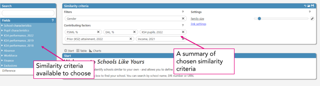
Because we’re looking to benchmark our school’s most recent Key Stage 4 results, I’m going to look for schools whose Key Stage 4 cohort was most similar to ours.
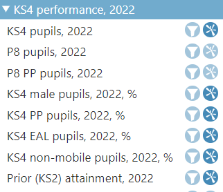
First, let’s add the size and prior attainment of the Key Stage 4 cohort, and the proportion of boys, disadvantaged pupils, EAL pupils and non-mobile pupils. We add these as “contributing factors,” in other words, we want all of these criteria to be used to decide how similar another school is to ours.
We also add these criteria to the view by clicking their names and dragging them into the table on the right.
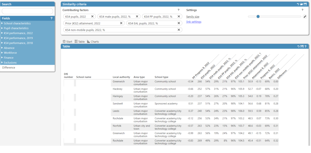
Already this is useful! We can see the range of Progress 8 scores in schools whose cohorts were most similar to ours. If we wanted, we could add other aspects of performance to the view too – scores in the different pillars of Progress 8 perhaps, to pick out areas of particular strength and weakness.
As well as using “contributing factors”, some data items are able to be used as “filters”. Let’s add distance as a filter to limit our group of schools to just those who are nearby.
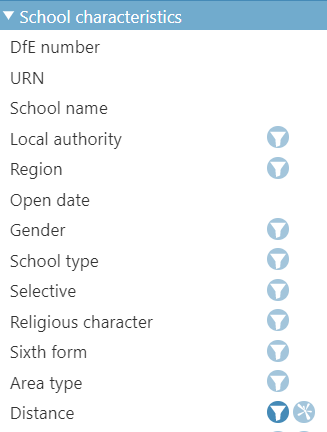
Once we’ve done this, we can click on its name in the top panel, and choose a value. In this example we’re limiting the group to schools within 40km of ours (as the crow flies).
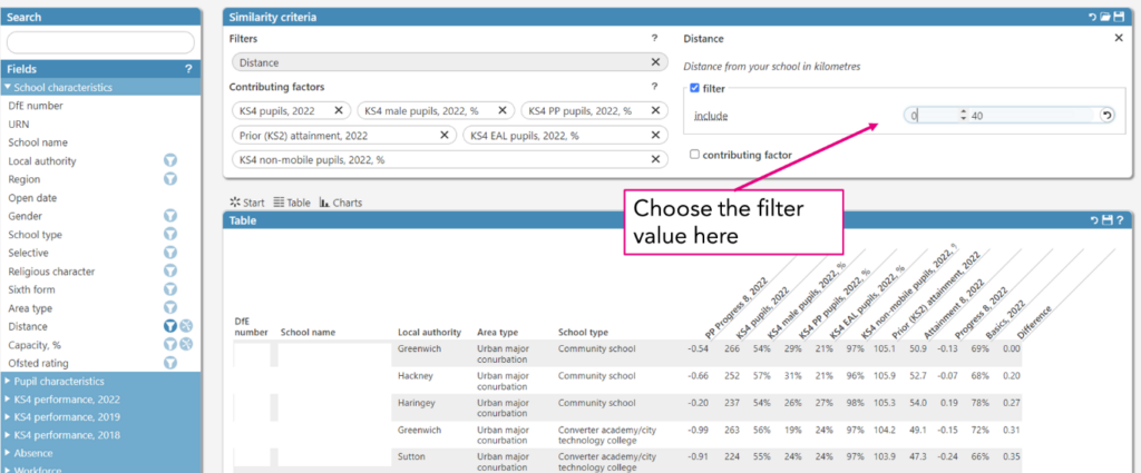
We could add other filters too. Perhaps our school is rated “Good” by Ofsted, and we’d like to see similar schools who are rated “Outstanding”. Perhaps our school is in a coastal area and we’d like to compare with other coastal schools. Perhaps we’re a single sex school and we’d like to compare with other single sex schools. All of these options are possible by adding them as filters to the similarity criteria.
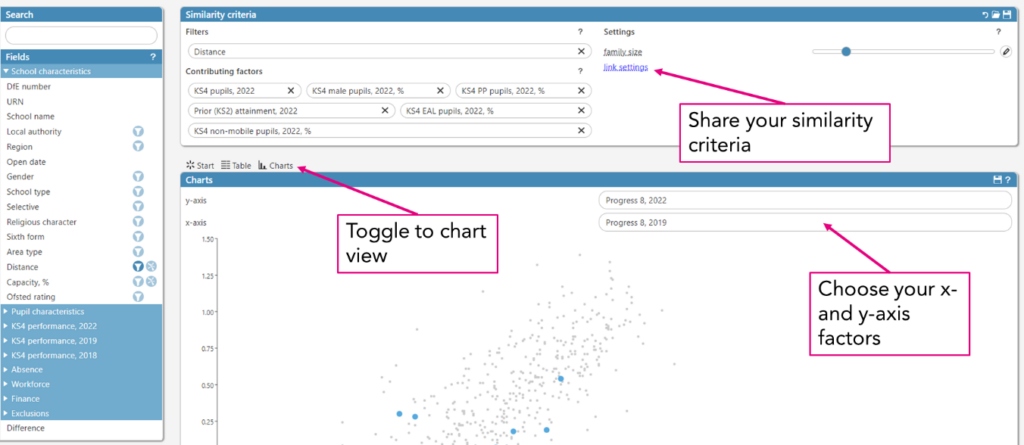
Once we’re happy with the view, we can export the results to a csv by clicking the save button in the top right-hand corner. Or, if we wanted to share the criteria we’ve selected with a colleague, we can right-click “link settings” in the top panel, and copy and paste the address of the page out. Like this.
We can also see how our school compares to our chosen group of schools in the form of a chart by clicking “Charts”. This too can be exported.
Other things we could do
Schools Like Yours isn’t limited to performance data. You can also explore school workforce, absence, exclusion and finance data. For example, you might want to see how the percentage of qualified teachers varies for schools in your local area, or among schools with similar levels of disadvantage.
And it’s not only for Key Stage 4 schools. We have a site for Key Stage 2 and special schools too. However, we must admit that there isn’t much new stuff for primary schools since school-level Key Stage 2 results have not been published this year.
If you’ve got any feedback on features new or old, or suggestions for future improvements, please get in touch.
To use Schools Like Yours, simply follow this link to the tool and get started today.
Is there a feature to compare the difference in progress 8 between 2019 and 2022? I can see it on the chart tool, but this doesn’t allow us to see which schools have made the largest increases.
Hi Jen- no, sorry, that’s something slightly different to what the tool does. If you send us an email at educationdatalab@fft.org.uk we’ll send you some data.