Absence has been high since the start of the pandemic. And there doesn’t seem to be much in the latest data to suggest a return to pre-pandemic norms any time soon.
Naturally, this raises concerns about the possible impact of high absence rates on outcomes. So today we’ll look at the relationship between absence and Progress 8 scores in 2022.
A note about the data
The data I’ll use is from the National Pupil Database, and covers pupils who completed Key Stage 4 in 2022, linked to absence data from 2020/21 and 2021/22.
The absence data I have doesn’t contain the number of sessions coded as “X” in registers, used for pupils who were unable to attend because of COVID (apart from those who tested positive themselves – they tended to be marked as ill). As a result, the figures here will ignore school closures due to the national lockdown of 2021, “bubbles” bursting en-masse in Autumn 2020 and Summer 2021, and any other days missed due to mandatory isolation[1].
Absence in Year 10 and 11
I start by calculating the percentage of sessions missed due to absence across Year 10 and 11 for each pupil who appeared in Key Stage 4 performance tables in 2022[2]. The averages and distributions are shown below.
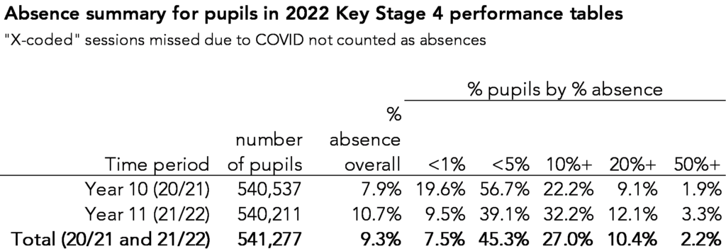
Overall, across Year 10 and 11, pupils missed 9.3% of sessions due to absence. 27% of pupils were persistently absent, missing at least 10% of sessions over the period. And around 2% were severely absent, missing more sessions than they attended.
Absence was lower in Year 10 than 11. But because excluding “X” coded sessions impacts the Year 10 figures more than Year 11 this isn’t meaningful.
Absence and Progress 8 are correlated
I now calculate the correlation between pupils’ absence and their Progress 8 scores. A coefficient of -1 indicates perfect correlation (every pupil with a high absence rate has a low P8 score, and vice versa) and 0 indicates no correlation (pupils’ P8 scores are random). Here are the results:
- Year 10 absence vs Progress 8 score: -0.43
- Year 11 absence vs Progress 8 score: -0.49
- Year 10 and 11 absence vs Progress 8 score: -0.50
These scores indicate a moderate correlation between absence and Progress 8 score. That is, some of the differences in pupils’ Progress 8 scores are related to differences in absence rates, but not lots[3].
We can make these correlation coefficients more tangible by calculating the average Progress 8 scores among pupils with similar rates of absence.
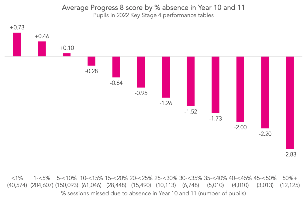
The relationship between higher absence and lower Progress 8 scores is clear. Pupils who missed less than 1% of sessions across Year 10 and 11 had an average P8 score of +0.73, while those who missed 50% of sessions or more had an average score of -2.83. (That the first negative average score is seen after the boundary for “persistent absence” is coincidental.)
Of course, these are just averages. Plenty of pupils with very low absence rates achieved negative Progress 8 scores, and vice versa. (32% of pupils who missed less than 5% of sessions had a P8 score of less than zero, and 29% of those who missed at least 10% had a score greater than zero.)
What happens to Progress 8 if we discount pupils with high absence rates?
To see the impact of pupils with high absence rates on schools’ Progress 8 scores, I recalculate each school’s Progress 8 score but I discount any pupils who missed 20% of sessions or more across Year 10 and 11 – around 10% of the cohort overall. Then I compare the recalculated scores with the original scores.
The plot below groups schools by their original Progress 8 score, and shows the percentage of schools whose score improved by less than 0.1, at least 0.1, at least 0.2 and at least 0.3 when discounting pupils with high absence rates.
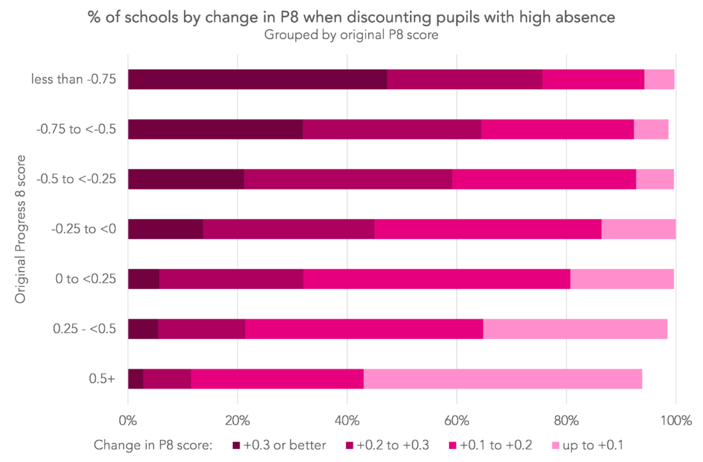
Schools with the lowest Progress 8 scores tended to see their scores increase the most. Almost half (47%) of schools with scores below -0.75 saw increases of at least 0.3, compared with 3% of schools with scores of +0.5 or higher. In fact, a lot of schools with the highest scores saw very little change, while this was true for only a handful of schools with the lowest scores (51% of schools with a P8 of at least +0.5 saw increases of less than 0.1, compared with 5% of schools with a P8 of less than -0.75).
Not shown on this chart, there were some schools (18) where Progress 8 actually went down slightly.
Relationship between absence, disadvantage, and outcomes
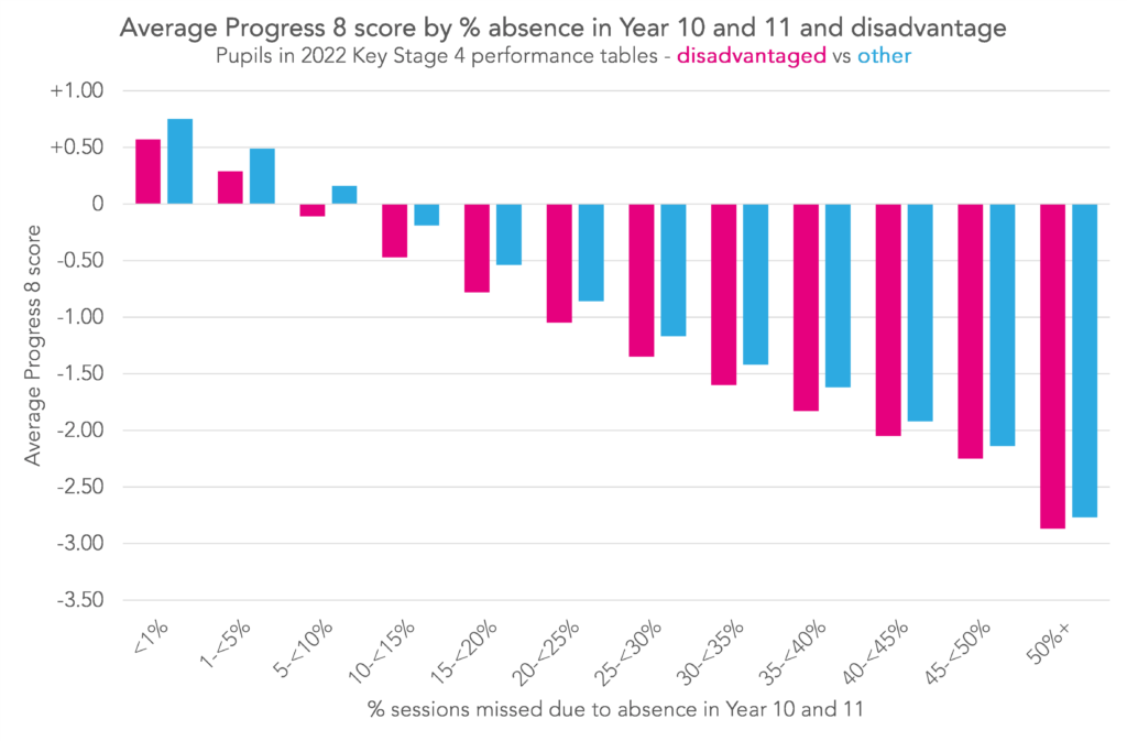
To finish, we’ll look at how outcomes varied by absence and disadvantage. Below I again plot average Progress 8 score by absence in Year 10 and 11, but this time I plot disadvantaged[4] and other pupils separately.
I also plot the percentage of pupils by absence rate, again split by disadvantage.
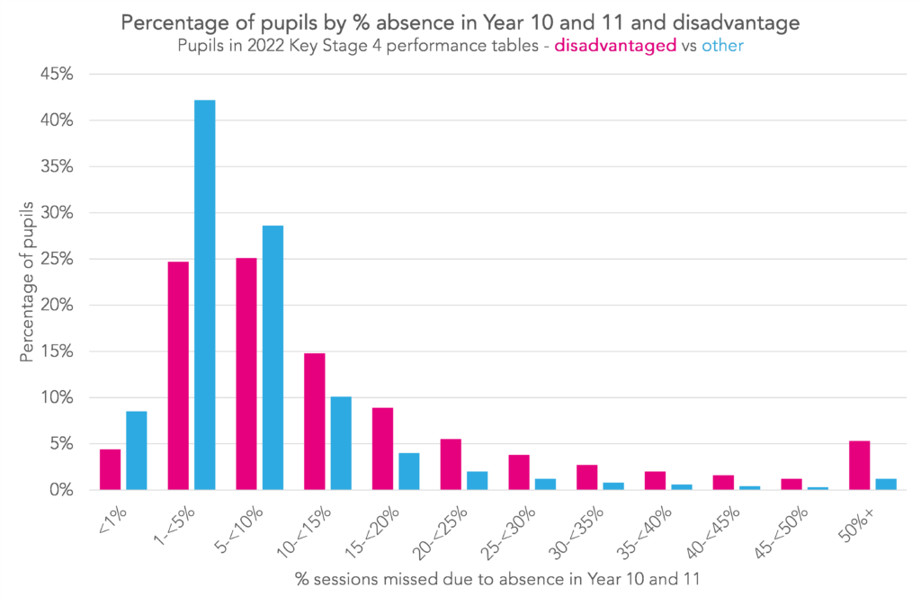
We can see two things here. First, disadvantaged pupils had worse outcomes than others even if they had similar absence rates. Second, disadvantaged pupils were more likely to have high absence rates than others. But which had the bigger impact on the disadvantage gap?
To find out, we’ll construct two thought experiments:
- Disadvantaged pupils achieved the same scores as other pupils with similar absence rates (i.e. the first chart here would show two series of bars of equal height, and the second chart would stay the same).
- Disadvantaged pupils had the same absence rates as other pupils (i.e. the second chart would show two series of bars of equal height and the first chart would stay the same).
Here are the results:
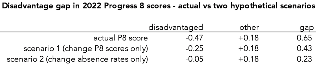
Naturally, neither scenario eliminates the gap completely. But changing disadvantaged pupils’ absence rates had almost twice the impact of changing their scores. Put another way, around 65% of the disadvantage gap was related to pupils’ absence rates, and around 35% to other factors.
Correlation vs causation
We’ve shown that, as expected, there is a relationship between absence and Progress 8 scores. And that this relationship accounts for around 65% of the disadvantage gap in Progress 8.
Crucially, we haven’t shown that absence causes low Progress 8 scores, or that 65% of the disadvantage gap is caused by disadvantaged pupils having higher absence rates. It’s possible that instead there is something unobserved which causes both higher rates of absence and lower Progress 8 scores (for example, stability of home environment). Most likely the truth is somewhere in between.
- They are included in possible sessions though, the denominator of absence
- Really I’m calculating absence in 2020/21 and 2021/22. For the vast majority of 2022’s KS4 pupils this is equivalent to Year 10 and Year 11.
- Because 20/21 and 21/22 were so disrupted by COVID, you might be worried about how reliable these results are. So I checked the equivalent figures for 2019’s Key Stage 4 cohort. The correlation of Progress 8 scores with Year 10 absence was -0.37, with Year 11 absence -0.40, and with Year 10 and 11 absence -0.42. Slightly lower, but similar to 2022’s cohort.
- Defined as pupils eligible for free school meals any time in the last six years (FSM6) at the end of KS4.
Want to stay up-to-date with the latest research from FFT Education Datalab? Sign up to Datalab’s mailing list to get notifications about new blogposts, or to receive the team’s half-termly newsletter.

Fascinating set of data yet again, thank you Katie.
I imagine if we could measure “ambition”, “enagement ” or dare Ii say it “enjoyment” it would correlate to both attendance and progress.
We have found it very hard to correlate atttendance and acttianment, I may play with P8 values in the summer.
Thanks Chas. Yes, absolutely, it’s a point we always try to emphasise when we do these types of analyses – although it could simply be that missing school causes lower attainment and progress (and it probably does to an extent), it’s more likely that there’s some unobservable quantity that correlates with both. I’d be interested to know what you find when you look at your P8 this summer vs attendance, particularly if you find no correlation again!
Great stuff, thank you Katie.
For the section where you look at the impact on P8 of removing pupils with high absence, did you recalculate A8 averages nationally?
Thanks Duncan. No, I just removed the pupils from each school’s calculation. So each pupil who remained had the same P8 score as they had before pupils with high absence were removed. It would be interesting to see how the picture would change if we removed them from all calculations completely, though. Perhaps a topic for another post.
Hi Katie, this is a fascinating article.
Are the data sets you used available anywhere, please?
Hi Richard. Glad you’ve found it useful. I’ve uploaded the data for each of the charts here (xlsx). Progress 8 by absence isn’t included in DfE’s published statistics (we created this dataset ourselves from national pupil database data) so we don’t have it for older or more recent cohorts, unfortunately.
Hi Katie,
Thank you ever so much for replying with the data, I really appreciate it!