Most of the time our work involves using the National Pupil Database to examine particular aspects of the education system. However, it can also throw up interesting insights into the state of the nation more generally.
Last year, we wrote about how the percentage of pupils eligible for and claiming free school meals (FSM) had fallen between 2002 and 2016, and in particular between 2013 and 2016 following welfare reforms and the introduction of universal infant free school meals. Today we publish an interactive map showing how rates have changed at a local area[1] level.
Click here to view the interactive map
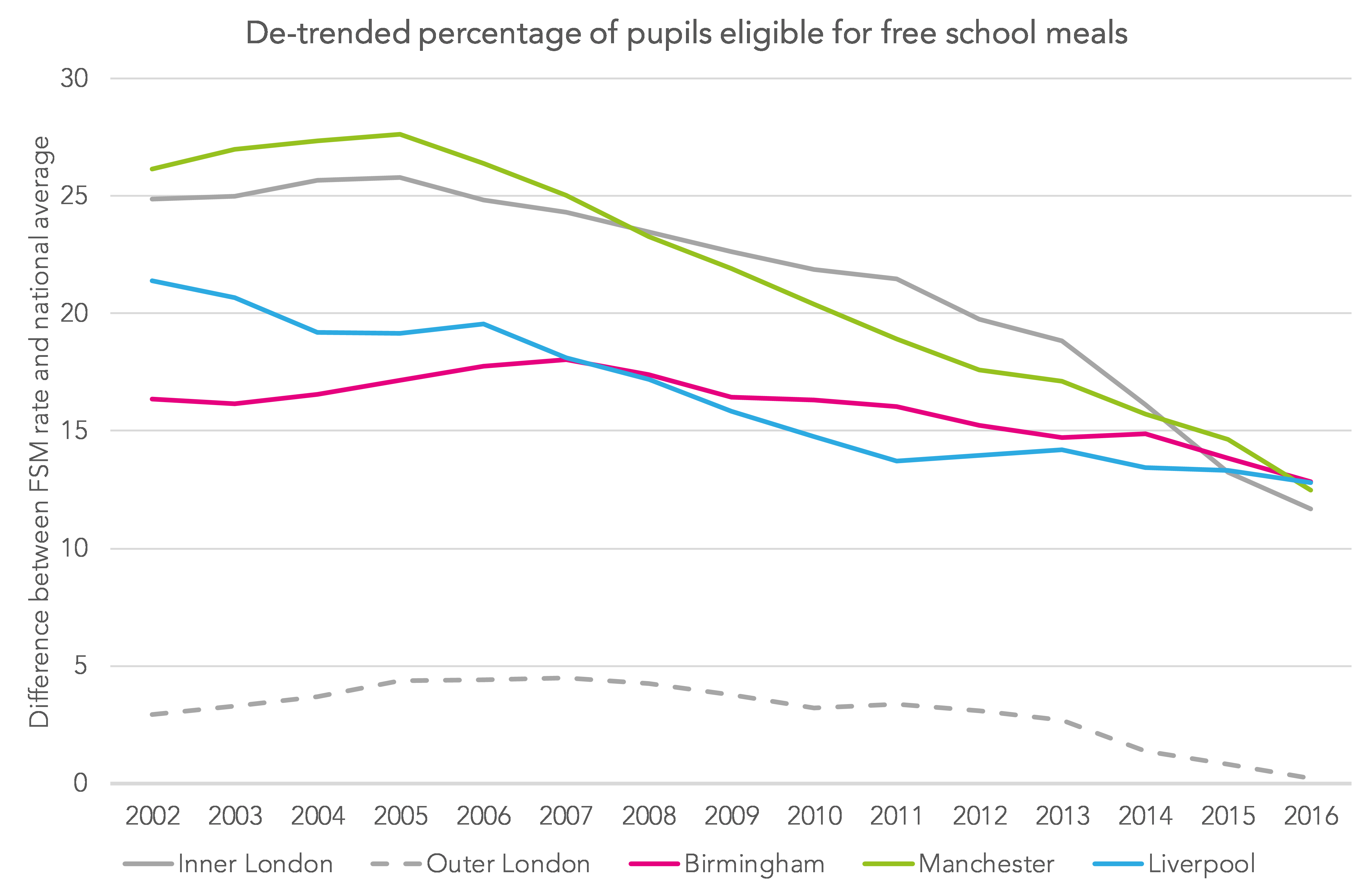
What is stark is the extent to which FSM eligibility has fallen in major cities in England.
It’s not just a London thing either.
There have been sizeable falls in Liverpool, Manchester and Birmingham too.
The falling FSM eligibility rate in major cities
Our analysis is based on pupils in Years 1 to 11 in state-funded schools.
The chart below shows the de-trended percentage eligible for free school meals – that is, the difference between the FSM rate for an area and the national average.
Changes in pupil populations in major cities
Alongside changes in FSM rates are some fascinating changes in the numbers of young people in each area.
These bring challenges in expanding (or reducing) the number of school places in response.
The chart below looks at the percentage change in the population relative to 2002.
In England as a whole, the number of pupils in Years 1 to 11 fell between 2002 and 2010, since when it has begun to increase again.
However, the size of the pupil population in London, Manchester and Birmingham has rocketed since 2010.
Meanwhile, the pupil population in Liverpool fell by 20% between 2002 and 2013, since when it has begun to increase.
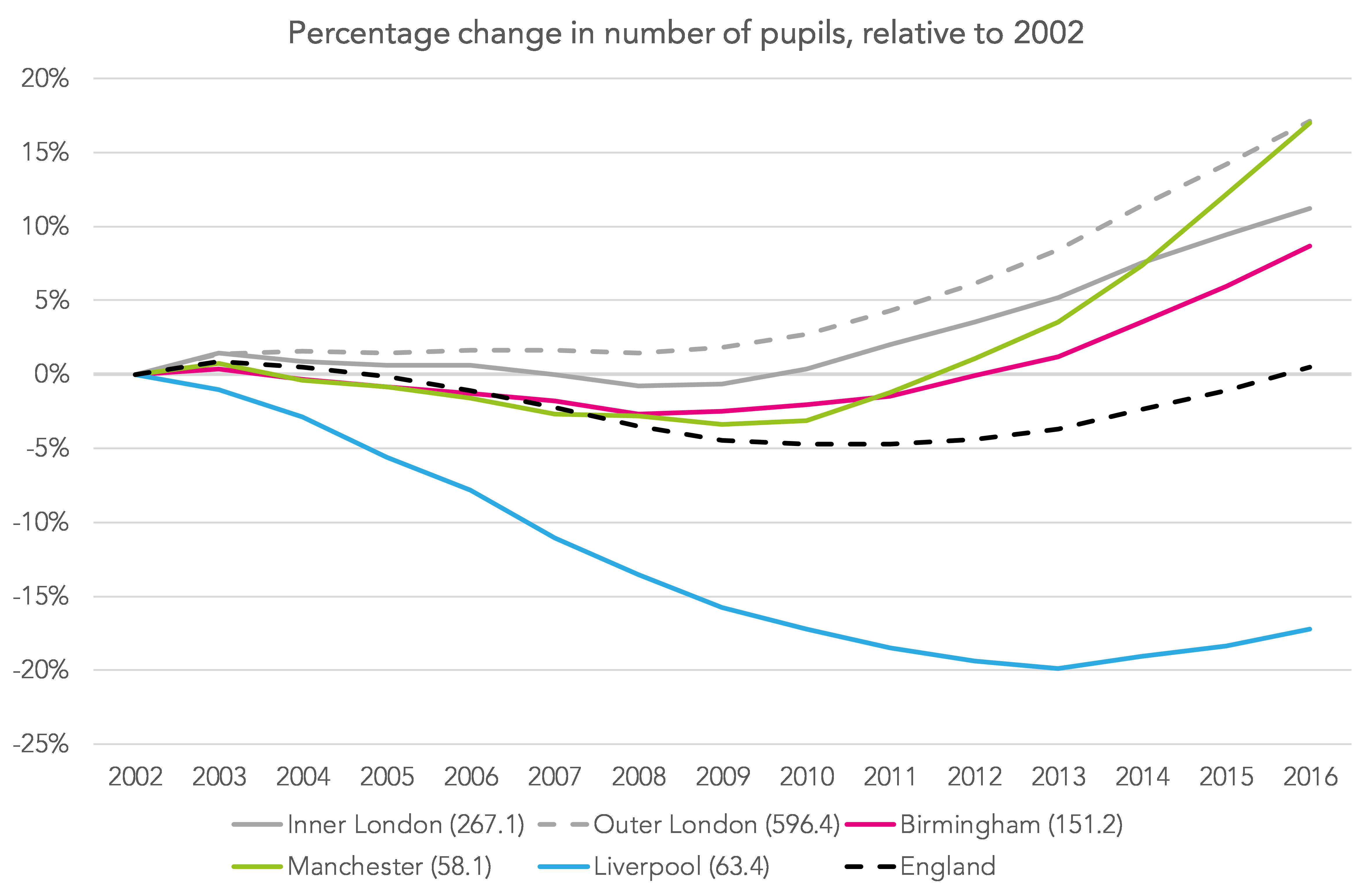
(Numbers in brackets are the Y1-Y11 population in January 2002)
But major cities haven’t changed uniformly
What is interesting is that, even within major cities, change has not been uniform.
The number of school-age children living in central Birmingham has increased, with the FSM eligibility rate falling at the same time.

There has been relatively little change in many outlying areas, though, and in some the FSM eligibility rate has in fact increased.
The same is true to some extent of Liverpool. The school-age population has grown in the very centre of the city (although relatively few pupils still live there). But elsewhere the population has tended to fall – and the FSM eligibility rate has fallen across the city.

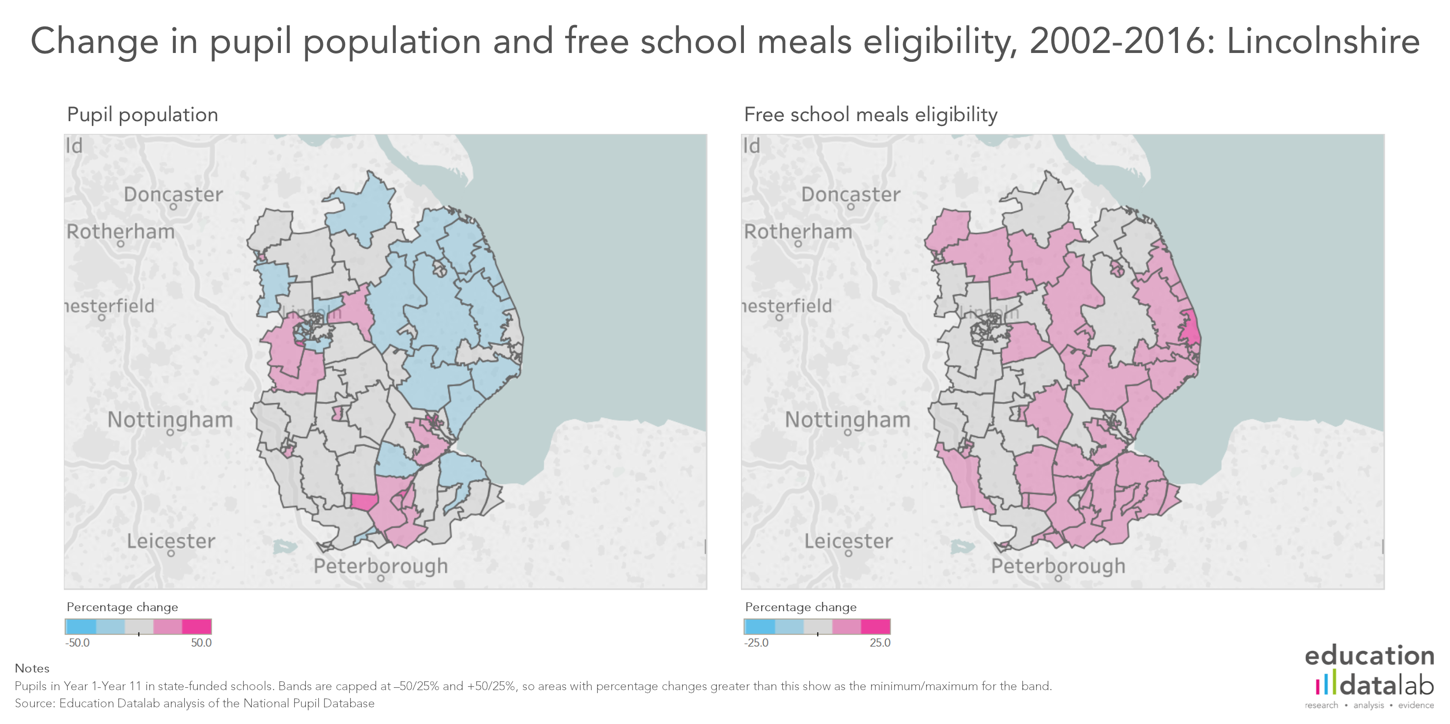
And some rural areas have become more disadvantaged
Whilst the FSM rate has tended to fall in most major cities, some rural areas have gone the other way.
The school-age population of Lincolnshire has become more disadvantaged. It has also fallen in size in the eastern part of the county.
Summing up
So what conclusions can we draw from this?
Firstly, it shows quite how much the demographics of an area can change in a little less than a decade and a half.
This change can be driven by any number of things: investment, migration and the labour market, among other factors.
Our map of the whole country shows that major urban centres have tended to become less disadvantaged over the period looked at. But a number of smaller urban areas have too: Bedford, Telford, Stoke-on-Trent and Grimsby, for example.
Little wonder the policy focus has shifted away from major cities. Initiatives from the earlier part of the century, such as London Challenge and Excellence in Cities, have given way to social mobility opportunity areas. Similarly, Teach First has expanded its reach beyond London and into rural and coastal areas. Whether resources have shifted accordingly is perhaps a matter for debate.
Do explore our interactive map, and share anything interesting you find in the comments section below.
Want to stay up-to-date with the latest research from Education Datalab? Sign up to our mailing list to get notifications about new blogposts, or to receive our half-termly newsletter.
1. Middle layer super output area (MSOA). There are 6,791 MSOAs in England. On average, 950 pupils live in each MSOA, but numbers vary. In 2016, the smallest MSOA had 16 pupils and the largest 3360. The standard deviation was 338. For more on MSOAs see: https://www.ons.gov.uk/methodology/geography/ukgeographies/censusgeography
Hi Dave, thanks for this insight. I would however be cautious about concluding that major cities have become less disadvantaged over the period looked at. I’m an LA education data officer working in a large northern city and our school census records over recent years have shown a similar pattern of declining free school meal (FSM) eligibility, but my experience from working with both headteachers and LA welfare and benefits staff, is that this is less about increasing affluence and far more to do with welfare reform since 2013. There has been a trend in our city for families to move away from the “passported” benefits that mean families quality for FSMs and into low-paid work, subsidised by Working Tax Credit. The exclusion of Working Tax Credit from the FSM eligibility criteria has meant that many children are no longer FSM-eligible directly as a result of their parents moving into Working Tax Credit, even though there may be very little change in the financial circumstances of their families. When I look at FSM rates alongside the percentage of children who live in the most deprived lower super output areas, they suggest very different things about deprivation in an area. Even in the most deprived parts of our city only 3 in 10 children now qualify for FSMs. I firmly believe that this is a reflection of national welfare policy, sadly not more stable financial circumstances for our most vulnerable families. Of course the consultation out currently about changing FSM eligibility criteria from April 2018 as a result of Universal Credit will change things again!
Thanks Becky- really appreciate your comments. There’s probably a bit of loose drafting on my part. All I was trying to get at was that the FSM rate had fallen by a greater amount in cities than elsewhere in England rather than cities necessarily becoming more affluent (although one or two might have). Will certainly be interesting to see how the picture shifts again with UC.
We see similar issues as you, Becky. Much of our LA is pale blue, and the grey areas are at least as negative as positive across the borough … but our experience on the ground is that deprivation is getting worse, not better, and families are struggling more now than ever. I dread to think what things must be like in areas where FSM is going up …
The Joseph Rowntree Foundation would certainly agree that child poverty has been increasing since 2012 even though the national FSM rate has been falling. According to their latest Poverty Monitor Report, 30% of children in the UK lived in poverty in 2016, double the FSM rate in England. https://www.jrf.org.uk/file/50890/download?token=3jsCmyhA&filetype=full-report
Hi Dave, if you ever want to do some more work in this area, e.g., case studies of schools where the FSM change has been most pronounced, please do get in touch as this is an aspect of demographic change that we have been closely monitoring in my LA and would be very interested to work with others elsewhere in the country to explore the impact of this. I have some schools where deprivation as measured by the home postcode of pupils and indices of multiple deprivation is very high, yet rates of FSM eligibility are actually below the national average. We also have parts of the city with a high concentration of new arrival families who are not yet allowed to work or claim FSMs, plus some areas with many houses where multiple generations live together and the housing benefit is claimed by an adult in the household other than the child’s parent, and so therefore the parent does not meet the FSM qualifying criteria because the housing benefit is not in their name. It is complicated! Kind regards, Becky.
Thanks for this very useful map, Dave. It reflects very well what we see in our schools in terms of deprivation being subtly shifted from cities. Whilst you can see that the deprivation is still spread and all areas have some challenges you can also see that the pattern is clear across the country. We are experiencing this as people move from London to the surrounding counties and also interestingly as some London boroughs purchase housing in blocks out of London to rehouse some of their population. There are areas where there are big differences in levels of deprivation between neighboring localities. Do the numbers you have allocated e.g Rochford OO4 correspond with postcodes? We are doing some research into the changes in one of our schools and where on the IDACI bandings our pupils are. They are now almost exclusively in the top A and B categories and the impact this is having on the turnover of pupils in a small school is immense. Any further pointers much appreciated. Thank you for the great work you do at datalab. Debbie
Hi Debbie, thanks for your comment – very interesting to hear that your experience on the ground reflects what you’ve seen here. Your assumption here is correct – numbers by MSOA are based on pupil postcodes.
The introduction of the Universal Free School meal has certainly muddied the waters in EYFS and KS1: parents have to be reminded that they still need to apply for FSM eligibility if they are receiving certain benefits. Most don’t bother to apply because they see no tangible benefit in doing so ie their child is already receiving a free school meal. At my primary school, in a deprived coastal area, I have actively encouraged parents to apply for a FSM and we have seen an increase of 30% (30 pupils) in the number of eligible children since September 2017 – only because we have heavily promoted application for FSMs. Many schools do not have the manpower to do what we have done to raise awareness, despite the positive impact on school budgets that this can have.