This blogpost supports a new report available for secondary schools in FFT Aspire, but may be of interest to a wider audience.
Let’s imagine you’re a member of the senior leadership team of a school and you’re reviewing your school’s 2017 performance data. You decide to examine how pupils from each of your eight main primary feeder schools (those from which at least 10 pupils were recruited) performed using Progress 8.
To do this, you produce a boxplot of P8 scores for each of the eight schools (labelled A to H) such as that shown below, including a final box for pupils recruited from other schools, labelled O.
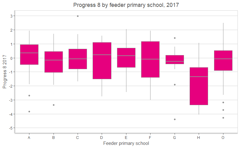
Your eye is immediately drawn to School H. On average, the pupils from this school went on to achieve a Progress 8 score of -1.9.
Assuming a notional 9-1 grading system for all qualifications, this equates to almost two grades per subject lower performance than that of pupils with similar prior attainment nationally. Just four pupils achieved a P8 score above 0.
Your curiosity is piqued.
How to interpret a box plot
The charts used here are box plots, a type of chart which most people are likely to recognise – but the details of which we may not all remember.
The line across the middle of the box is the median – the value which exactly half of results fall below, and the other half fall above. The box itself shows the range between the lower quartile – the value below which exactly a quarter of results fall – and the upper quartile – the value above which exactly a quarter of results fall. This definition means that exactly 50% of results are within the range of values covered by the box.
The difference between the lower quartile and the upper quartile is the inter-quartile range. The whiskers stretching out from the box reach to the maximum and minimum values, excluding outliers, which are shown as dots. Outliers are defined as results more than 1.5 times the inter-quartile range away from either the lower or upper quartile.
What were pupils’ KS2 results like?
Apart from a couple of outliers, pupils from School H achieved very high KS2 results, as the below chart shows.
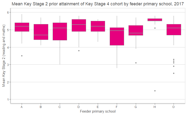
In total 18 of the 23 pupils from School H achieved an average fine grade of 5.5 or higher in reading and maths.
Was the 2017 Progress 8 score a one-off?
You decide to examine data from 2015 and 2016 as well. As Progress 8 is affected by pupil demographics such as disadvantage, you decide you’ll use a contextual value added (CVA) version of Progress 8, which we’ll call Attainment 8 CVA. (This is available to FFT Aspire users).
The next three charts show the outcome of this, for 2015, 2016 and 2017.
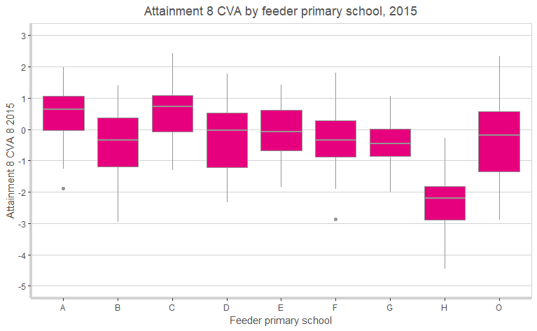
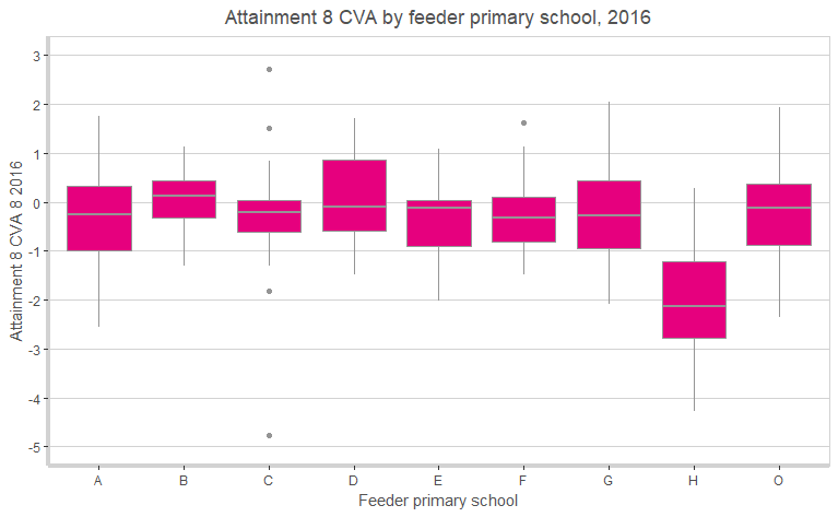

So, no, the 2017 data was not a one-off. Pupils from School H have consistently achieved results two grades lower per subject at Key Stage 4 on average than pupils with similar prior attainment nationally.
Difficult questions
This is a real example. The secondary school is in an Ofsted category, criticised in its latest inspection for the progress of its most able pupils.
School H is rated outstanding.
We need to ask difficult questions about the Key Stage 2 results of School H.
Was it really the case that pupils performed at such a level at School H that they simply could not maintain their progress at secondary school?
Could they have received additional assistance when taking their KS2 tests?
Does test security need to be improved?
What can be done?
FFT Aspire users
*2023 Results update – A new 2023 interactive version of this report is now available to FFT Aspire schools. To access the latest report, simply log in to Aspire. From the main side navigation panel, click School reports and then select Special reports.
Not an FFT Aspire user?
We have produced a report for FFT Aspire users to enable them to see a breakdown of Progress 8 by primary school (see the sidebar for details of how to access this).
Are there any primary schools from which pupils perform particularly, and consistently, poorly? Or even consistently well, perhaps indicating some under-performance at Key Stage 2? How does your P8 score look with these schools removed?
Looking at Attainment 8 CVA for the last three years and taking account of secondary school attended[1], we found around 30 feeder primary schools with a score of -1 or lower, indicating that pupils achieved at least one grade below expectation per subject on average.
There were none with a score of +1 or higher.
The Department for Education plans to cap the P8 scores of pupils with anomalously large scores. Ofsted’s Inspection Data Summary Report (IDSR) shows the effect of removing outliers on schools’ value added scores [PDF, p.5].
We would also recommend to both DfE and Ofsted that they also consider making adjustments for pupils who attended primary schools with anomalously high KS2 results.
Better still, don’t rely on a single metric to decide which (if any) schools are performing poorly.
Now explore your data by feeder primary school in the new report available in FFT Aspire. To download a copy, log in to FFT Aspire, go to the downloads menu in the top right-hand corner (↓) and choose ‘FFT special reports’.
Want to stay up-to-date with the latest research from Education Datalab? Sign up to our mailing list to get notifications about new blogposts, or to receive our half-termly newsletter.
1. As secondary schools vary in Attainment 8 CVA scores, with some performing poorly and some very well, pupils’ CVA scores are centred around the secondary school average to enable a fairer comparison of primary schools.

Interesting article, brilliant that we can look at the report in FFT Aspire too.
As the data manager at a school with one of ‘the 30’ feeder primary schools mentioned, this report is so helpful to me.
Every time we have an OFSTED data meeting I bring up this issue. Every time I get the ‘all secondary schools say this’ response and it then takes me several hours to ‘persuade’ them that this is a real issue and that our overall progress figure (now P8 but previously 3 and 4 levels progress) would be so much better. It obviously impacts hugely on our P8 figure for ‘High PA’ pupils as all of these pupils are being judged as level 5. Ofsted come into the school with the preconceived idea that the High ability students are performing very badly.
Is this report available in Wales? I can’t seem to find it.
Hi Steffan. No, it’s currently only available for England (as Progress 8 doesn’t apply in Wales).
It’s interesting that the immediate reaction to high end of KS2 test scores is that the primary school is somehow fiddling results. I would ask how the test scores correlate with the end of KS2 teacher assessment, what the secondary schools baseline assessment on entry for these pupils looks like etc before deciding that these results can be deemed inaccurate (with the possible consequence that these pupils are not given the opportunities they need to fulfil their potential).
I have been beating this drum for a while
The issue has always been the difference between the KS2 score and their CAT score.
Plus when we internally test the skills of the pupils with our own version of a SAT paper we notice that the same pupils underperform against the expected result you would have by looking at the score they achieved at KS2.
But always came up against a brick wall when you tried to discuss this with OfSted or County.
Is this a pdf report that is already generated ie is available in the ‘downloads’ from self evaluation > see all downloads area? That one is black and white only; I am just wondering if I am meant to be able to generate this myself somewhere within aspire.
Hi Chris. Yes you go to “see all” in the downloads section. On the reports for schools the funnel plots are in grey, so if you’ve managed to find a 3 page pdf with the first page titled “Progress 8 by Feeder School (2017)” then you’ve found it.
Hello,
Can you expand on this:
Looking at Attainment 8 CVA for the last three years and taking account of secondary school attended[1], we found around 30 feeder primary schools with a score of -1 or lower, indicating that pupils achieved at least one grade below expectation per subject on average.
Is it a three year average? Also is it the average of the FFT Progress 8 CVA on the bottom of the download sheet?
I may be stupid but where is this report?
Hi James, it should be in the downloads section of Aspire, but I’ve found what I believe is your school, from your email address, and if I’m correct it isn’t showing for you because of a change of LAEstab upon academisation. Could you drop me an email to philip.nye@fft.org.uk, please, with your LAEstab to check I’m looking at the right school, and I’ll get the report added. Thanks, Philip.
Interesting. Clearly KS2 results are not always reliable (open to manipulation, though we may only hypothesize what form this manipulation takes), so why are Ofsted so hung up on the Progress 8 measurement?
Hi
I don’t have the report in my downloads and would be really interested to see this please I think this might be down our school having two accounts with two DFE numbers?
Hi Emma, sorry about this – that will indeed be the reason. I’m getting the report added, though it might be tomorrow before it’s live, if I could ask you to check back towards the end of tomorrow.
will this be updated for 2018? And if so, when?
Hi Alex, we haven’t finalised which reports we’ll be producing based on 2018 data yet – but this one has been very popular, so I think would be a strong contender.
Where can we find a list of the 30 schools?
We haven’t published this list of schools, I’m afraid, Steve.
Will you be doing a similar report for 2019?
Hi Clayton – sorry for the slow reply. A new version based on 2018 data was made available in FFT Aspire earlier this month – hope that meets your needs. And if it’s popular, I’m sure the report will be produced again next year.
Thanks for a very informative article, and for the previous reports which I just downloaded for the first time (I’m relatively new to the role).
It would be really useful for us to see this report for the 2019 results as we seem to have exactly this issue of one feeder school having P8 results that vary considerably from the rest over the past few years (I first noticed this with a scatterplot of KS2 vs average GCSE points, coloured by school, but a boxplot of P8 shows the same thing very clearly). I have no reason to suspect maladministration, but would not be surprised to find considerable “teaching to the test” and lots of time spent practicing for it. My main concern is whether we should be using this data to make better-informed choices when setting targets – should we downgrade some targets for students from this, or other schools (or increase others).
Hi Adam. Thanks very much. We hope to have 2019 data in Aspire later this month. We’ll update the boxplots after that.