There’s been more interest in school attendance over the last 18 months than there has ever been. As there is no new fortnightly data from DfE’s survey this week we thought we’d provide an update.
Aspire Attendance Tracker
Schools can track, analyse and compare their attendance data against 1,000s of other FFT schools using Aspire Attendance Tracker.
Log in to Aspire to access Attendance Tracker – log in here.
Not an FFT Aspire user? Learn more here.
In this post we’re going to look at the broader picture by analysing pupil absence this academic year in the context of earlier phases of the pandemic. In a term that saw the end of bubbles, high COVID prevalence, and the rollout of jabs to secondary pupils, there’s lots to unpack.
The data we’ll use is from the 5,200 primary and 2,500 secondary schools who subscribe to Attendance Tracker.
Absence is down but sickness is up
Let’s start with an overview of this term so far.
In the chart below, we show absence up to the end of last week (3rd December) and compare it with the same period last year and with Autumn term 2019. We show total absence, as well as absence due to COVID self-isolation[1], sickness, and unauthorised absences. Sickness includes pupils with COVID.

Overall, absence improved compared with last year, with a bigger improvement at secondary than primary (a 4.1 percentage point drop in absence to 9.8% for secondaries vs a 2.0 percentage point drop to 6.9% for primaries).
Looking at COVID self-isolation absences, it’s not hard to see the reason why. There’s been a huge reduction. And the reduction is bigger at secondary than primary. Indeed, this year, primaries and secondaries actually had pretty similar rates, which isn’t something we’ve seen before. So it looks like the removal of “bubbles” achieved its aim of getting more pupils attending.
However, the cost of that has been increased levels of sickness, particularly in primary schools. Last year, 1.9% of sessions were missed due to sickness in primaries, and this year it’s 3.7% – almost double. At secondary, sickness absences have increased by around two-thirds – from 2.9% to 4.9%.
This will be having a knock-on effect on staff absence. Which means disruption might not have reduced by as much as overall pupil absence figures would suggest.
Sickness absences are higher than ever
Now that we know the overall picture this term, let’s dig into the detail.
Here we plot absence each week from the beginning of last academic year to the end of last week. The top chart shows overall absence, and the bottom chart shows only sickness absence (bear in mind that sickness for the last week or two will be undercounted because schools will still be chasing up reasons for absence).
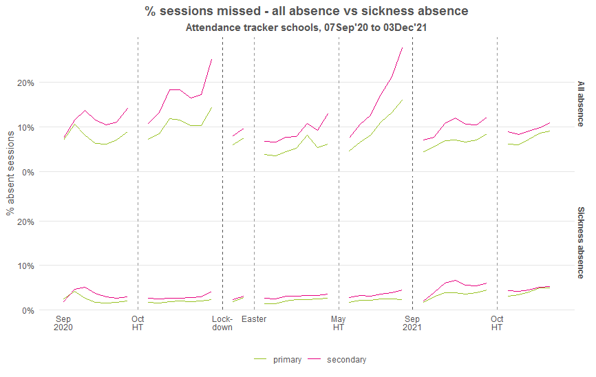
Looking at the current term in the top chart it seems that things haven’t been all that bad (in the context of the pandemic – still worse than pre-pandemic, of course). Absence in primary schools wasn’t too different from the period of relative calm following the January to March lockdown. And in secondary schools, although absence has been higher, it’s still a fair way down on what we saw in Autumn term last year.
When we look at the bottom chart though, we see that sickness in both primary and secondary schools has been higher this term than at any time since the start of last year. For secondary schools, the peak came around half-way through last half-term. For primary schools, it’s happening now. (Not good news for those in Government hoping to see mass in-person nativities this year, perhaps.)
The difference in timing of that peak could be hinting at an impact of the vaccination programme in secondary schools. But we can’t say for sure.
The national picture is mirrored in most regions
To finish off, let’s look at what’s happening around the country. We’ll plot the same two charts for each region – one for overall absence, and one for sickness. First, overall absence.

There hasn’t been too much variation in absence patterns across the country this term, in contrast to some of the stark differences we saw last year.
There was a slight uptick in the South West in the weeks leading up to the October half-term break, though this didn’t seem to carry on into the next half-term.
London has seen relatively low levels of absence throughout this term, with both primary and secondary absence similar to the post-lockdown period. Like the rest of the country, though, they too have seen an acceleration in recent weeks, particularly at primary.
Now let’s look at absence due to sickness.
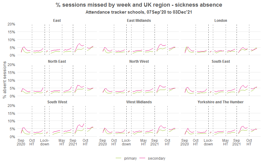
Sickness in primary schools was at a high last week almost everywhere. And the peak in secondary sickness absence in the first half-term was seen in all regions, though less pronounced in London than elsewhere. It has come down from that peak since, but is still high and rising. (This in spite of the most recent weeks’ sickness being undercounted.)
Of course, all of this is only up to the end of last week. Who knows what effect omicron will have in the final two weeks of term?
Conclusions
Removing bubbles for the start of this academic year has certainly been effective in reducing pupil absence. But it has also led to sickness rates as high as they’ve been since the grand reopening last Autumn. Due to the probable impact on staff absence, disruption might not have reduced by as much as pupil absence figures suggest.
If the situation is to improve next term, then the COVID infection rate in schools must be brought down. This becomes even more pressing if mandatory isolation for all omicron contacts is here to stay.
Asking schools to test pupils on their return after Christmas is a good start. But will it be enough?
Leave A Comment