In the wake of the publication of secondary school performance tables last month, there was a brief flurry of activity about ranking schools based on Progress 8 scores. This tweet from Tom Sherrington was a particular favourite:

In this blogpost, I’m going to use far more words and a few charts to say the same thing. I’ll also say why I don’t think we need a more precise measure.
By how much do schools differ?
Let’s start with Attainment 8.
In the chart below, I’ve plotted schools ranked by A8 score. I’ve altered the scale such that the axis is centred on the national average for state-funded mainstream schools of 47.4, and A8 scores have been divided by 10 to calculate an average grade per slot. This is so we can use the same axes as Progress 8 later.

Almost 1,600 out of the total of 3,165 schools have A8 average grades per entry between -0.5 and +0.5 (A8 scores between 42.4 and 52.4). In other words, they differ from the national average by at most half a grade per subject.
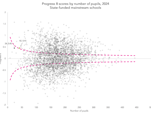
Now let’s do the same thing for P8 – see the chart below.
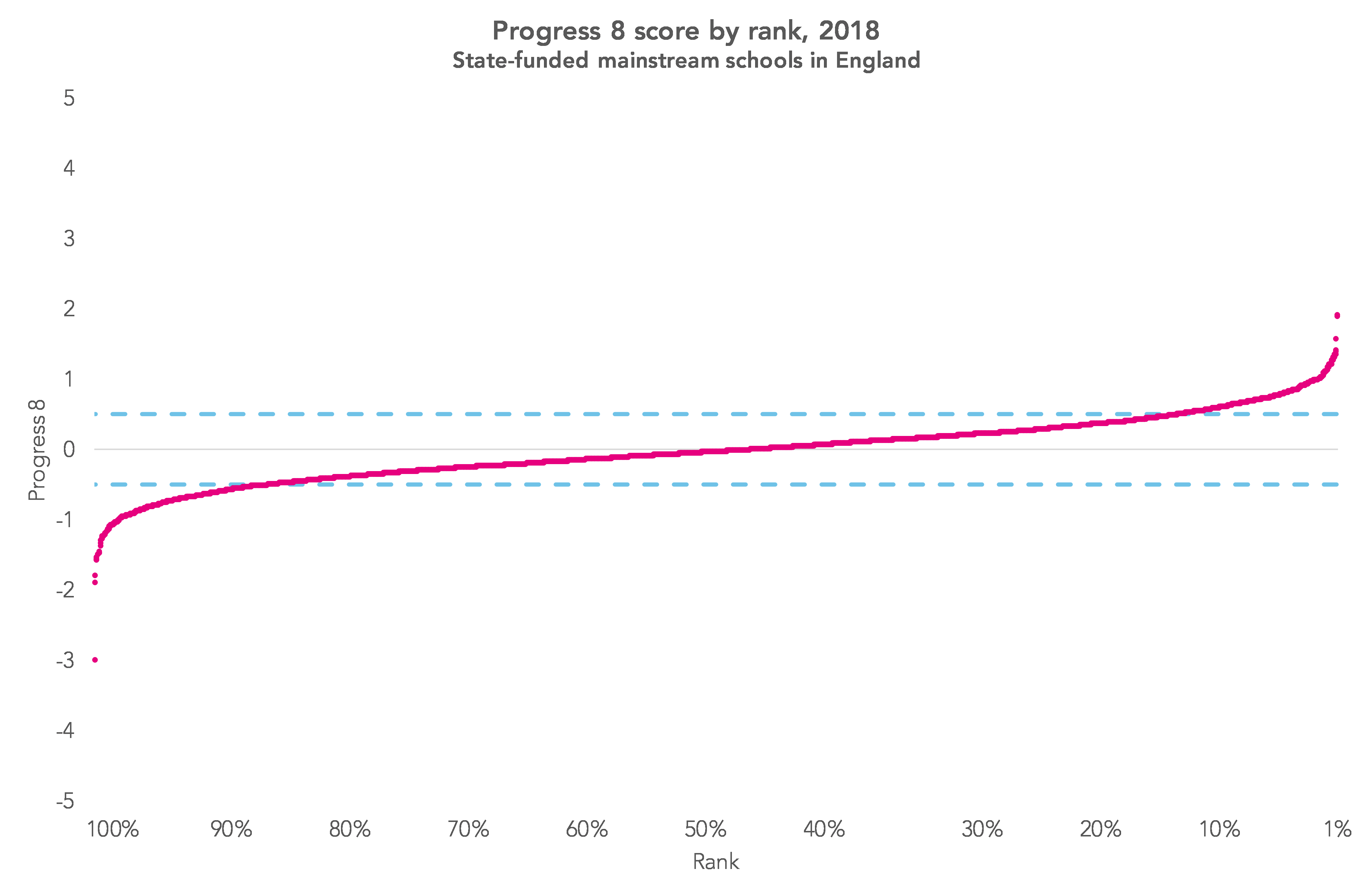
The key thing to note here is that the distribution is flatter. By removing differences in prior attainment, we reduce the amount of variation in attainment between schools. The number of schools between -0.5 and +0.5 increases to 2,300.
It can also be seen that the range of P8 scores for the top and bottom 10% of schools (particularly the top/bottom 5%) is greater than the middle 80% of the distribution. In other words, there is a small number of schools with particularly high (or low) scores.
Put another way, the difference in P8 scores for the top 300 schools is 1.3 and for the middle 300 schools it is 0.09. It is far harder to move up the rankings at the top or bottom end of the distribution – doing so involves a much greater increase in P8 scores.
What is a meaningful difference in P8 scores?
One reason why value added scores are converted into ranks by some is because they lack real world meaning. With the exception of the floor standard (-0.5) we don’t have any real sense of whether a score is educationally important or not.
There were over 300 schools with P8 scores between -0.05 and +0.05 – a difference of over 300 rank places (10% of schools) between the highest and lowest scoring of them. But what do these numbers mean?
Let’s say the score for School A was +0.05 and School B was -0.05. Taking the numbers at face value, one interpretation is that if you picked two pupils with the same KS2 attainment, the two pupils would have the same grades in seven of the subjects included in Attainment 8 but the pupil from School A would have one grade higher in one and only one subject than the pupil in School B.
Is this an educationally important difference?
Perhaps, but there are plenty of reasons why it might arise beyond the quality of education offered by a school, such as differences in qualifications offered and demographic characteristics.
Measurement error and chance also play a part. The attainment of pupils varies, even when taking account of prior attainment.
Here’s a simple demonstration of how chance could affect schools’ P8 scores.
Let’s imagine we draw a random sample of 160 pupils from the national population and calculate their average Progress 8 score.
What would it be? Zero? Or higher? Or lower?
The answer is that it depends on the sample drawn. We could draw a typical sample and so the score would be close to zero. Or one that was atypical, with a score that was much higher (or much lower).
Let’s imagine we draw repeated random samples of 160 pupils from the national population and make a note of the average P8 score for each. In the chart below I’ve drawn 10,000 samples and plotted the results. The scores are normally distributed and clustered around zero.[1]
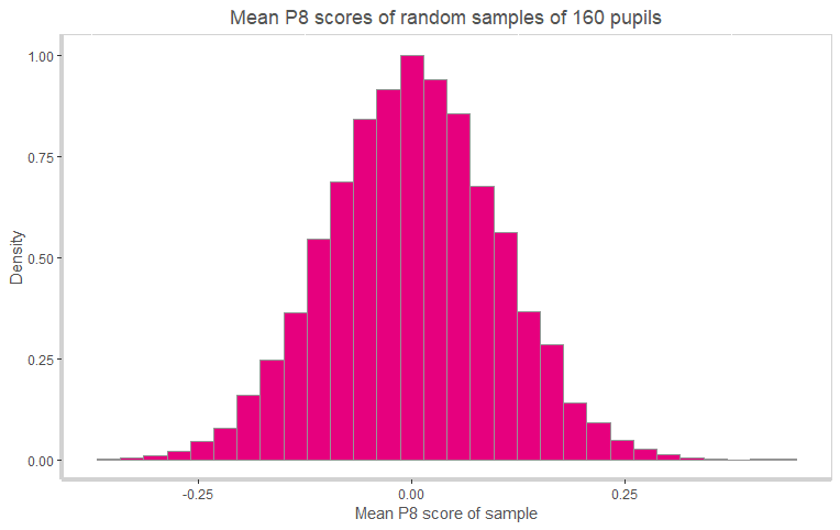
A total of 90% of the sample had scores between -0.16 and 0.16. If these were real schools, they would be separated by 920 places in the rankings.
It is also worth re-iterating that schools with smaller cohorts will tend to have more extreme scores (either higher or lower) – in other words their scores are more variable.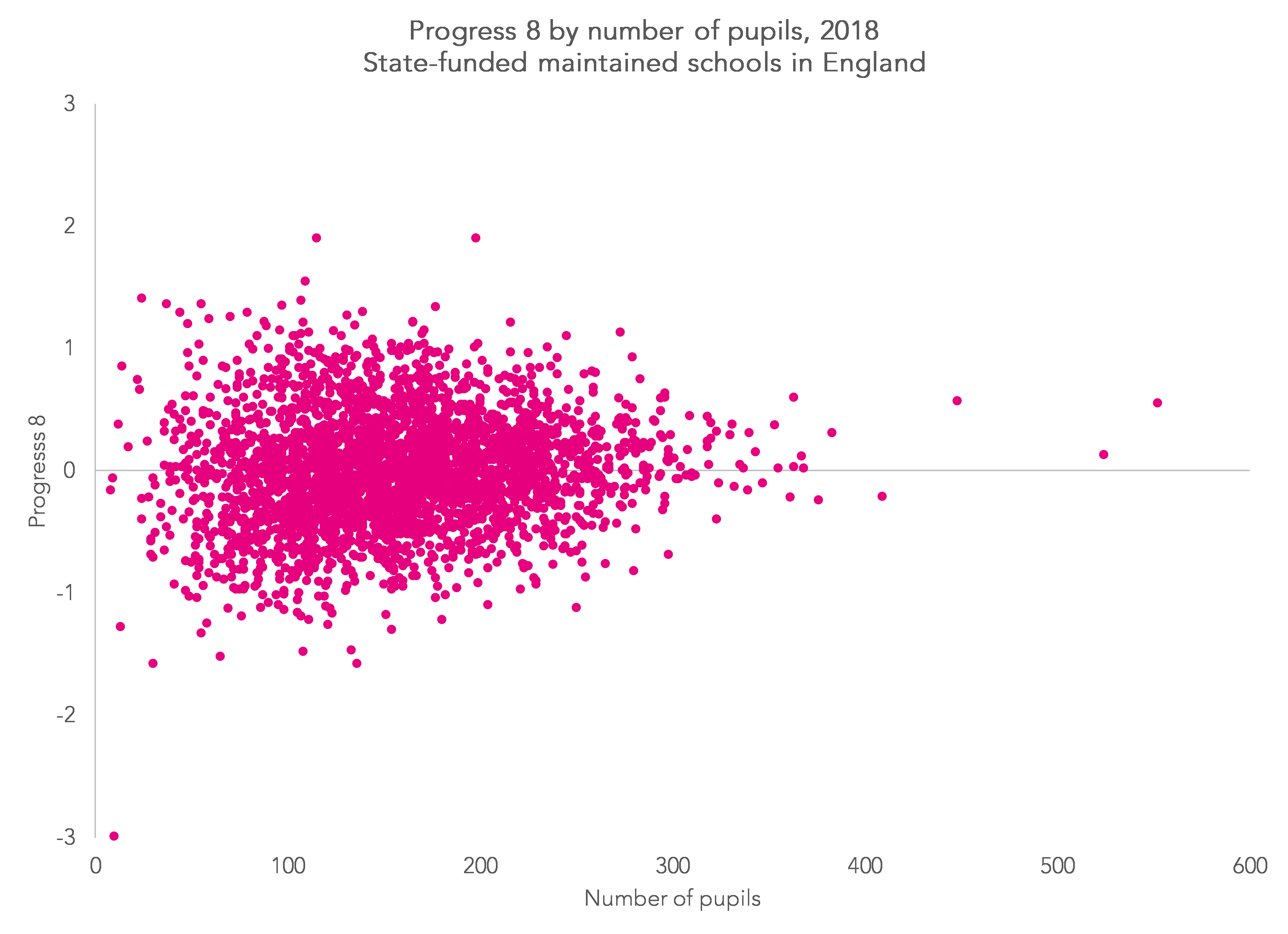
Making better use of data
In summary, for a value added measure like Progress 8, which is aggregated from a number of subjects, there is not a great deal of difference between most schools. Only around 14% of the variation in pupil P8 scores is between schools. Even less when studio schools, university technical colleges and further education colleges are removed.
The result of this is that schools’ P8 scores will appear to jump around from year to year. This doesn’t really matter because the differences between the vast majority of them are tiny in comparison to the range of scores between pupils.
Plenty can be done to improve P8, such as taking context into account. But this will make differences between the majority of schools smaller still.
That said, the data would be good enough to do two things. Firstly, to identify a small group of schools where support may well be needed. Secondly, to examine how much variation there is within the system.
Given comparable outcomes, not all schools can improve. And not all schools can score above zero on a value added measure. But we can try to reduce variation in the system, whether it is between schools or between groups of pupils. This would be a better use of data than ranking schools from best to worst.
Want to stay up-to-date with the latest research from FFT Education Datalab? Sign up to Datalab’s mailing list to get notifications about new blogposts, or to receive the team’s half-termly newsletter.
- This uses the 2018 standard deviation in pupils’ P8 scores of 1.26.


Morning,
It seems that the most significant influence on the school P8 score is the number of EAL students in the data-set. Only students who were in English education at age 11 are included, and so EAL students in the data have 5 more years of English experience than when they took the “input data” test at KS2. It would be interesting to see a plot of % of EAL students against P8 for each school.
Thanks Jon. You can see something like this here https://www.tes.com/news/exclusive-progress-8-penalises-schools-white-working-class-communities-study-shows. There is variation within the EAL group (e.g. by ethnicity) and length of time spent in the English education system prior to taking KS2 tests.
An interesting read. It is astonishing and sad that such high stakes are attached to these scores, given what you have highlighted regarding the meaning (or lack of meaning) that can accurately be attached to differences in scores for most schools. Never mind the demographic influence that yourselves and others have highlighted.
When you say “measurement error” are you referring to ideas similar to those presented in the Ofqual research around marking accuracy? I wonder if you could use the probabilities of achieving the “definitive grade” at qualification level, as presented in the Ofqual research, to further illustrate your point around chance playing a part?
Hi Andy. Thanks for commenting. Yes, the accuracy of grading GCSEs is one aspect of measurement error although with measures like A8, which aggregate several results together, some of it cancels out. The equivalence of non-GCSEs and GCSEs is also part of this. More of a problem is measurement error in KS2 results. With value added measures an implicit assumption is made that prior attainment is measured without error. Tom Perry (from Birmingham University) has done some work on how this might be driving up the P8 scores of grammar schools https://www.tandfonline.com/doi/abs/10.1080/02671522.2018.1424926?journalCode=rred20
Thanks for your response and the link. Again interesting to read the conclusions in it. There seems to me to be so many inherent, systematic flaws in Progress 8, including measurement error at both the input and output, that it really should not be used to rank schools. Going further I don’t think that ranking schools at all is helpful, let alone accurate.
Switching to a value added measure was supposed to be the solution to the issues that arose from ranking schools by attainment: it wasn’t and I agree with you that adding some kind of adjustment for context wouldn’t be sufficient. Data alone will never be able to determine school quality.
In an age of fake news we shouldn’t be using data in such an inaccurate way. I also agree that there could be better uses for the data and I’d like to hope that we could stop the pretence that ranking schools using data would ever by reliable or accurate.
Sadly, many of us work under a need for definitives even when the overarching message here and elsewhere is not to do so. I’d really appreciate your comments on SEN performance if possible, as I am increasingly questioning how useful SEN P8 actually is in any form. I take your argument about context and I too would like to see this, and although blessed with its own issues, I currently find it incredibly hard to make any tangible or worthwhile comment about it. It seems ludicrous to look at our SEN P8 scores and make comments such as “SEN students P8 is negative but at least it isn’t as negative as the national SEN figure If possible, I’d appreciate any thoughts you might have on how to best use SEN outcomes nationally to form some kind of constructive conclusions that staff in schools can truly find useful, because at the moment using this measure particularly for vulnerable groups, feels totally useless..
Hi Ben. Thanks for taking the time to comment. The blogpost is mostly about outsiders forming a view about school performance based on data. For those of you working in schools you have both data and professional judgment to form a more rounded view. With SEN are you talking just about those with statements/ EHCPs or also including those with SEN support? If you’re including the latter, I must confess I struggle given how fluid the group is (e.g. https://ffteducationdatalab.org.uk/2018/11/more-pupils-have-special-educational-needs-than-you-might-think/). However, you might find the national data for SEN pupils broken down by type of need useful if you haven’t seen it already (see table CH1A of https://assets.publishing.service.gov.uk/government/uploads/system/uploads/attachment_data/file/772851/2018_National_characteristics_tables.xlsx). I also wonder how suitable A8/P8 is an indicator for pupils with complex needs (see https://ffteducationdatalab.org.uk/2019/01/progress-8-for-pupils-with-sen-are-p8-scores-really-that-low/). If you use FFT Aspire you can access value added and contextual value added analysis for a range of performance measures.
We certainly do make statements along the lines of “SEN students P8 is negative but at least it isn’t as negative as the national SEN figure” – when looking at the performance of schools, we would always compare the outcomes for groups of pupils with the outcomes for similar pupils nationally, because we know that some groups typically have better or worse achievement than others. But the smaller the groups, the less robust this kind of comparison is, and with SEN you are typically talking about quite small groups, even at secondary.
But the bigger problem with assessing outcomes for pupils with SEN against the national average for similar pupils is knowing whether they *are* similar pupils. We know that there is inconsistent between schools in what they classify as SEN Support or needing an EHCP, and so a school that puts pupils onto the SEN register more readily would expect this to boost their P8 scores for both SEN and non-SEN. Unless we are confident in the school’s determination about SEN status, analysing outcomes for pupils with SEN is pretty nebulous!
Hi Dave and Stephen
Thanks for your replies. It’s very interesting and reassuring to know I am not the only one finding this whole area contentious. The difficulty I have is on a professional level but from personal experience of there being children in my family who have SEN needs themselves. Indeed, it is from this ‘real life’ perspective that it is ludicrous to group SEN students together even with similar needs, status, or even similar prior attainment, but I take the point about the contextual analysis available in FFT and to me, that is far more useful than what the DfE currently provides. I take the points about group size – we don’t have a massive SEN cohort but you are absolutely right about the variation and even with regards to this blog and P8 scores fluctuating from year to year, it is even more the case with our SEN cohorts year to year. To me, it seems totally pointless to use this measure for SEN and whilst I respect the need to determine strengths and weaknesses of a school, I genuinely don’t believe you can do this for SEN students with any genuine conviction. As in my previous post and certainly in my experience, there is certainly too much emphasis on determining success or failure based on a statistic or an exact figure, and I appreciate the effort you have gone to to really examine and undermine some of the wider responses to ranking and so on.
Thank you also for referring me to your earlier post about SEN/EHCP specifically. This is very useful.
Dave, returned to this again now as here we go again with 2019 provisional scores. Our governing body is concerned about the strong reliance on progress scores with so much publicity as if they are THE TRUE measure of school success. One worry is the use of KS2 data on English and Maths as the baseline for progress in a range of subjects. We can just about go with the logic for assessing progress in Eng and Ma but is there a reasonable case to be made for the use of KS2 data in assessing progress in other subjects?
There is a reasonable degree of correlation (r>0.6) between KS2 English and maths and most subjects at KS4. As you’d expect it’s highest in maths and weakest for many non-GCSEs and creative subjects. Some of the low correlation is due to some subjects not having an even spread of entrants from across the KS2 distribution. Leaving that to one side, I think it’s worth looking at attainment in KS4 subjects having removed the correlation with KS2 attainment. However, for the reasons I give in the blogpost, these can’t be interpreted as measures of school effectiveness because lots of other stuff affects attainment beyond the work of the school.