Last week the Department for Education (DfE) published exclusions and suspensions data covering the Autumn and Spring terms for 2022/23 (i.e. last year).
By the end of 2021/22 the rate of suspensions was the highest on record since DfE moved to its present method of collecting exclusions and suspensions data via School Census. The permanent exclusion rate remains lower than in 2006/07. The data published for 2022/23 suggests that the suspension rate has risen again.
We can go one better and provide some basic statistics on exclusions and suspensions for the current academic year using attendance data we’ve collected from schools to gauge whether the increase in exclusions and suspensions observed in 2022/23 continued.
Data
Briefly, pupils who remain on the school roll but who have been suspended or permanently excluded are recorded in the attendance register using code E. If the exclusion is for 6 days or more, alternative provision is supposed to be arranged from the 6th day.
We use attendance data for the Autumn and Spring terms 2023/24 collected from almost 10,000 schools subscribing to FFT Attendance Tracker. We then identify spells of absence recorded as code E. Counting spells gives us an approximate total number of exclusions and suspensions.
What we cannot do is distinguish between spells that are due to suspension and spells that are due to exclusion (or more accurately, spells that will result in due course in permanent exclusion).
Comparing our method to published statistics
As we did last time we did this exercise (based on data for the Autumn term), we compare our exclusion statistics using attendance data with the official statistics.
The figures we produce are equivalent to the sum of the permanent exclusion rate and the suspension rate, in other words the total number of exclusions and suspensions divided by the total number of pupils.
We show our calculated figures for the Autumn and Spring terms 2022/23 alongside the published DfE figures in the chart below.
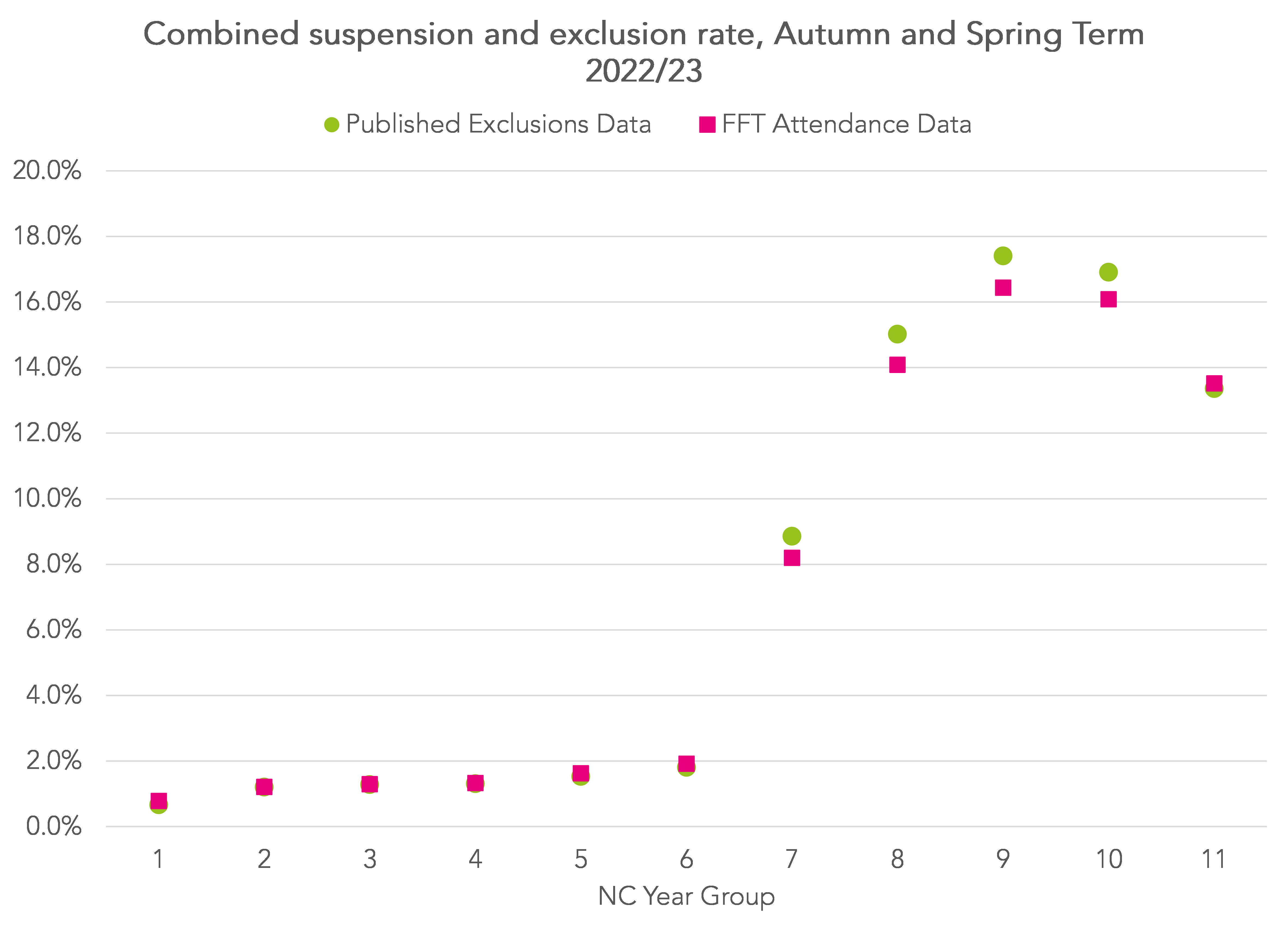
Our figures are fairly close to DfE figures but, if anything, are a bit lower, particularly for Years 8 and 9.
Consequently, our figures for 2023/24 might be something of an under-estimate.
The increase in suspensions in 2023/24
Repeating our methodology for 2023/24, we see a notable increase in suspensions and exclusions.

For example, the suspension/ exclusion rate for Year 9 in 2022/23 stood at 16.4%. In 2023/24 it increased to 20.6%, an increase of 4.2 percentage points or a 25% increase in suspensions.
For Year 7 pupils, there was a smaller absolute increase (from a lower base) of 2.7 percentage points but a larger relative increase – a 33% increase in suspensions.
The suspension rate is the number of suspensions divided by the number of pupils so a rate of 20% does not mean that 20% of pupils have been suspended. Some pupils will be suspended more than once.
But we can also summarise the percentage of pupils who are suspended or excluded at least once.
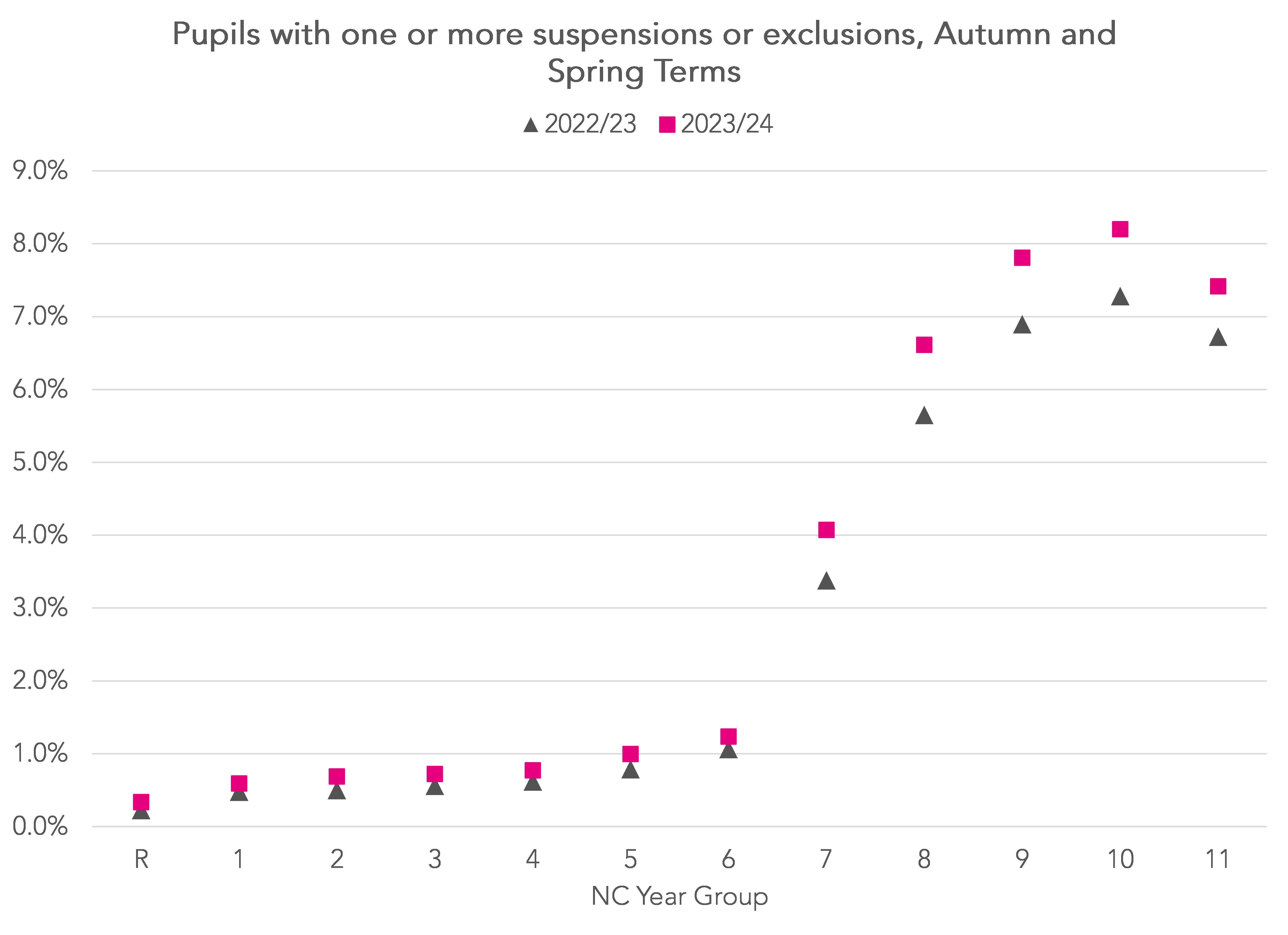
Whereas in the previous chart the highest rate was among Year 9 pupils, this time the highest rate is among Year 10 pupils (8.2% in 2023/24 compared to 7.8% in 2022/23).
That the suspension rate is more than double the rate of pupils suspended at least once implies that, on average, the mean number of suspensions per suspended pupil is above 2. It also appears to have increased compared to last year although we will leave that for another day.
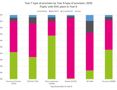
Disadvantaged pupils
We also see stark differences in the percentage of disadvantaged pupils suspended or excluded at least once compared to their peers.
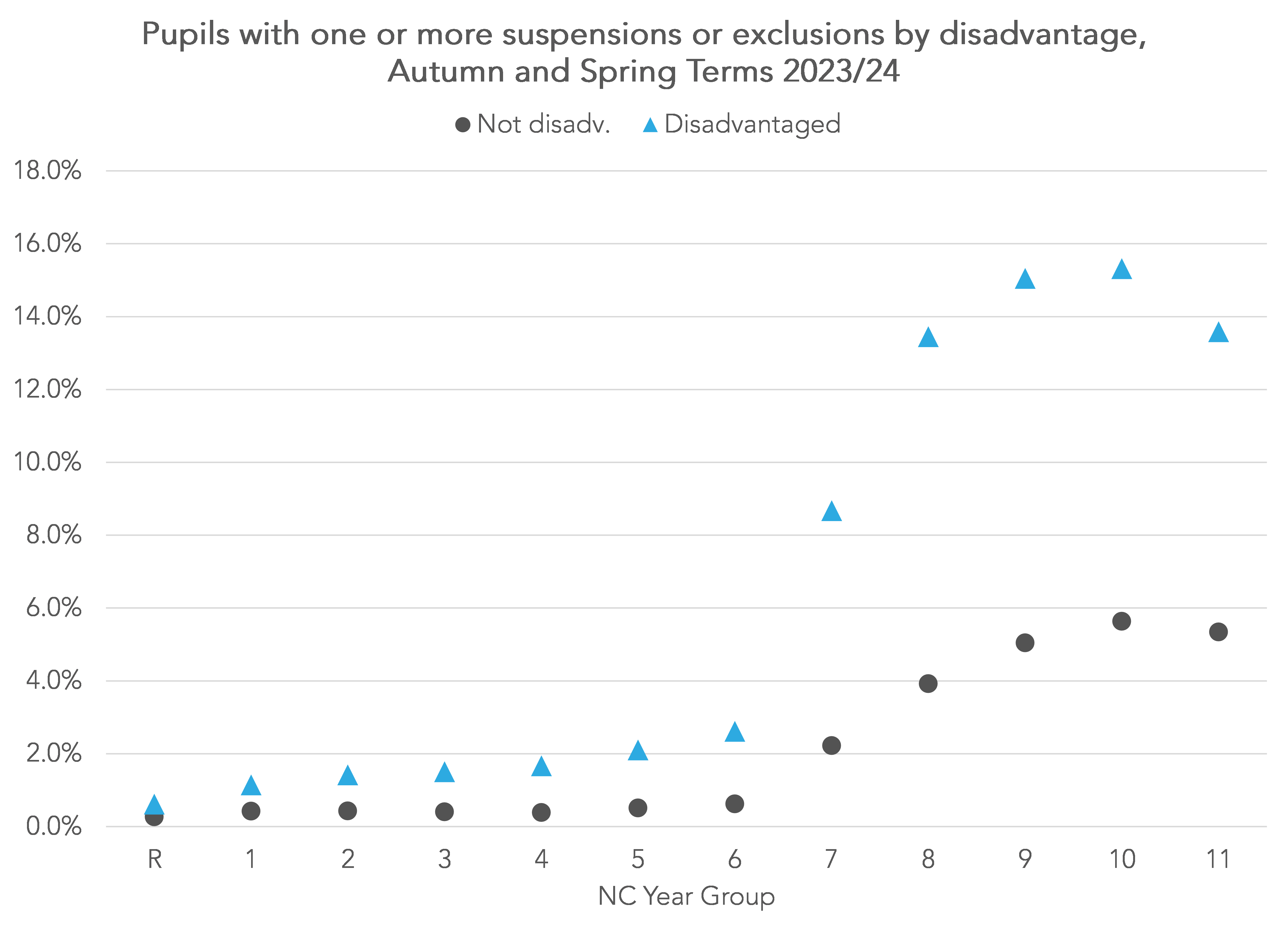
Around 15% of disadvantaged pupils in Years 9 and 10 have been suspended or excluded at least once so far this academic year.
Summing up
Published DfE statistics for the Autumn and Spring terms combined 2022/23 showed an increase in exclusions and suspensions compared to the previous year.
Analysis of attendance registers for the Autumn and Spring terms combined 2023/24 suggests there has been a further increase this year.
This will become apparent when DfE publishes statistics for last term this time next year.
Want to stay up-to-date with the latest research from FFT Education Datalab? Sign up to Datalab’s mailing list to get notifications about new blogposts, or to receive the team’s half-termly newsletter.
Well, that is a depressing picture, Dave! One apparent separation is Primary to Secondary, and I wonder whether the structure of a primary school compared to a secondary is the difference. Primary, one teacher (generally) all year, typically with the support of the same TA, shows how the key difference to students is the relationships they can build. They move to secondary with multiple teachers and classrooms (often with subjects split across teachers to ensure consistency further up the school), which kills this aspect of school. As a former mainstream HT and timetabler, I am not sure (beyond the obvious more teachers) how you bridge the gap in the curriculum in its current format. To make the needed change, we would need to copy some of the approaches of the Far East, i.e. to reduce the breadth of each subject’s curricula and enable non-specialists to teach to a prescribed “everyone much reaches” level. Remove GCSEs and look at secondary sorting at aged 14 (see Lucy Crehan’s Cleverlands).
Interesting stuff!
Is the graph showing Disadvantaged students taken as a percentage of disadvantaged students vs the whole year or as Excluded/Suspended Disadvantaged students vs the other Disadvantaged students?
For exmple if your year group has 500 students and 100 are disadvantaged and of those, 10 were Suspended or Excluded, is the graph using 10/100 or 10/500?
Thank you.
Thanks a lot! In your example it would be 10/100, so excluded/ suspended disadvantaged students as a % of disadvantaged students