How do you know if a school is any good?
Many readers of this blog work (or have worked) in schools. You may well have a feel for whether a school is good (or not) based on your experience.
For those of us who have never done so, we have to rely on information. This includes Ofsted reports, published performance data and the word on the street. All of this may be incomplete or imperfect. We’ve written plenty in the past about the problems with Ofsted judgments and school performance measures.
Given these problems, we could just give up and accept that nobody knows which schools are any good.
But I was nudged out of this fatalism by reading a call for the introduction of an “accountability dashboard or balanced scorecard” in the ASCL blueprint for a fairer education system last week. These ideas have been around for some time. School Report Cards were an idea towards the final days of the last Labour government, abandoned when the coalition came to power.
Along similar lines, one of the last bits of work we did before the pandemic was something called the “Good Schools Index” for the former Children’s Commissioner, Anne Longfield.
Since then, we’ve tinkered about with it following discussions with other organisations within the IntegratEd partnership , in particular colleagues from The Difference. To distinguish it from the version we calculated for the Children’s Commissioner, we have rebadged it as the School Quality Index (SQI).
Dimensions of school quality
The problem with measuring school quality is that we all have different views about what quality means.
We probably all agree that children should go to school, be safe and learn some stuff. However, what stuff and how seems incredibly contested.
Measures of attainment have been published for almost thirty years (but not the last two). These also remain contentious. Firstly, they can have distorting influences on what is taught. Secondly, they may not even provide parents with useful information when choosing schools.
Some of the problems with accountability measures arise from trying to keep things simple and not publishing too much. But the measures that get published often buckle under pressure. Progress 8 isn’t a bad measure. But it is not a measure of school effectiveness, and the Progress 8 scores of schools aren’t all that different.
A better idea might be to publish lots of measures about schools, possibly changing which are used for accountability each year.
The Schools Quality Index works like this:
- Identify a long list of “things” that represent different dimensions of quality
- Find data about them
- Allow users to decide which are the “things” that mean “good” to them
- Aggregate them into a composite score
The Schools Quality Index
Working with other organisations within the IntegratEd partnership, we tried to define a list of dimensions of school quality. From the list, we tried to find or calculate appropriate indicators.
We felt that the dimensions of quality fell into two broad areas, inclusion and attainment, with inclusion being composed of several sub-dimensions:
- Inclusion
- Disadvantaged pupils
- Pupils with a first language other than English who have recently arrived
- Pupils with EHCPs
- Joiners and Leavers
- Absence
- Exclusions
- Attainment
Taking a similar approach to the Index of Multiple Deprivation (IMD), we refer to the two broad areas as “domains” and the component parts as “sub-domains”.
The indicators for each of the domains and sub-domains are listed in the methodology document. Briefly, we look at the characteristics of pupils on roll at each school and how representative they are of the local area. We also examine absence, exclusions and attainment for all pupils taking into account the context of a school and for “vulnerable pupils” [1] separately.
All of the indicators on their own have issues. But their strength comes from aggregating them together. The idea is that the best schools will tend to do well on all the indicators.
Clearly, there are lots of dimensions of quality we haven’t included. There’s nothing on staffing or finance. Or anything about volunteering, being able to swim or whatever else. Suffice to say that they could be added if data about them exists.
Equally, you might think that some indicators or domains shouldn’t be included. That’s also fine. If this were done for real, there would be an option to select which indicators to include.
Using the indicators, we calculate sub-domain and domain scores for each school in 2019 as set out in the methodology document. It also contains some thoughts about statistical issues, such as dealing with small numbers.
Results
For the purposes of illustration, I use the resulting Index scores from the version including all the domains listed above.
Each of the domains and sub-domains is measured on a notional 0 to 1 scale. The inclusion domain score is an average of its sub-domain scores.
The overall SQI is an average of the inclusion and attainment domain scores. There is some slight correlation between the two domains (r=0.17). This suggests that they are measuring different things. In practice, the overall SQI range from 0.12 to 0.9.
The chart below compares the SQI to Ofsted ratings. We’ve used the latest rating by the end of 2019 academic year.
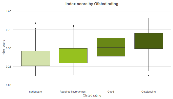
This shows that there is a spread of results for each Ofsted grade. However, the schools with higher Ofsted grades tend to have higher SQI scores.
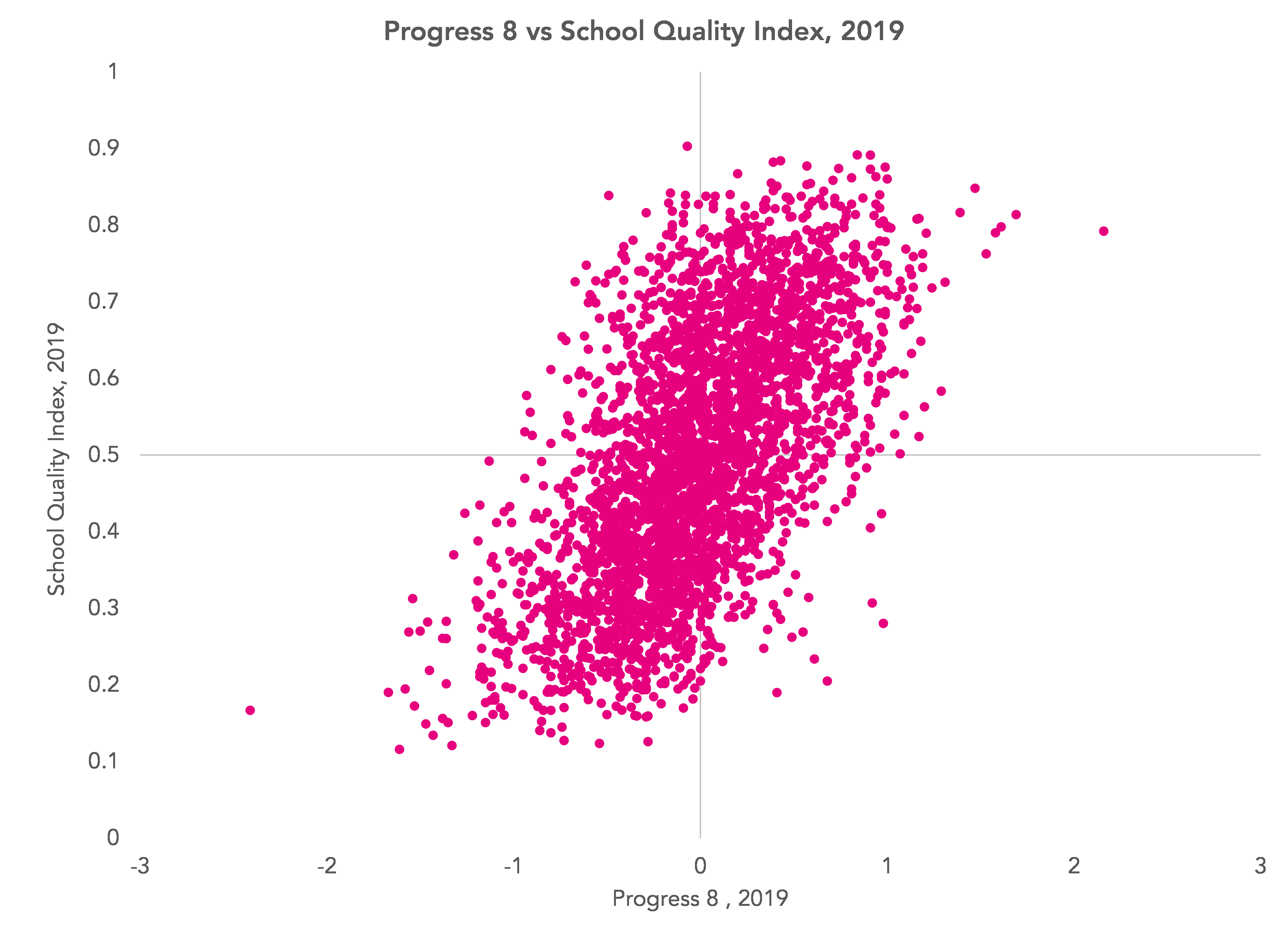
Similarly, there is a correlation with 2019 Progress 8 scores. But the correlation (r=0.61) is not especially strong. By way of comparison, a contextualized Progress 8 measures correlates far more strongly (r=0.9) with the published Progress 8 measure.
Schools in London tended to achieve higher scores than those in other regions, but there is a spread within each region.

And which schools come out on top?
Bearing in mind that the data we used relates to the 2019 year, these were the ten highest scoring schools.

I appreciate that these scores are fairly meaningless presented as they are in the table above. If the SQI was calculated for real there would need to be full transparency, showing the raw indicators for each school and the stages they pass through to calculate the index scores.
Summing up
The middle of a pandemic is not ideal for a discussion about school accountability. There are more pressing things to deal with first.
However, we think that the methodology we present to combine a range of indicators of school quality has potential.
Do let us know what you think we should/ should not include.
You may or may not agree with the selection of domains included in the Index. You may think that other dimensions of quality should be included or some should not be included at all. That’s fine. It would be better to create a more comprehensive set of domains and allow users to decide which to include in an index.
Of course, this would change the scores. Given there would be many possible permutations, perhaps lots of schools could appear in a top 10 list. But would this be a problem?
- These are pupils classified as disadvantaged, with an EHCP, or who have ever been in need.
Want to stay up-to-date with the latest research from FFT Education Datalab? Sign up to Datalab’s mailing list to get notifications about new blogposts, or to receive the team’s half-termly newsletter.


I guess if the hypothetical “SQI” is designed to help parents choose a school, then it would be useful to have parental feedback in the measure too – e.g. is is possible to scrape something from Ofsted Parent View?
If the index (or a variant of it) was designed for school leaders/analysts, then it probably needs an element of financial accountability in there too. Looking at FE for example, Hadlow College in Kent was one of the country’s few ‘Outstanding’ colleges for a number of years – but it failed and fell apart because the financial model was not sound.
Thanks Stephen. Agree that these would be good to include. The choice of indicators to measure financial accountability would need a bit of thinking about. Suggestions welcome!
There’s an awful lot to love about this approach. It acknowledges the complexities and could simultaneously empower stakeholders to explore within an information-led view of schools and reduce perverse incentives such as accountability gaming by schools.
Is it worth considering post KS4 and Post 16 destination data. Obviously small cohorts for “not positive destination” measures and might need controlling for neighbourhood employment, but it’s something else many stakeholders care about.
I see you added “length of time disadvantaged” to the contextualised attainment measures, did you look at it for the deprivation measures in the inclusion domain? Would its inclusion in both domains mess up the factor analysis? If so then it certainly belongs in the attainment domain, but I was just curious.
Hi Chris. Thanks very much! We had destinations in an earlier version but we used published school-level data which we felt had a few holes. In principle it can be included but I’d be worried about supply-side issues (e.g. if suitable post-16 opportunities aren’t available in some areas and these are beyond the control of schools). On the inclusion domain, we just did some simple contextualisation at school-level (e.g. %FSM6) rather than the pupil-level contextualisation we did for the attainment domain.
I think it should include a measure of extra curricular opportunities. Need to consider the “whole child” not just academic issues. Can we also see the return of emphasis on the old G+T groups. All the emphasis is on the lower end and PP. Then we get told the top end isn’t doing well enough when there’s no funding etc for them so they don’t seem to be a high SLT priority
Thanks Sarah. Yes, that’s worth including. It would require data to be collected first though.