We’ve written several times before about the London effect. Here, by popular demand[1], we return to the topic with this short series of two blogposts.
A brief history of the London effect
Journalist Chris Cook was the first to point out, in 2012, that disadvantaged pupils in London schools were outperforming those in the rest of the country. This prompted a slew of research and discussion trying to understand the cause of this London effect.
One popular explanation is that the effect is a reflection of differences in pupil demographics and school composition. Simon Burgess, of Bristol University, was able to show that controlling for pupils’ ethnicity accounted for the entire difference in performance between London and the rest of England.
Burgess’s paper was published back in 2014. We argued at the time that pupil demographics might not quite tell the whole story; if outcomes in vocational qualifications were excluded, a small London effect remained even after controlling for ethnicity. Since then, in a post-Wolf reform world, vocational qualifications have declined dramatically.
The London effect today
So what does the London effect look like now, and how much of it is explained by demography? To explore this question, we’ve recreated some of the analysis that Burgess did, using data from 2018. (Further details on this process are available as a technical appendix [PDF].)
This was done by calculating predicted Key Stage 4 outcomes for pupils, based on their Key Stage 2 attainment, and comparing these to their actual outcomes, looking at:
- capped (best 8) point score in GCSEs or equivalent – referred to in the remainder of this pair of blogposts as overall progress;
- grade in English GCSE;
- grade in maths GCSE;
The progress scores used in the rest of this pair of blogposts have been normalised – that is, put onto a common scale with an average of 0 and a standard deviation of 1.
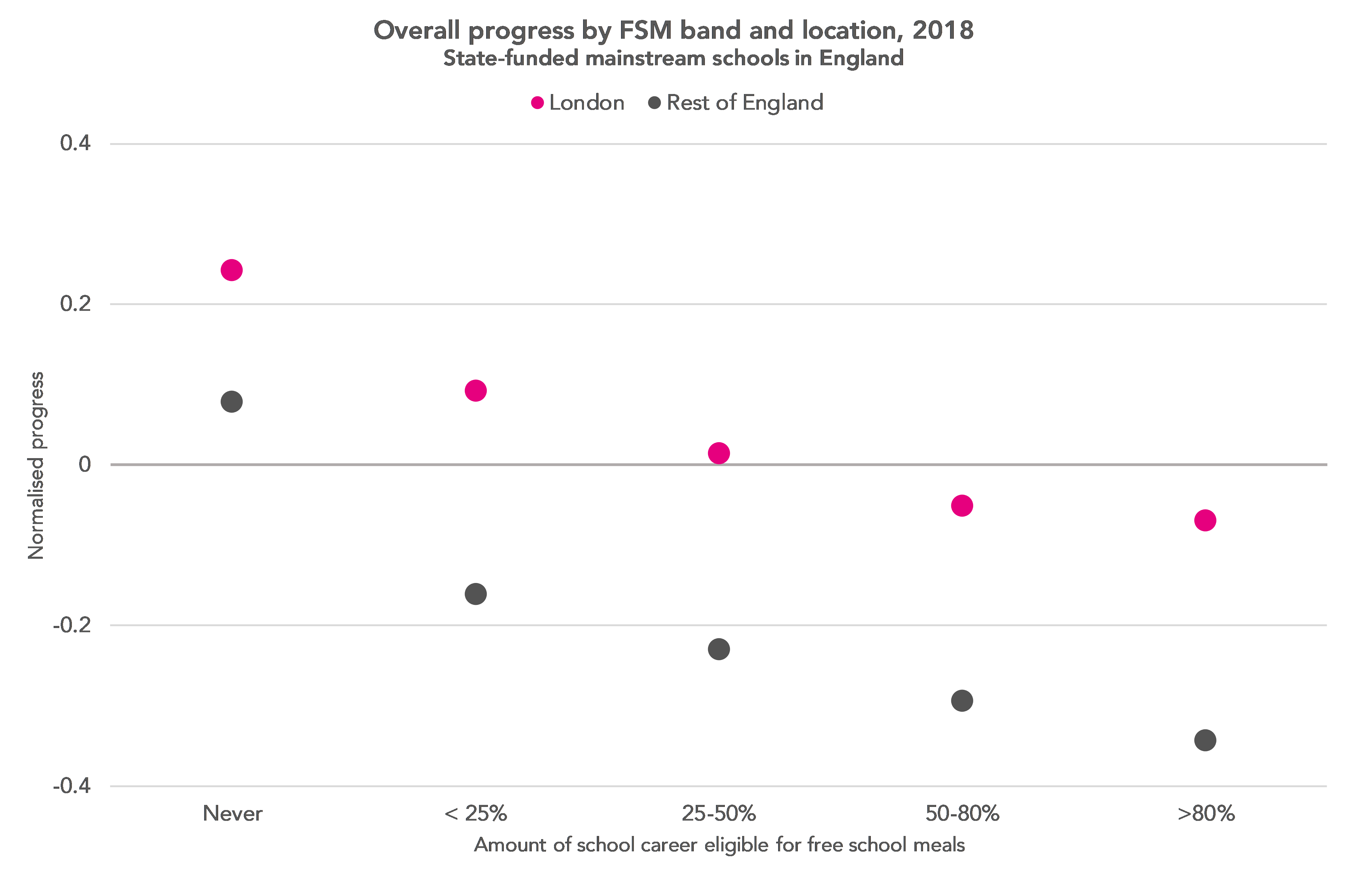
The chart below splits students into bands according to the proportion of their school career for which they were eligible for free schools meals, comparing the average progress of pupils in London and the rest of the country.
This shows that there is still a London effect, and the difference is larger among disadvantaged students, just as it was when Chris Cook first wrote about the effect in 2012.
The following chart looks at how the difference between London and the rest of England in 2018 compares to that in 2013 – the same year as that used by Burgess in his analysis.
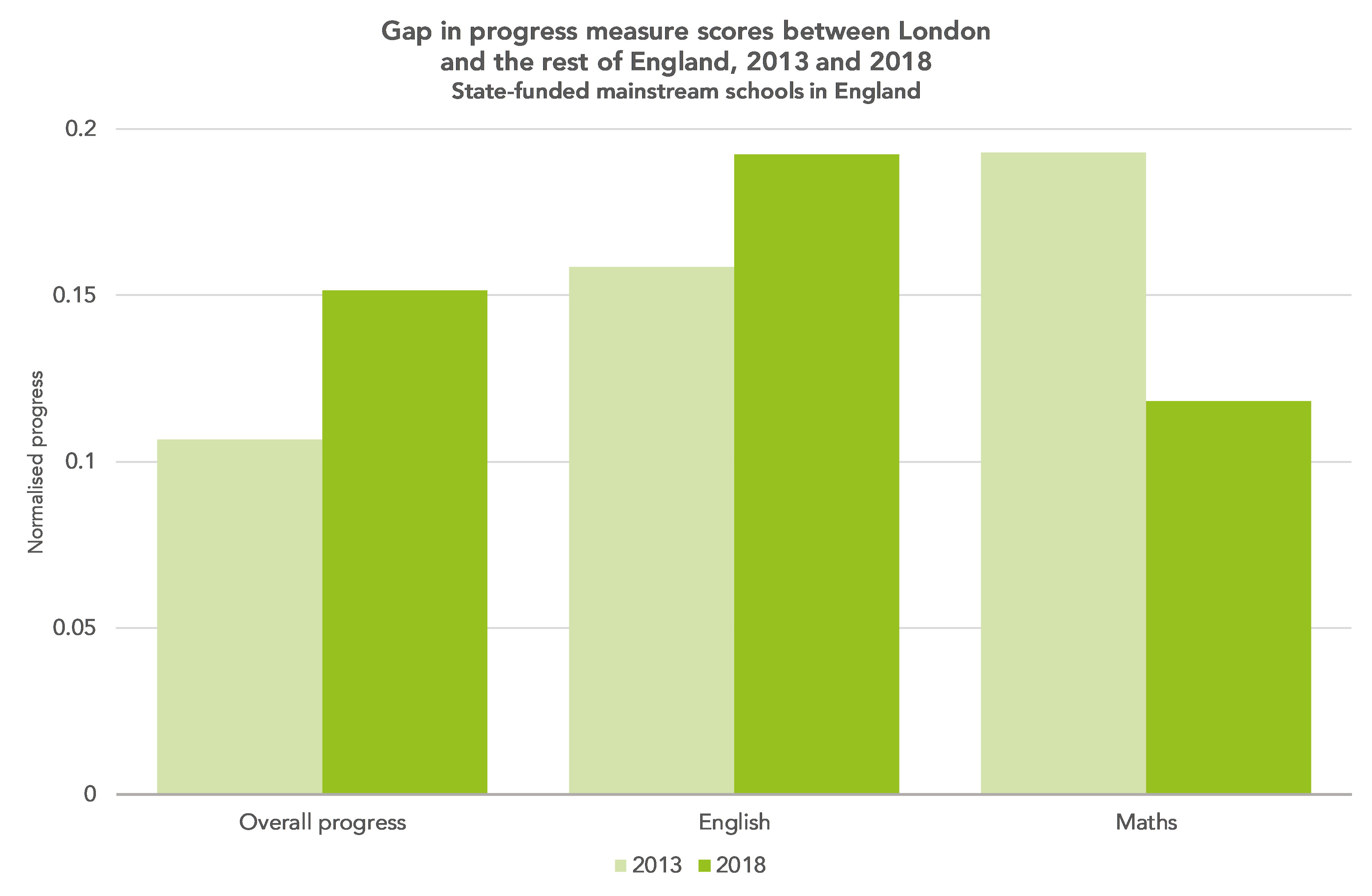
Overall, the London effect was larger in 2018 than in 2013. This was also true in English but not in maths.
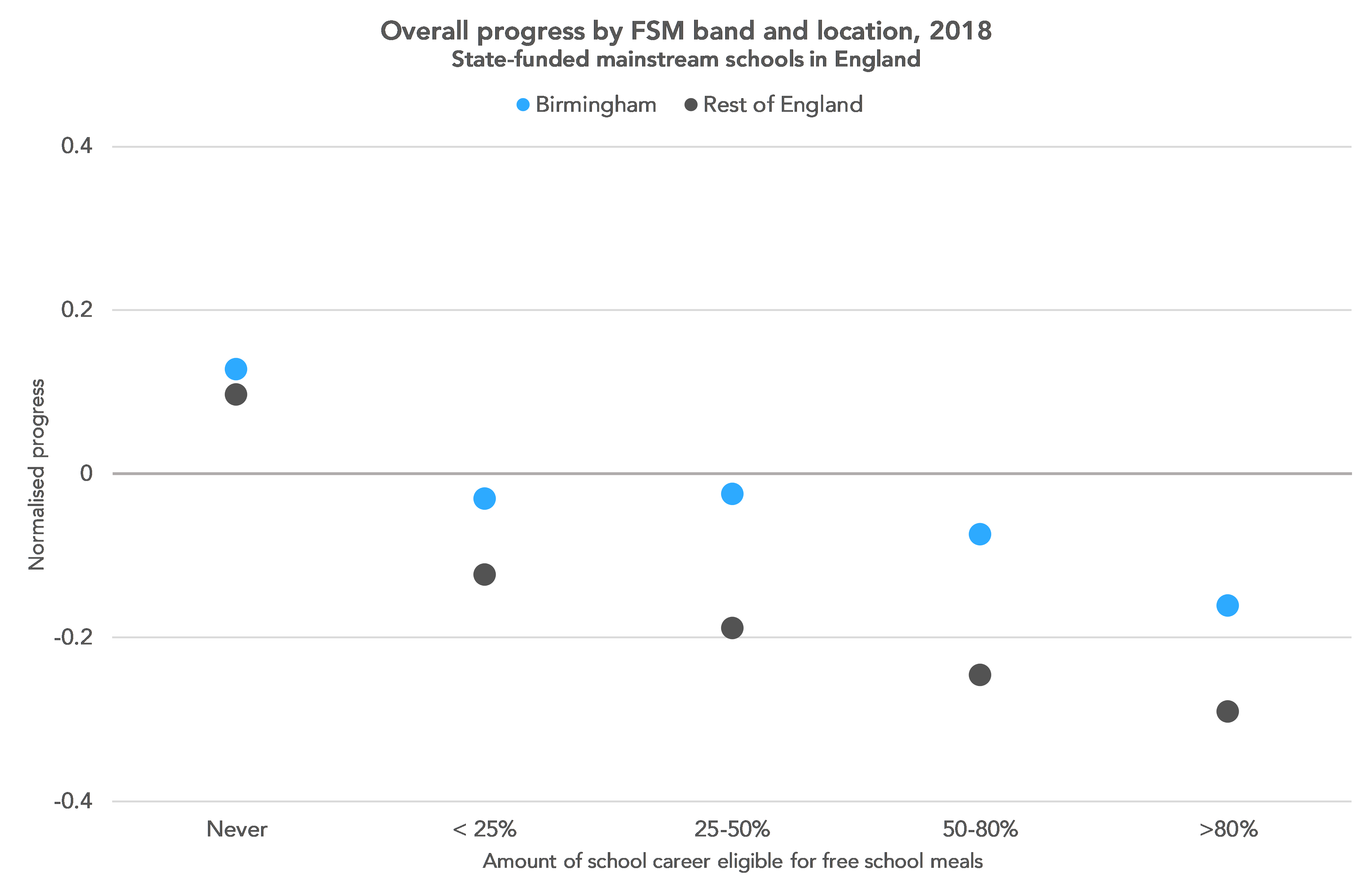
The Birmingham effect
We’ve seen that the London effect was still alive and well in 2018, but what about similar effects elsewhere?
In 2013, Burgess showed that students in Birmingham outperformed those in the rest of the country in a similar way to students in London. This supported his argument that the effect was explained by demography; he pointed out that Birmingham, like London, has a lower proportion of white British students than the rest of England.
The difference in performance could just be because white British students tended to perform less well than others.
We can see from the graph below that the Birmingham effect does still exist in the 2018 data. And, like the London effect, it is larger for disadvantaged students.
Controlling for ethnicity
So can the London effect still be entirely explained by controlling for ethnicity, as in 2013?
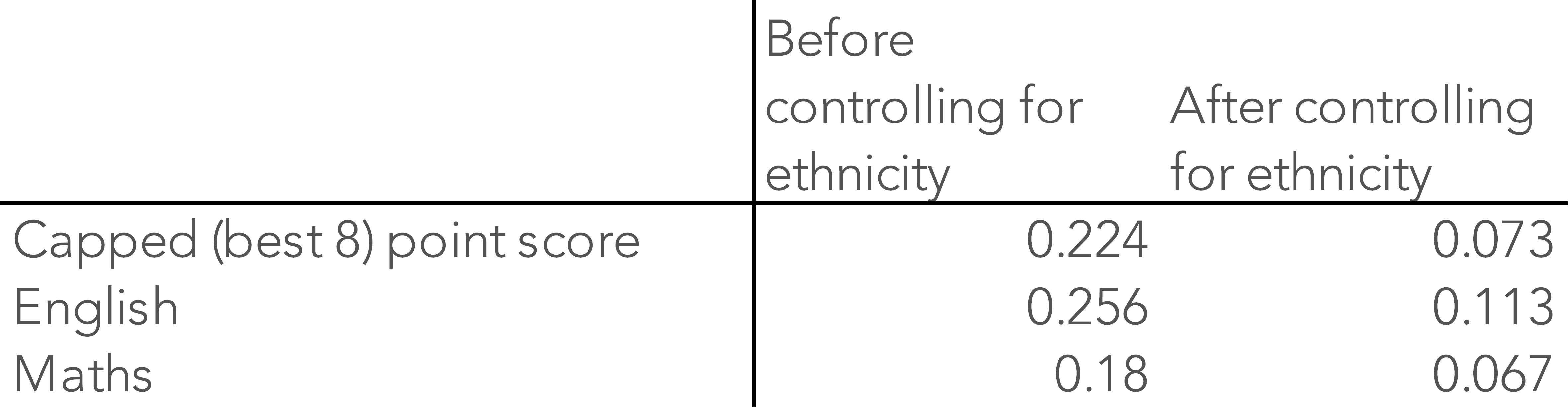
The table below shows what we estimate the London effect to be, based on a statistical model of the relationship between progress at KS4 and whether a pupil went to school in London or not – before and after controlling for ethnicity. That is, by how much we would expect a student in London to outperform a student elsewhere.

We then controlled for additional demographic factors[2]. As the table below shows, this increases the “London Effect” both before and after controlling for ethnicity. In English, in particular, we can see a London effect of 0.11 of a standard deviation after also controlling for ethnicity– roughly the equivalent of a quarter of a grade on the 9-1 GCSE scale.
Why might we be seeing a larger overall London effect today than Burgess found in 2013, even after controlling for ethnicity?
Part of the answer may lie in the choice of outcome measure. The capped (best 8) point score, which Burgess favoured, uses GCSEs or equivalent non-GCSE qualifications.
As we’ve written previously (e.g. here), the methods used to determine GCSE equivalence for non-GCSE qualifications have never really worked. High stakes accountability incentivised schools to maximise the capped point scores achieved by pupils by entering them for higher scoring qualifications.
Schools in London were less likely to enter pupils in non-GCSEs back in 2013 and so were better placed to respond to the Wolf reforms and the introduction of Progress 8. Schools in other parts of the country are now doing far fewer non-GCSEs. This goes some way to explaining why the gap has emerged since 2013.
(Results for 2018 based on Attainment 8 are very similar, by the way).
Looking at progress in English and maths, rather than our overall progress measure, may give us a more reliable measure. If we reproduce the table above for 2013, we can see that even after controlling for ethnicity, Burgess would have found a sizeable London effect if he had considered these outcomes rather than capped point scores.

Coming up next
These days it appears that the “London effect” can still be found in Birmingham (and London, of course) but it is no longer explained by ethnicity as it was in Simon Burgess’s analysis of 2013 data.
In the second post in this series, we’ll look at whether this effect exists for some groups of pupils but not others.
Now read the second post in this series.
Want to stay up-to-date with the latest research from FFT Education Datalab? Sign up to Datalab’s mailing list to get notifications about new blogposts, or to receive the team’s half-termly newsletter.
1. Within the Datalab office.
2. We controlled for prior attainment, gender, level of deprivation (defined by both proportion of years in school when a student was eligible for free school meals, and IDACI) and birth month.

Leave A Comment