Today sees the release of national Key Stage 4 (GCSE and equivalent) data for 2023.
This provides further information, including school-level data, that goes beyond the headlines published by JCQ in the summer.
That was accompanied by press coverage of a widening gap between schools in the North and those in the South (see this for example).
Our view is that while this is not entirely groundless, it diverts attention away from much more fundamental inequalities: specifically, local variations in school performance and the again-rising inequality in GCSE outcomes between poor and non-poor pupils. We set out the details of this below, noting that inequalities in GCSE outcomes contribute substantially to inequalities in life chances, and so the source of those differences is a key policy issue.
This is far from the first time that schools in the North have been criticised. This in the Times in 2020, quoted Sir Michael Wilshaw as saying that most of the lowest-performing Local Authorities (LAs) were in the north (see the FFT response here).
North-South differences
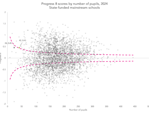
The first point to make is that there clearly IS a difference in average GCSE performance between the North and South of England. In the Figure below, we present results on both raw attainment (called Attainment 8 or A8), and pupil progress between age 11 attainment and GCSE performance (Progress 8 or P8).
Comparing the North East, North West and Yorkshire and the Humber in the North corner, with London, South East and South West in the South corner, there is a substantial difference in average P8: 0.04 for the South compared with -0.15 for the North, equivalent to 1 grade across 5 subjects. Even if we disregard the London performance, the average P8 score in the NE, Y&H and the NW is well below SE and SW schools at -0.02.
Note that we use P8 in the following analysis to measure school performance. It is far from perfect as a measure (as one of us had written here), but it is the best proxy of school effectiveness that is publicly available.

In the chart above, we plot both raw attainment (Attainment 8) and value added (Progress 8). We have centred Attainment 8 on the national average (46.3) and divided by 10 to put it on the same scale as Progress 8.
Differences in raw attainment tend to shrink when we account for differences in prior (Key Stage 2) attainment between regions, albeit not in the North West or, particularly, the North East. Improvements in the 2010s in Key Stage 2 results in the North East have not yet materialised into improvements at Key Stage 4.
Variation in pupil attainment
Of course, attainment varies between pupils. Some of this arises from measurable factors, some from factors that researchers cannot easily measure, and some from just statistical noise, for example the pupil feeling ill on test day. But we are interested in genuine systematic differences in attainment, because this helps us understand pupil and school performance and because policy can be addressed at the problem.
Our central point is that the “North/South” basis for inequality is of no use to either understanding or policy. Its role in explaining variation is trivial – differences in school performance between regions (technically, Government Office Regions or GORs) explain only 8% of inequality between schools (though we note that it was even less at 5% last year).
We can get at this statistic using a technique called variance decomposition – identifying the different sources of variation in an outcome. With only 8% of variation between , this means that 92% of the variation occurs within regions. That is the precise way of saying that focussing on regional or North/South differences is missing almost all of the action.
We can go deeper. Most of the inequality is even within Local Authorities (LAs). At this level of geography, 19% of the differences in GCSE performance are between LAs, again leaving the bulk of the action within LAs.
There is performance variation within towns, within cities and that accounts for a lot more of the total variation in school performance than the aggregate gross north-south variation. It is very firmly not the case that all the schools in the North are low performers and all the schools in the South are high performers.
There are good schools almost everywhere
Every government region and most local authorities have good schools in them and every region and local authority has low performing schools. It is simply not a question of only low performing schools in the North. The share of high performing schools is lower, but it is not zero, nor close to it.
In the table below, we put schools into three groups based on their 2023 P8 score. Those in the high performing group have a P8 score above 0.33 and those in the low performing group have a P8 score below -0.33. These roughly correspond to top and bottom quartiles nationally.

It is certainly clear that there are differences between regions. London obviously stands out from all other regions (more on this below). There are other differences too, not just London, but these are less dramatic divergences: the North East and North West respectively have 11% and 14% high performing and 42% and 38% low performing.
Combining the North East, North West and Yorkshire and the Humber, there are 150 high-performing secondary schools: a lower proportion than in other regions, but a long way from the stereotype of the north/south divide.
As the map below shows, there are high performing and low performing schools all over the country.
Local variation
School performance matters and inequality in school performance matters: not least because a pupil’s school outcome is an important part of getting on in life. And while education is about more than this, differential school outcomes means differential life chances
Our point is that the overall aggregate North/South characterization is a political diversion. The main issue is about local differences in effectiveness. These are driven by things like the effectiveness of teaching, of leadership, and funding. Beyond that, there are pockets of low achievement in “good” schools, and of high performance in low-performing schools. It is an open question whether it is better to direct policy to improving schools or to improving pupils within schools. The Pupil Premium is an example of the latter, recognising that there are disadvantaged pupils everywhere.
Consequently, at a local level, high-performing and low-performing schools exist within close proximity of each other.

Sources of variation
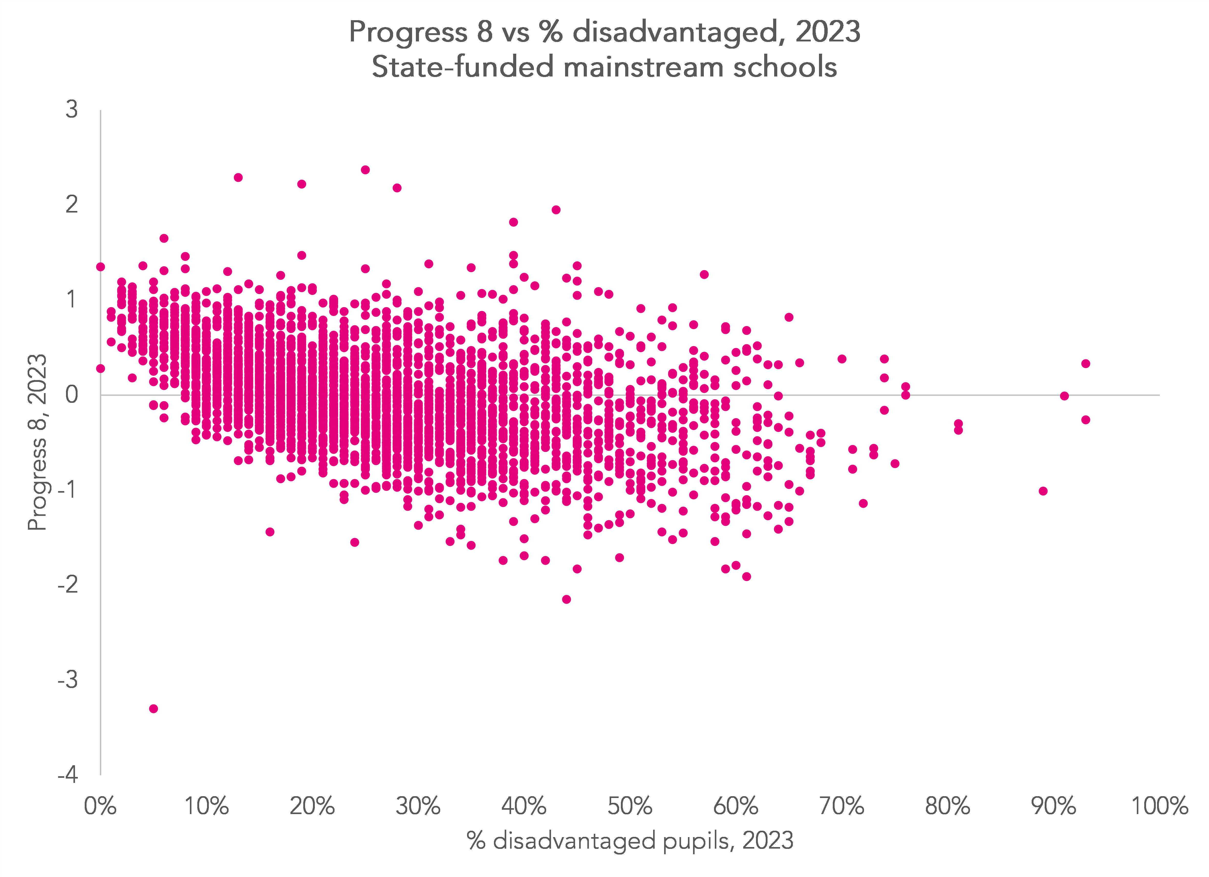
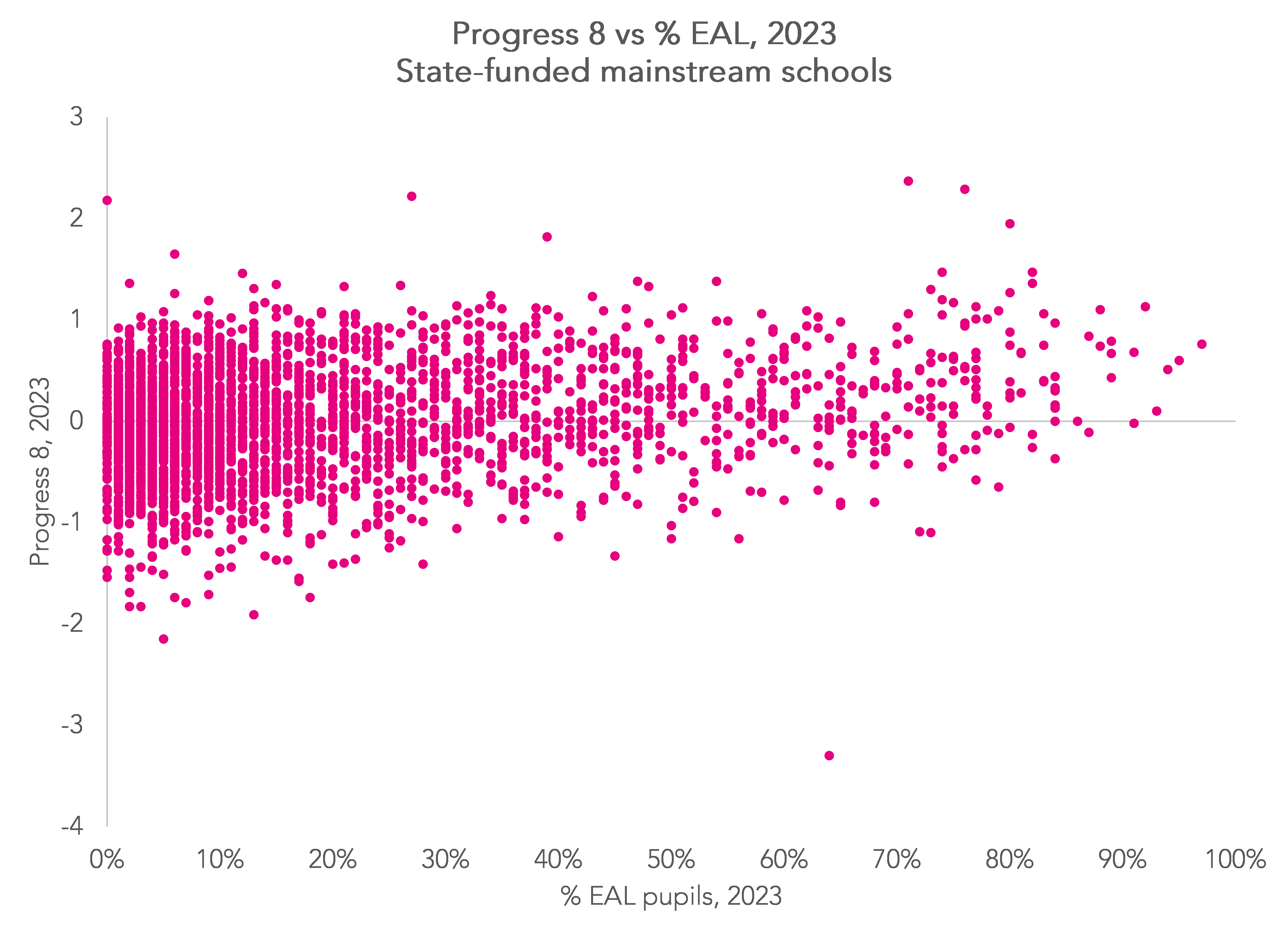
Differences in schools’ P8 scores are also related, to some extent, to pupil characteristics and funding. The following chart shows how P8 varies by a number of pupil characteristics.
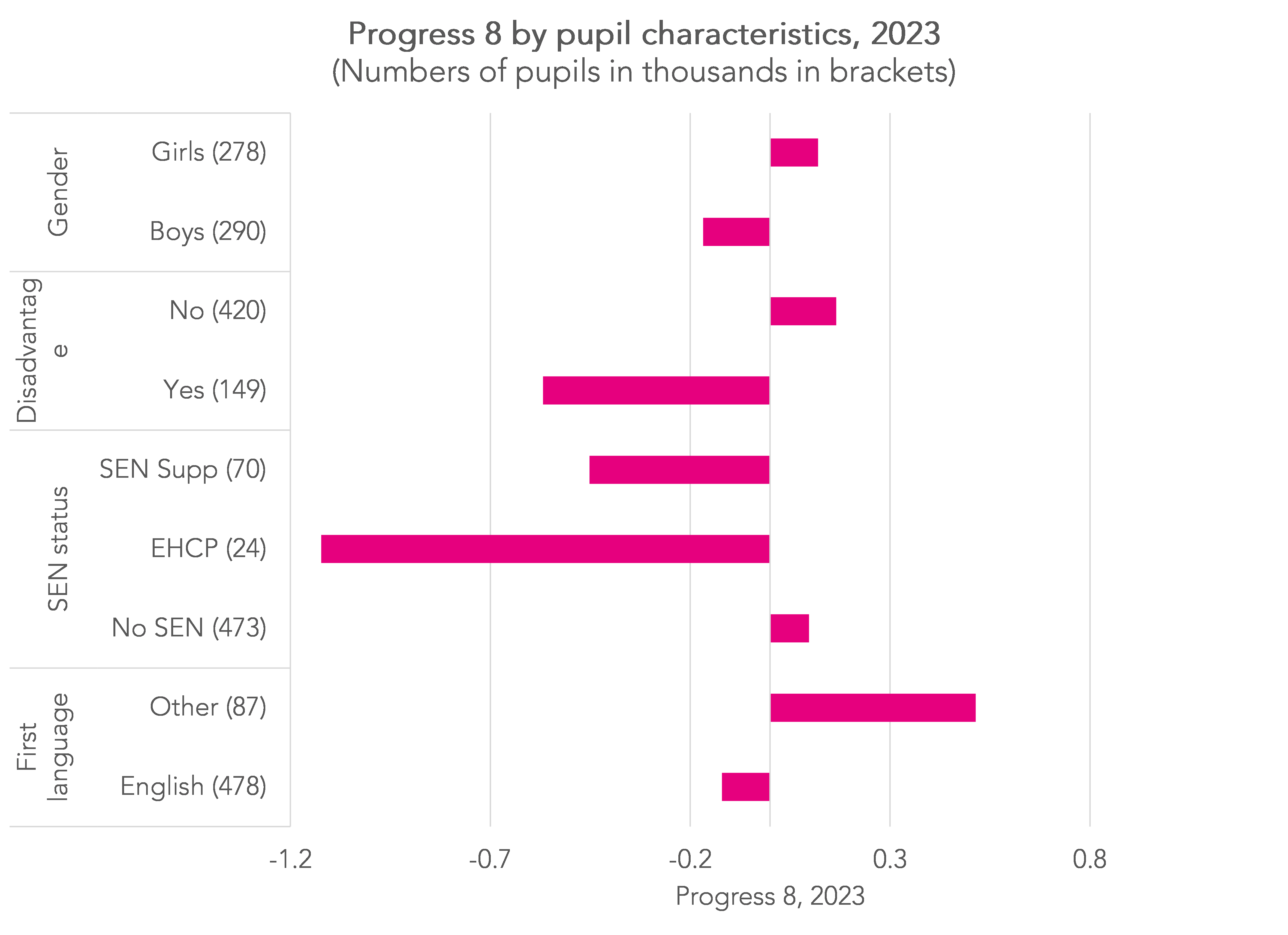
None of these factors is accounted for in Progress 8 although contextualised measures are straightforward to produce. But the important point is that pupils with different characteristics are not uniformly distributed between schools. Those with fewer disadvantaged pupils and those with more EAL pupils are more likely to achieve higher P8 scores.
Schools with higher rates of Year 11 absence also tend to achieve lower P8 scores though this will also in part be related to differences in demographic characteristics between schools: Some groups of pupils are absent more often than others (see this for example).

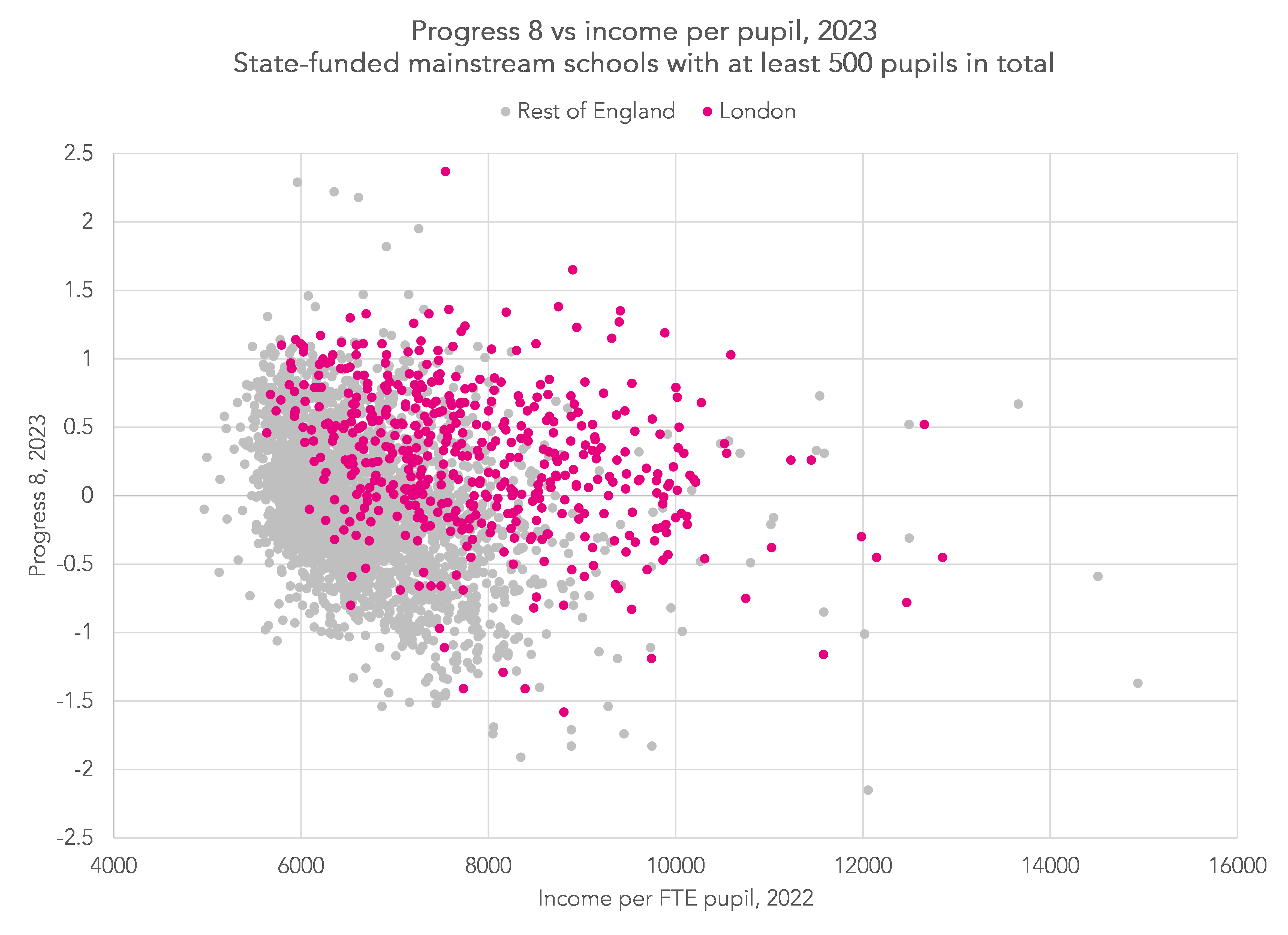
Differential funding, particularly between London and the rest of the country, is often cited as a factor in the performance of London’s schools. This may well be true although the relationship is not necessarily straightforward.
Conclusion
The north/south divide in school performance is mostly a distraction. Most of the variation in school performance is very local, between nearby schools. And of course, there is a lot of variation in GCSE outcomes within schools, so improving low performing schools won’t help all low attaining pupils much since there are low attainers even in high performing schools. The key policy questions remain focused on improving effectiveness in low performing schools, helping low attaining pupils wherever they are, and about improving fair access to locally effective schools.
Want to stay up-to-date with the latest research from FFT Education Datalab? Sign up to Datalab’s mailing list to get notifications about new blogposts, or to receive the team’s half-termly newsletter.

“at a local level, high-performing and low-performing schools exist within close proximity of each other.” I’m not convinced from your maps. If you live in the east side of Leeds you’ve got no access to a high-performing school. Similarly, the 4 high performing schools in Sheffield are all concentrated in the SW of the city. Doesn’t matter how close the school is, if it’s not it your designated catchment you have no access.
Hi Tony. Fairer access is one of the things we’re calling for. So a) being able to apply for and b) having a chance of getting into a school for which you might not currently be in the designated catchment.
Agreed, your point is true for many cities all over the country. Except Sunderland, which has no high performing schools. Equally bleak picture in rural areas particularly the West Country.